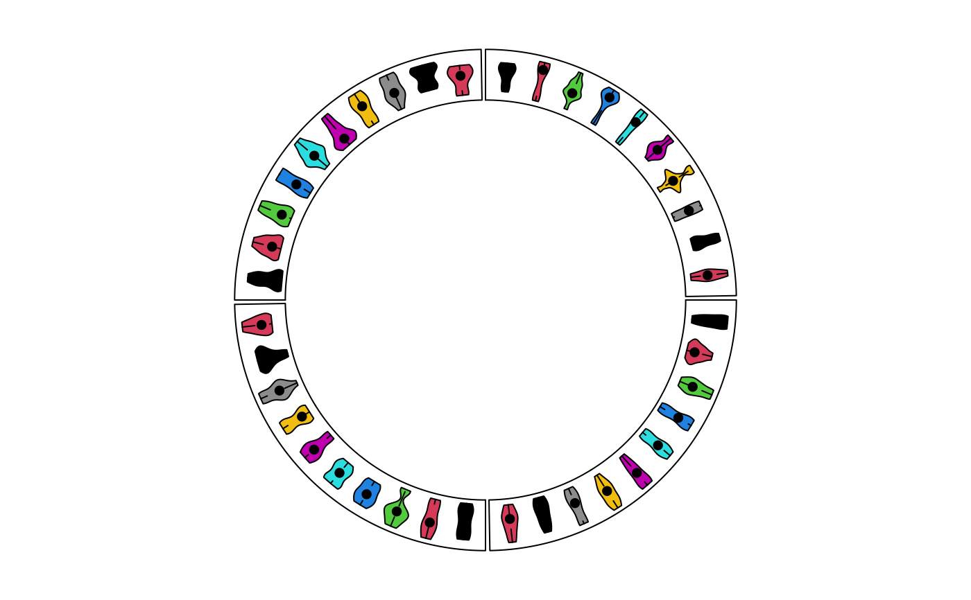
Draw violin plots
circos.violin.RdDraw violin plots
circos.violin(value, pos, violin_width = 0.8,
    col = NA, border = "black", lwd = par("lwd"), lty = par("lty"),
    show_quantile = TRUE, pt.col = par("col"), cex = par("cex"), pch = 16,
    max_density = NULL, sector.index = get.current.sector.index(),
    track.index = get.current.track.index())
Arguments
| value | A numeric vector, a matrix or a list. If it is a matrix, boxplots are made by columns. |
|---|---|
| pos | Positions of the boxes. |
| violin_width | Width of violins. |
| col | Filled color of boxes. |
| border | Color for the border as well as the quantile lines. |
| lwd | Line width. |
| lty | Line style |
| show_quantile | Whether to show the quantile lines. |
| cex | Point size. |
| pch | Point type. |
| pt.col | Point color |
| max_density | The maximal density value across several violins. It is used to compare between violins. |
| sector.index | Index of sector. |
| track.index | Index of track. |
Examples
circos.track(ylim = c(0, 1), panel.fun = function(x, y) { for(pos in seq(0.5, 9.5, by = 1)) { value = runif(10) circos.violin(value, pos) } })circos.track(ylim = c(0, 1), panel.fun = function(x, y) { value = replicate(runif(10), n = 10, simplify = FALSE) circos.violin(value, 1:10 - 0.5, col = 1:10) })circos.clear() # }

