vignettes/examples.Rmd
examples.Rmd
Click the corresponding link to see the complete code for generating the plot.
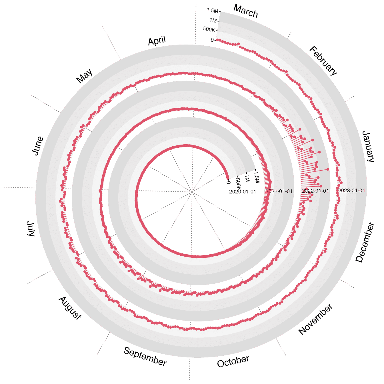
The COVID-19 daily increase
Daily downloads of ggplot2
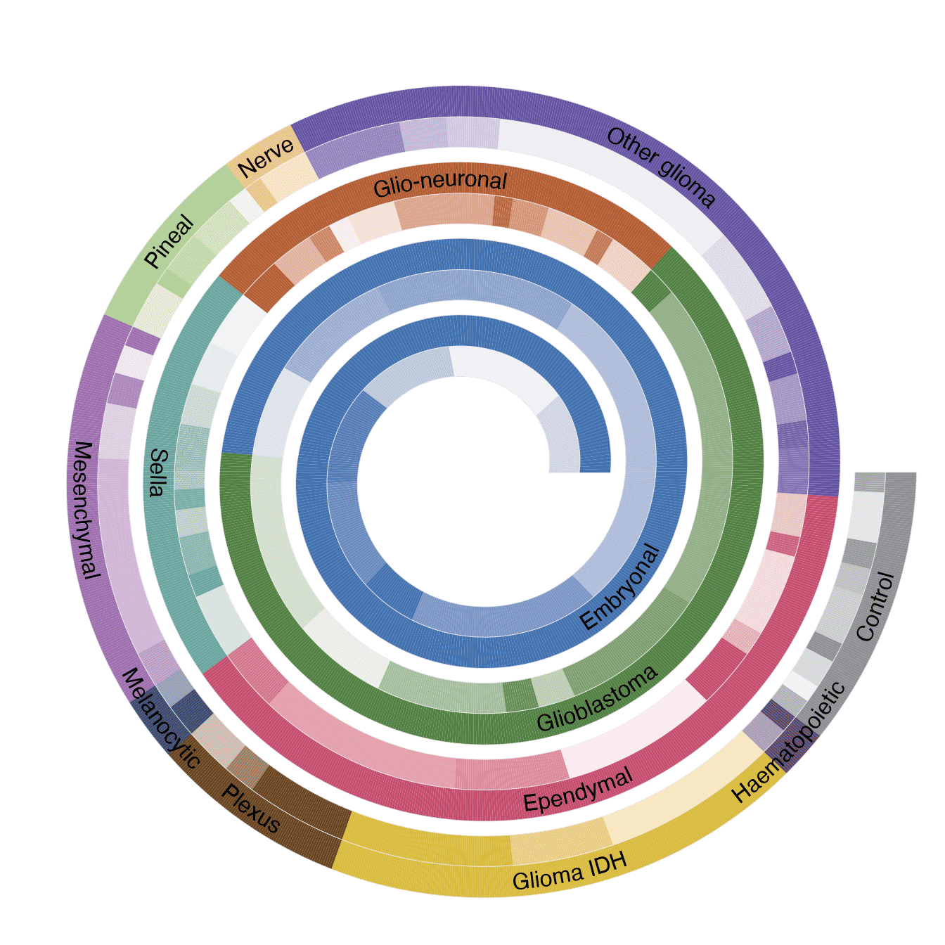
Classification of central nervous system tumors
First 5000 digits of π
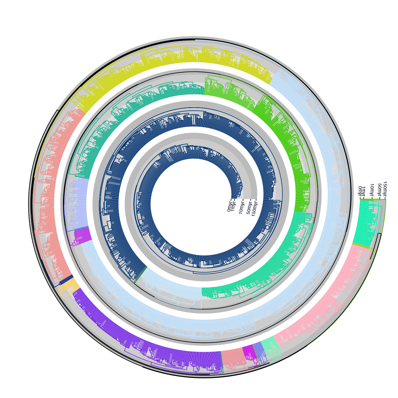
Phylogenetic tree
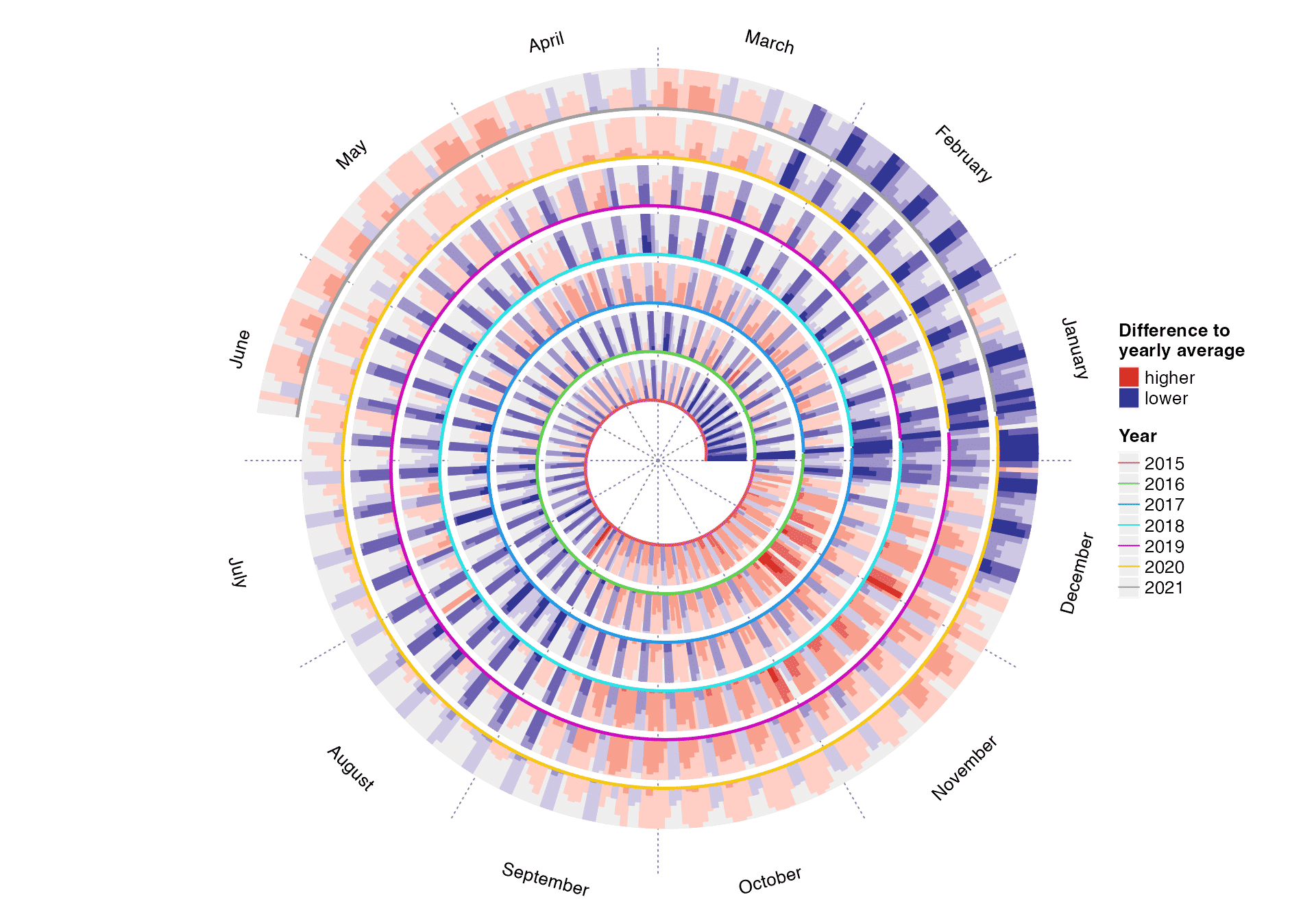
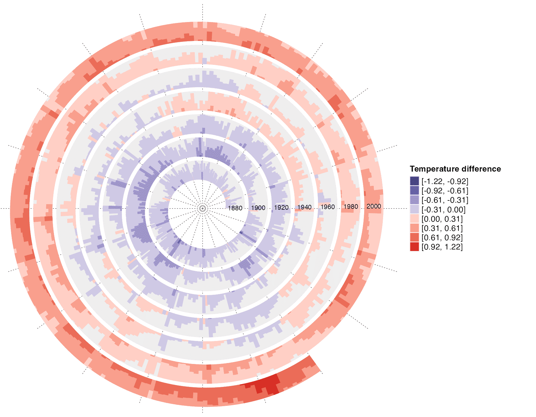
Global temperature change
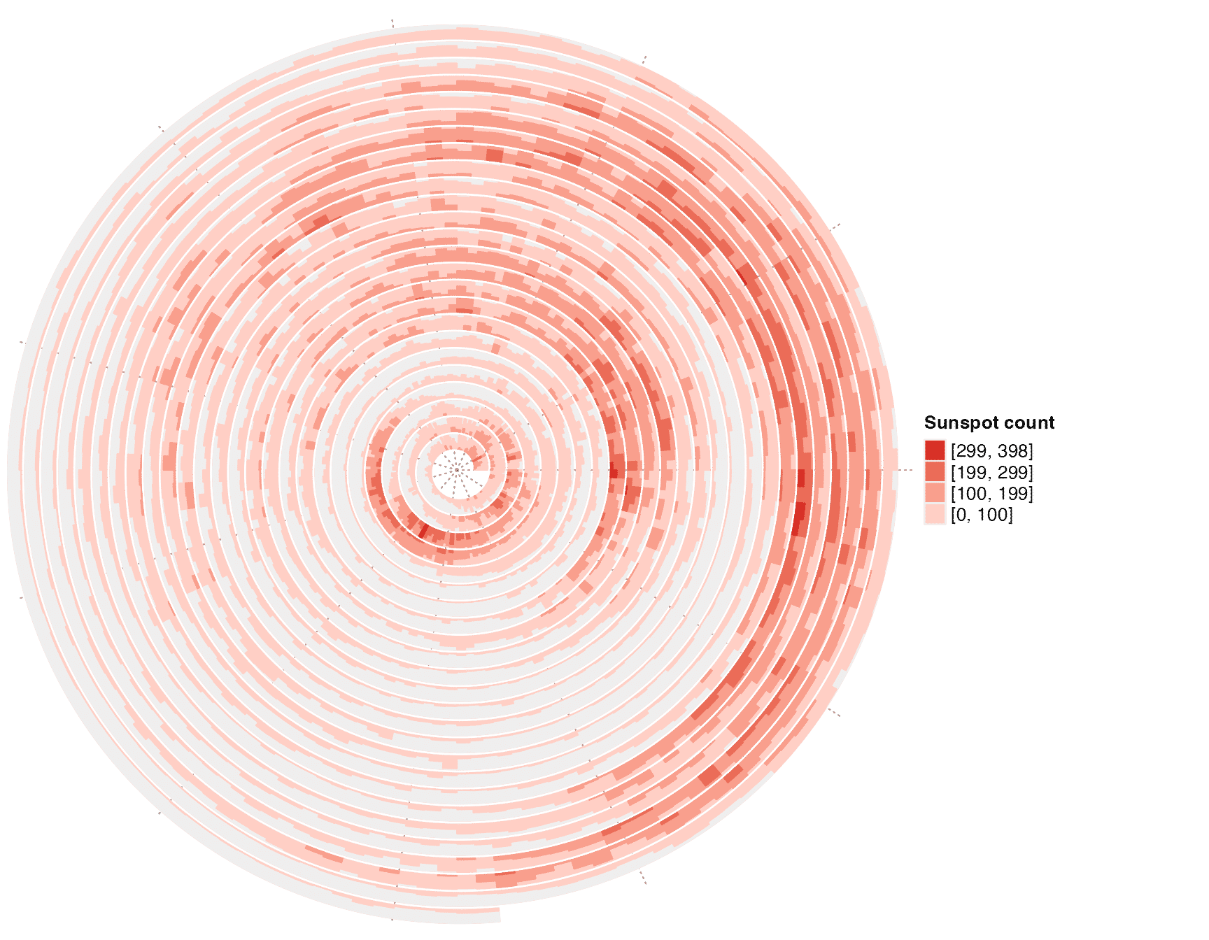
Sunspot cycle
DNA sequence alignment
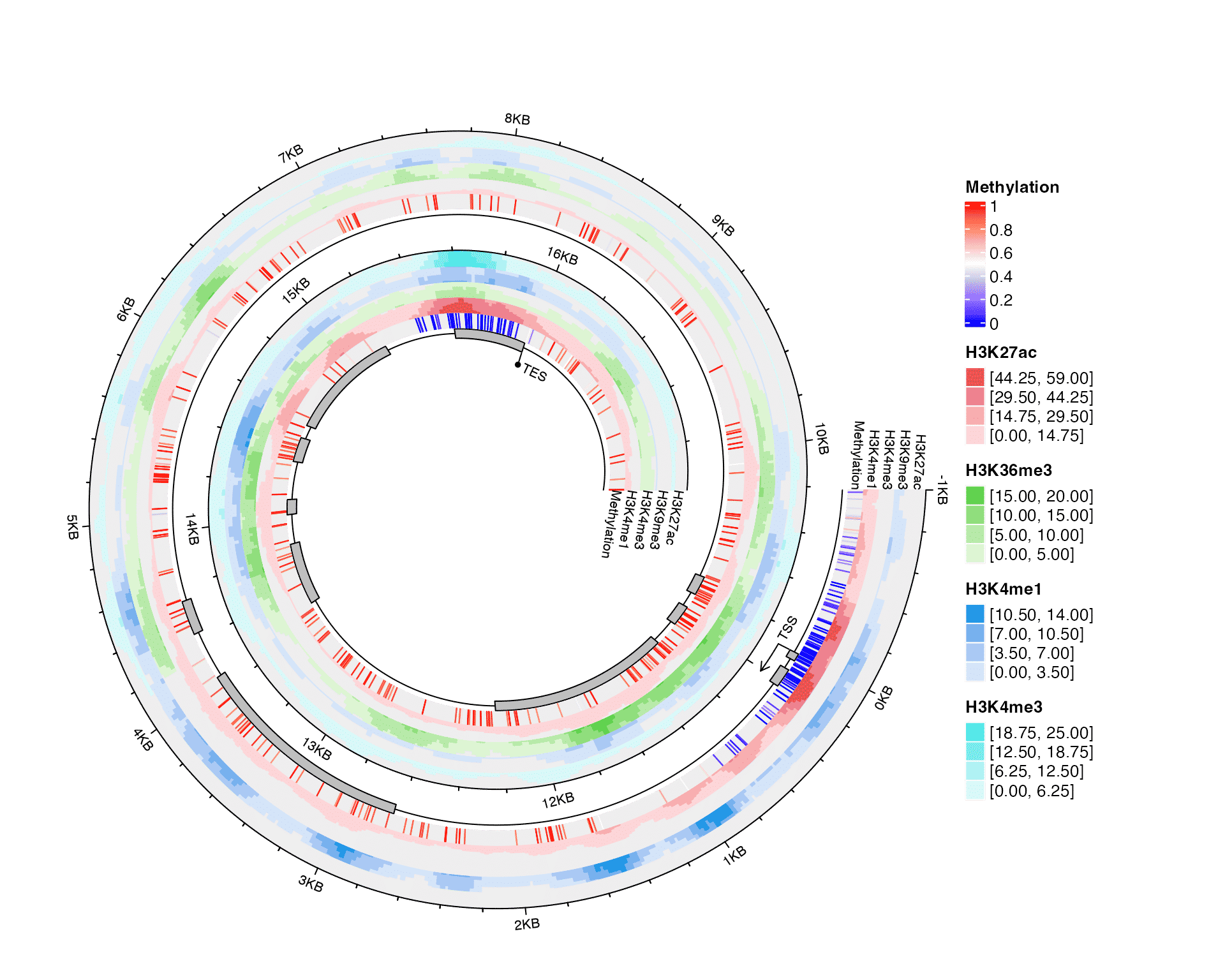
Integrative visualization of methylation and histone modifications
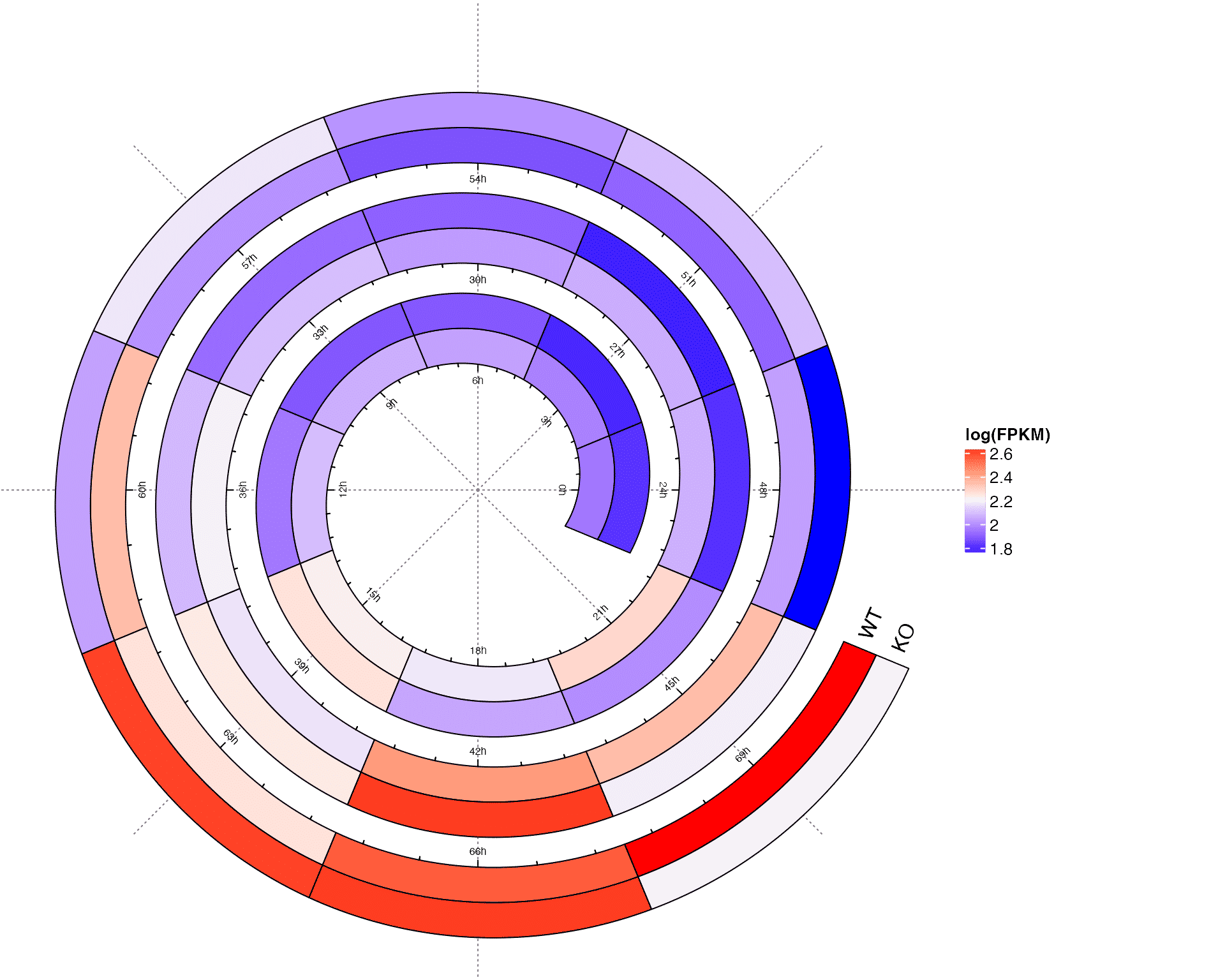
Circadian gene expression
Fill spiral tracks with images
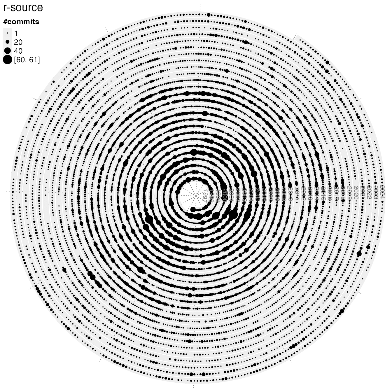
git commits
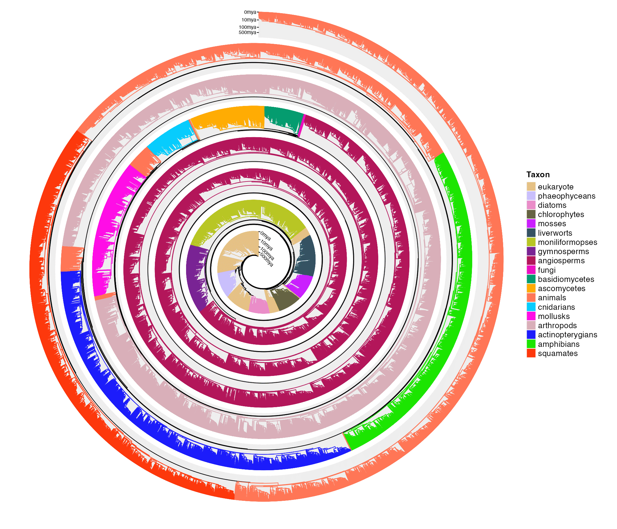
Visualize tree of life (50455 species)