In circlize package, x-axis in always clockwise in each sector, no matter it is on the top of the circle or at the bottom. However, you can manually reverse the original positions on x-axis to pretend you have a reversed x-axis. Take following example:
library(circlize)## ========================================
## circlize version 0.4.9
## CRAN page: https://cran.r-project.org/package=circlize
## Github page: https://github.com/jokergoo/circlize
## Documentation: https://jokergoo.github.io/circlize_book/book/
##
## If you use it in published research, please cite:
## Gu, Z. circlize implements and enhances circular visualization
## in R. Bioinformatics 2014.
##
## This message can be suppressed by:
## suppressPackageStartupMessages(library(circlize))
## ========================================circos.par(gap.degree = c(10, 10), start.degree = -5)
circos.initialize(factors = c("a", "b"), xlim = c(0, 1))
circos.trackPlotRegion(ylim = c(0, 1), panel.fun = function(x, y) {
circos.axis(major.at = seq(0, 1, by = 0.1))
})
circos.rect(0.2, 0.2, 0.4, 0.4, col = "red", sector.index = "a")
circos.link("a", 0.3, "b", 0.7)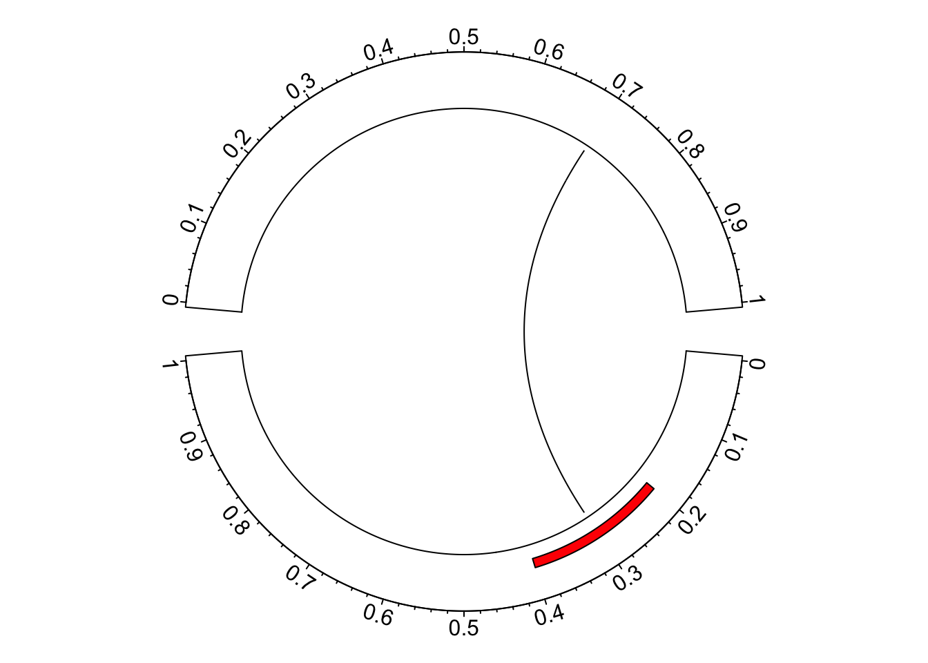
circos.clear()In the bottom sector, the order of x-axis seems not very convinient to read.
Actually we can make some transformation on the original coordinates on x-axis.
In following we defined reverse_xaxis() which flips the x-axis.
reverse_xaxis = function(x, xlim = get.cell.meta.data("xlim")) {
    (xlim[2] - xlim[1]) - (x - xlim[1]) + xlim[1]
}
reverse_xaxis(seq(0, 1, by = 0.1), xlim = c(0, 1))
## [1] 1.0 0.9 0.8 0.7 0.6 0.5 0.4 0.3 0.2 0.1 0.0In the arguments of reverse_xaxis(), the default value for xlim is get.cell.meta.data("xlim")
so that it can automatically get the ranges on x-axis if reverse_xaxis() is called inside panel.fun().
If it is called somewhere else, xlim should be defined explicitly.
Now we apply reverse_xaxis() to all the coordinates in the sectors we want to
flip.
circos.par(gap.degree = c(10, 10), start.degree = -5)
circos.initialize(factors = c("a", "b"), xlim = c(0, 1))
circos.trackPlotRegion(ylim = c(0, 1), panel.fun = function(x, y) {
    sector.index = get.cell.meta.data("sector.index")
    at = seq(0, 1, by = 0.1)
    if(sector.index == "a") {
        circos.axis(major.at = at, labels = reverse_xaxis(at))
        circos.rect(reverse_xaxis(0.2), 0.2, reverse_xaxis(0.4), 0.4,
            col = "red", sector.index = "a")
    } else {
        circos.axis(major.at = at)
    }
})
xlim = get.cell.meta.data("xlim", sector.index = "a")
circos.link("a", reverse_xaxis(0.3, xlim), "b", 0.7)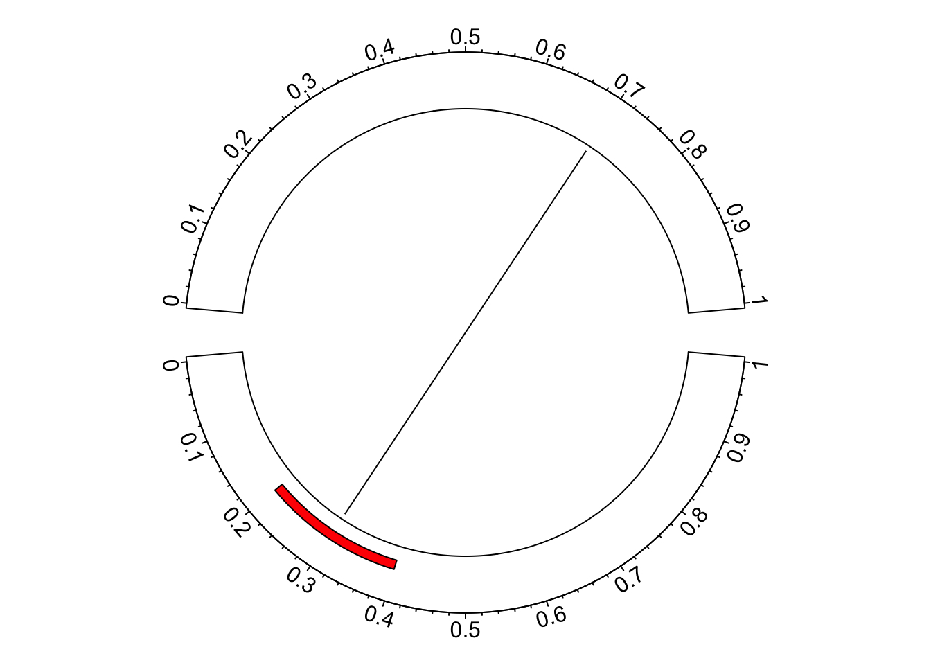
circos.clear()In the end, I want to say that users should be very careful with reversing the x-axes. The default design that all x-axes are clockwise actually makes it easy and straightforward to compare between sectors, especially when you have many sectors in the circle.