Enriched heatmaps are used to visualize the enrichment of genomic signals on a set of genomic targets of interest. It is broadly used to visualize e.g. how histone marks are enriched to specific sites.
Sometimes we want to visualize the general correlation around certain genomic targets or how the difference between two subgroups looks like in the vicinity of e.g. gene TSS. In this case, the signals contain both positive and negative value and it makes more sense to visualize the enrichment for the positive and negative signals separatedly.
In following example, variable mat_H3K4me1 contains correlation between H3K4me1 signal and
expression of corresponding genes in (-5kb, 10kb)of the gene TSS.
library(EnrichedHeatmap)
library(circlize)
load(paste0(system.file("extdata", "H3K4me1_corr_normalize_to_tss.RData", package = "EnrichedHeatmap")))
quantile(mat_H3K4me1)
## 0% 25% 50% 75% 100%
## -0.77089656 0.00000000 0.03763074 0.30214785 0.86717996To visualize the pattern of positive correlation and negative correlation, one way is to separate into two matrix and visualize them separately:
mat_pos = mat_H3K4me1
mat_pos[mat_pos < 0] = 0
mat_neg = mat_H3K4me1
mat_neg[mat_neg > 0] = 0
cor_col_fun = colorRamp2(c(-1, 0, 1), c("darkgreen", "white", "red"))
ylim = range(c(colMeans(mat_pos), colMeans(abs(mat_neg))))
EnrichedHeatmap(mat_pos, col = cor_col_fun, name = "pos_corr",
    top_annotation = HeatmapAnnotation(pos_line = anno_enriched(gp = gpar(col = "red"),
        ylim = ylim), height = unit(2, "cm")),
    column_title = "pos_corr") +
EnrichedHeatmap(mat_neg, col = cor_col_fun, name = "neg_corr",
    top_annotation = HeatmapAnnotation(pos_line = anno_enriched(gp = gpar(col = "darkgreen"),
        ylim = ylim, value = "abs_mean"), height = unit(2, "cm")),
    column_title = "neg_corr")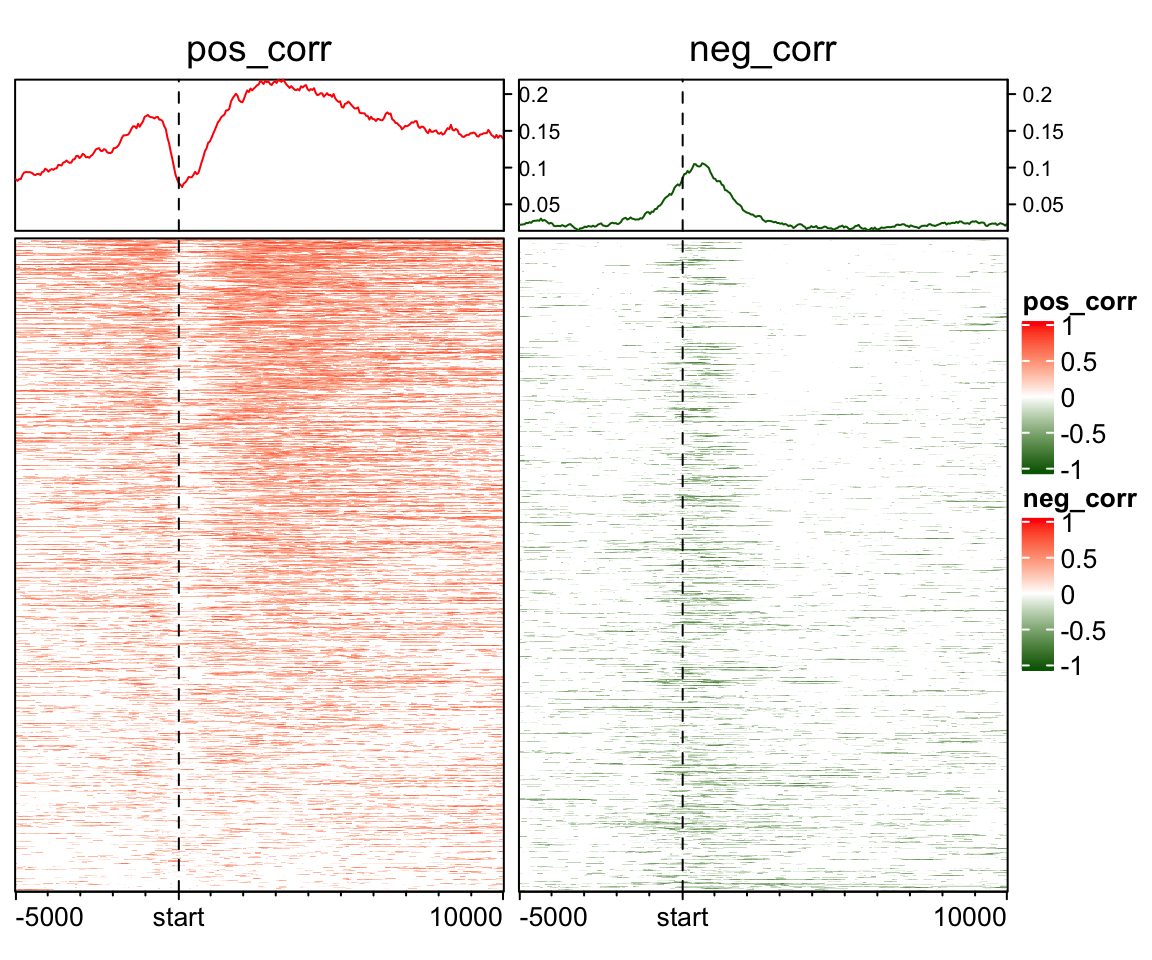
From version 1.5.1 of EnrichedHeatmap package, in anno_enriched(), there are two non-standard
parameters neg_col and pos_col for gp. If these two are set, the enrichment lines are drawn
for the positive and negative signals separatedly, and you don’t need to separate the matrix into
two matrix.
EnrichedHeatmap(mat_H3K4me1, col = cor_col_fun, name = "corr_H3K4me1",
    top_annotation = HeatmapAnnotation(line = anno_enriched(gp = gpar(neg_col = "darkgreen", pos_col = "red")),
        height = unit(2, "cm")),
    column_title = "correlation")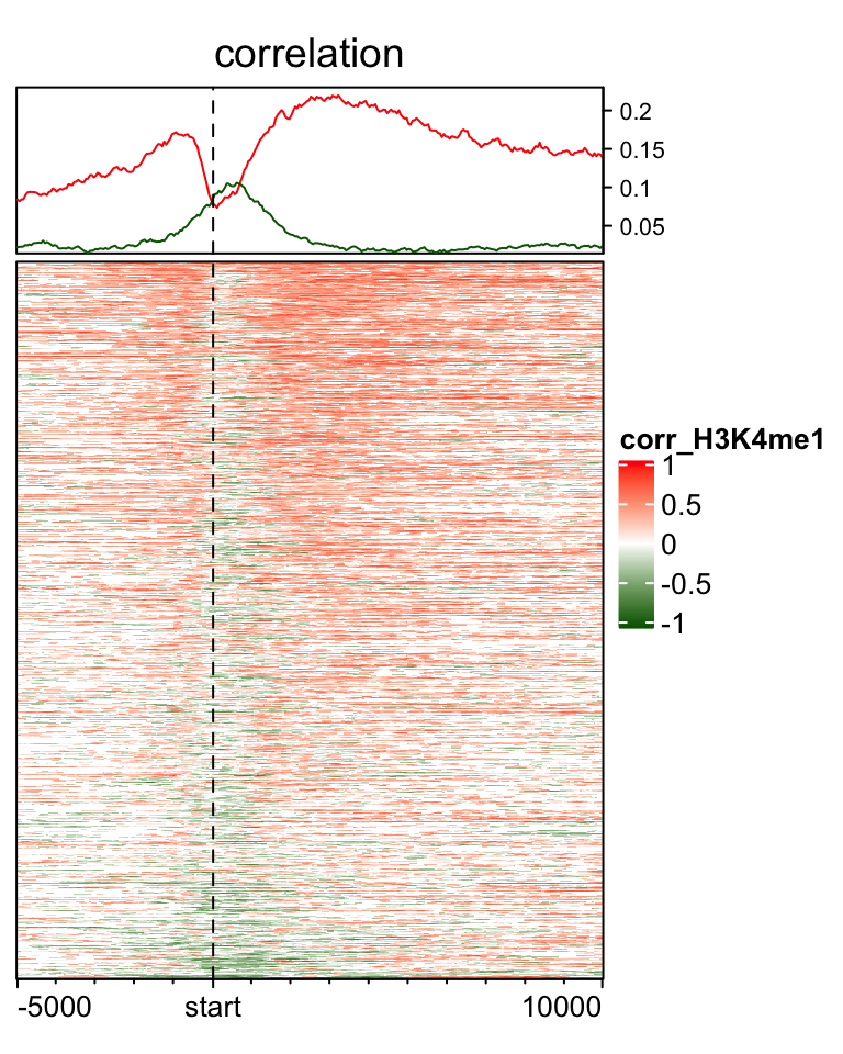
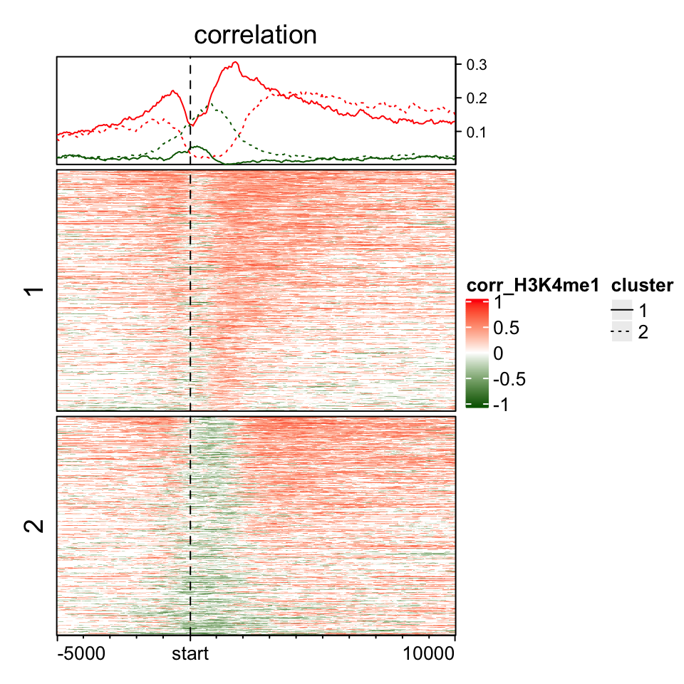
If you split the rows in the heatmap, graphic parameters can still be set as a vector. After observing the above heatmap, we make a kmeans clustering to a sub-matrix which contains signals in (0, 2kb) of TSS.
split = kmeans(mat_H3K4me1[, 101:140], centers = 2)$cluster
ht = EnrichedHeatmap(mat_H3K4me1, col = cor_col_fun, name = "corr_H3K4me1",
    top_annotation = HeatmapAnnotation(line = anno_enriched(gp = gpar(neg_col = "darkgreen", pos_col = "red",
        lty = c(1, 3))), height = unit(2, "cm")),
    column_title = "correlation", split = split)
lgd = Legend(at = c("1", "2"), type = "lines", legend_gp = gpar(lty = c(1, 3)), title = "cluster")
draw(ht, annotation_legend_list = list(lgd))