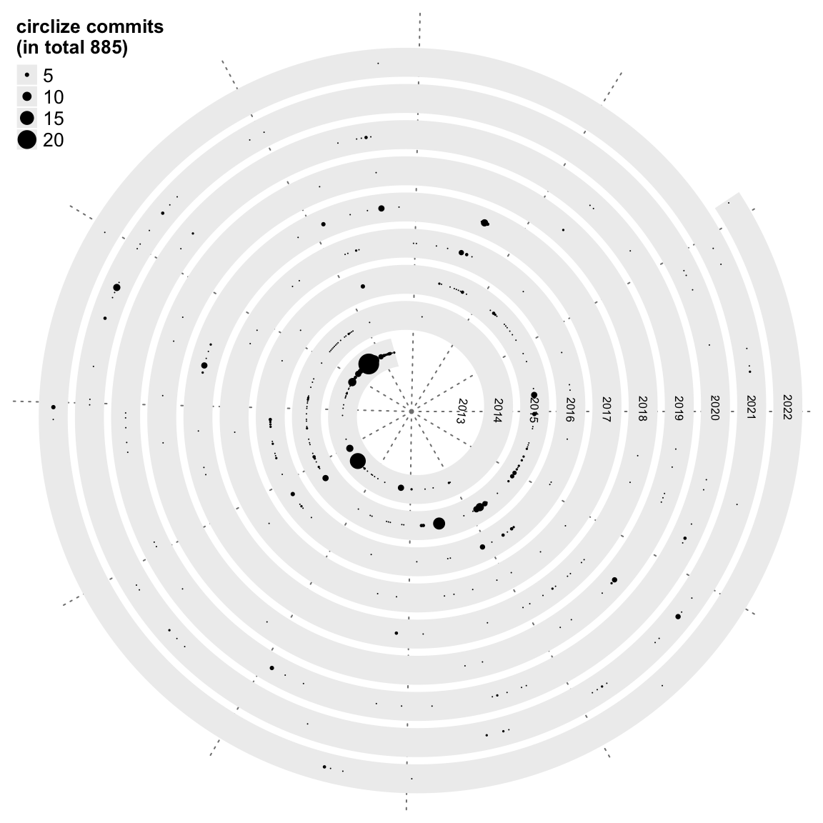
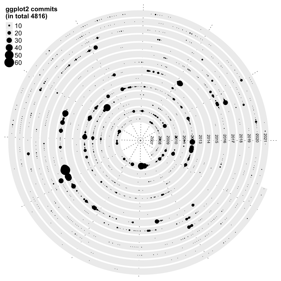
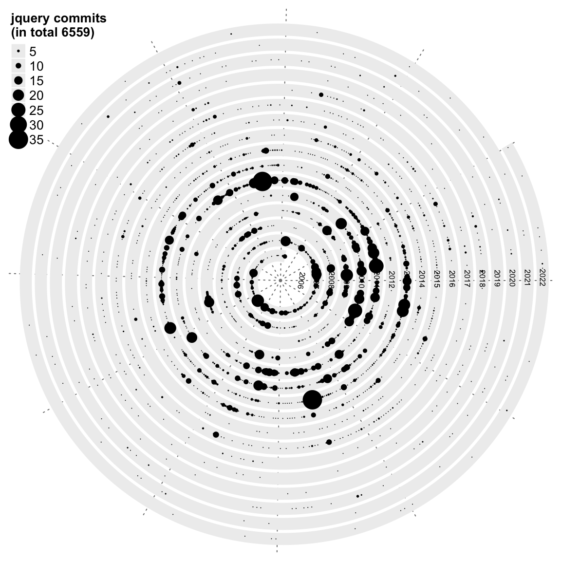
In this blog, I will apply spiral visualization on git daily commits. The following three plots are for R package circlize (which is developed by me), the R package ggplot2 and the JavaScript library jQuery. Each loop is a complete year. The point size corresponds to the number of commits on that day.
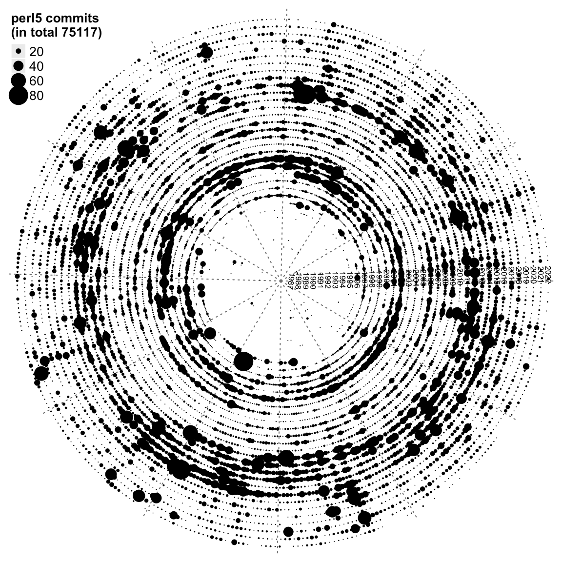
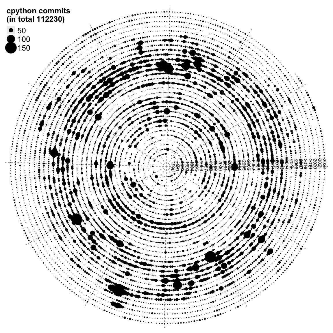
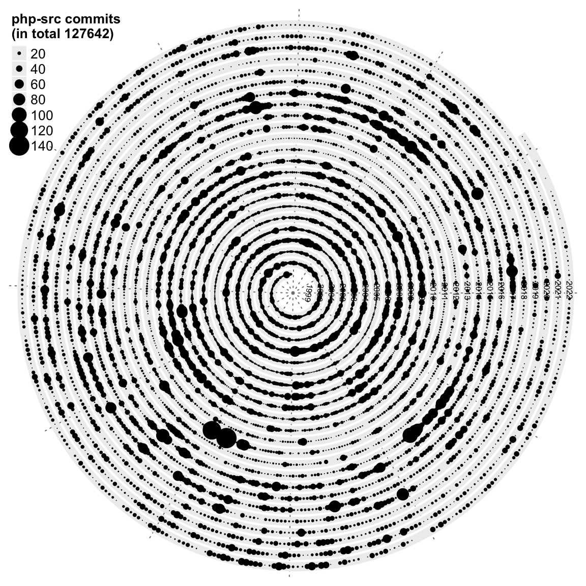
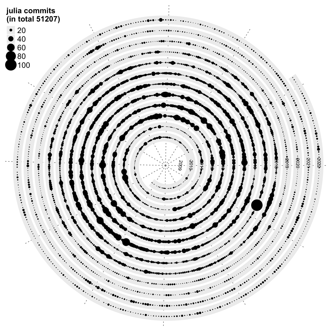
Next we visualize the git commits for the five programming languages: R, Perl, Python, PHP and Julia.
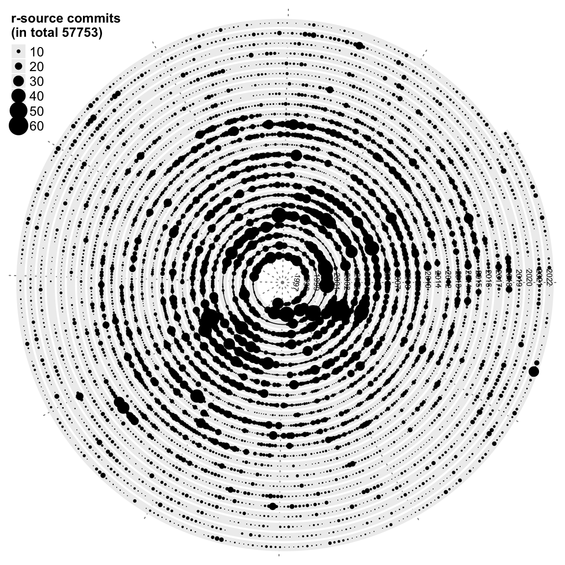
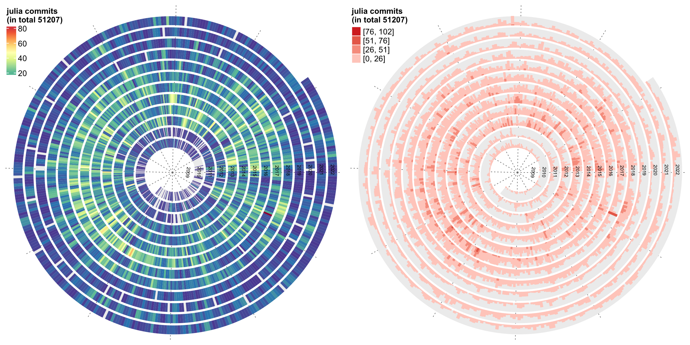
Since the git repos for the five programming languages contain many daily commits, which makes the plots quite crowded. Next we use two other graphics for visualization: heatmap and horizon chart.
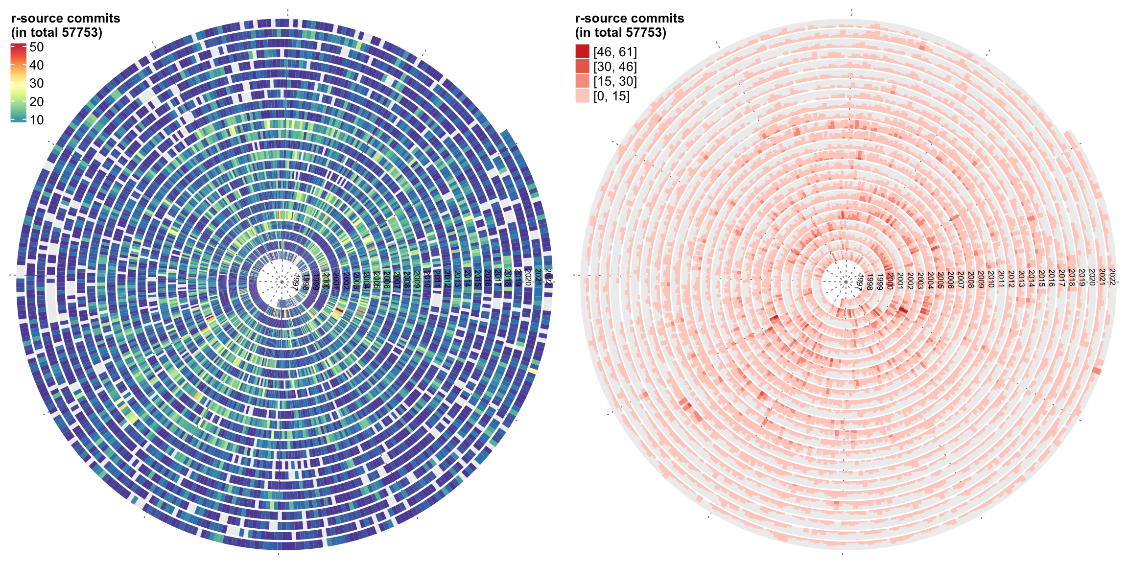
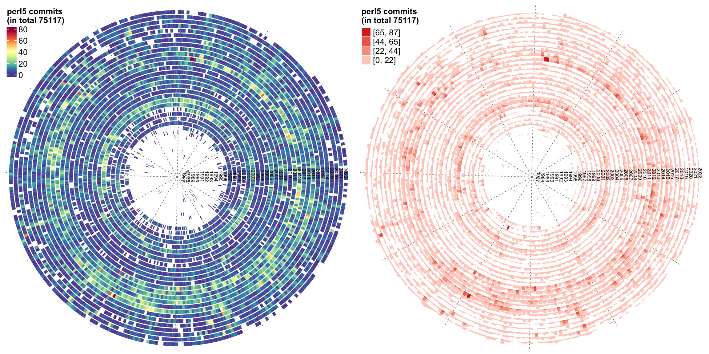
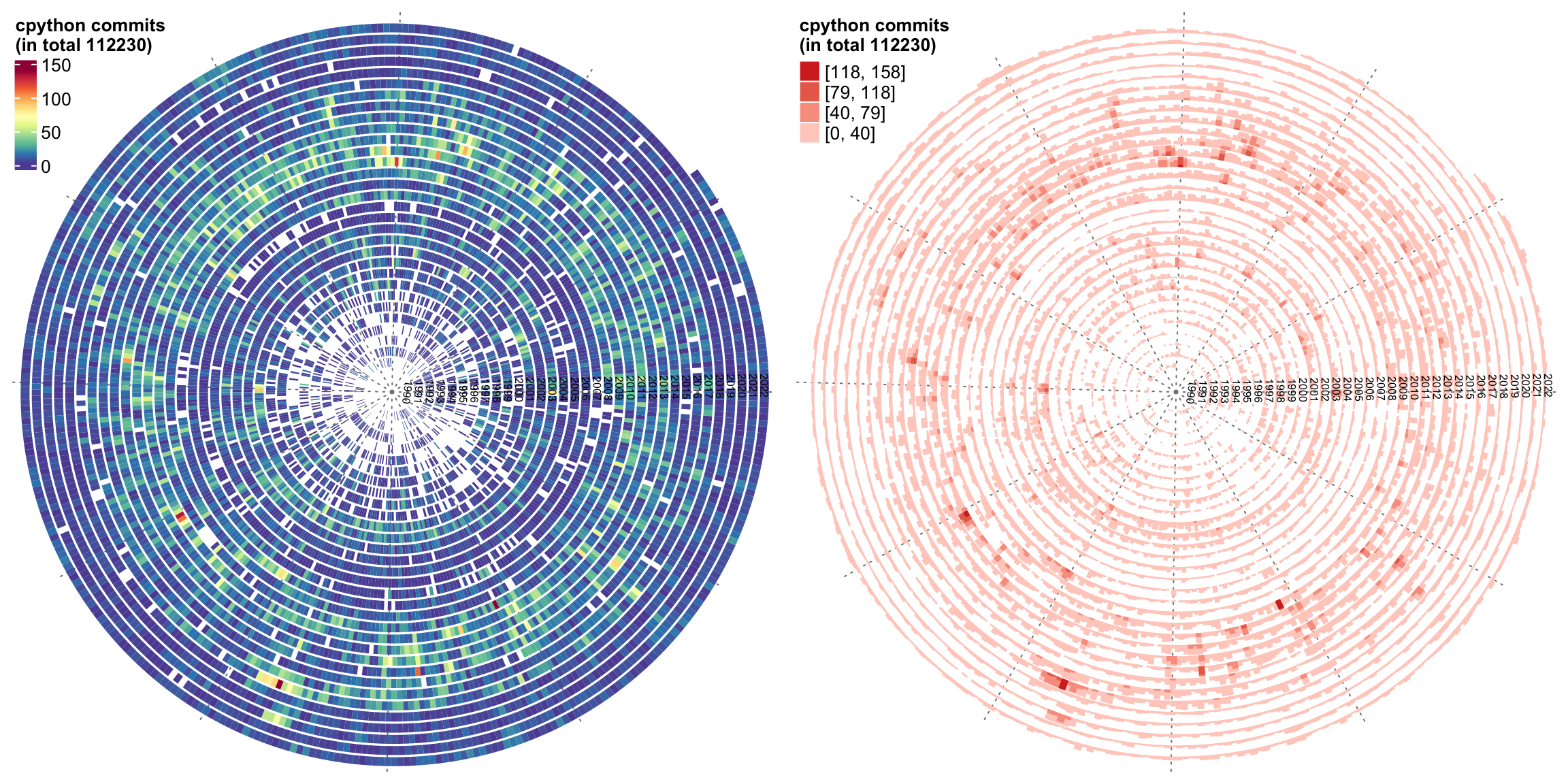
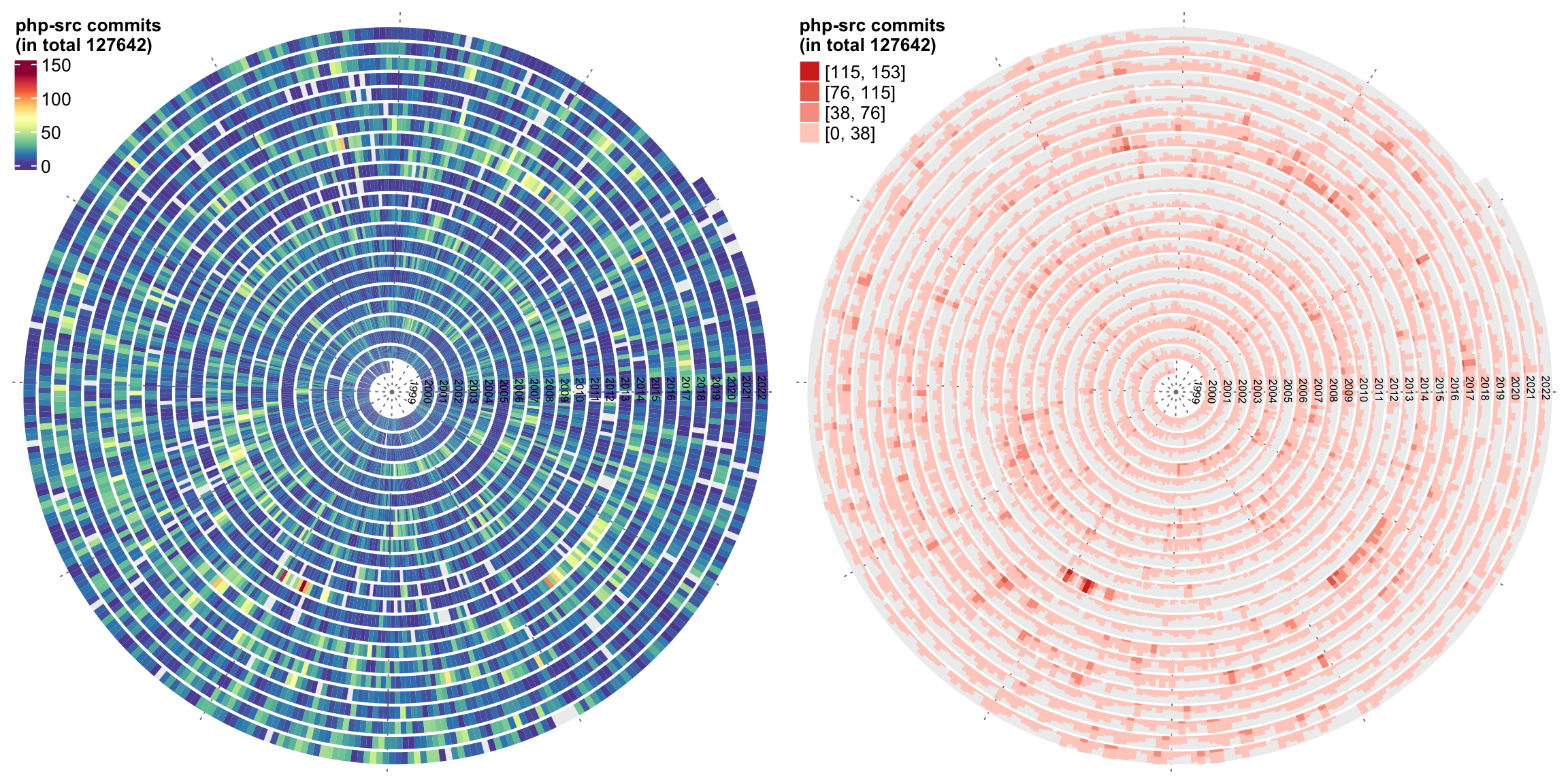
It seems the dot charts are the easist to read. What’s your opinion?
The source code for generating the plots is as follows. Note the value of repo should be a git repo path.
If you want to try other repos on GitHub, you need to first clone them to your local computer.
library(lubridate)
library(spiralize)
library(ComplexHeatmap)
library(circlize)
library(RColorBrewer)

calc_pt_size = function(x, x_max = 30, x_min = 2, pt_max = 20, pt_min = 1) {
    size = (pt_max - pt_min)/(x_max - x_min)*(x - x_min) + pt_min
    size[size < pt_min] = pt_min
    size[size > pt_max] = pt_max
    size
}

generate_color_fun = function(x, x_max = 30, x_min = 2) {
    colorRamp2(seq(x_min, x_max, length = 11), rev(brewer.pal(11, "Spectral")))
}

git_commits_spiral = function(repo, graph = c("points", "heatmap", "horizon")) {
    owd = getwd()
    setwd(repo)
    on.exit(setwd(owd))

    if(!file.exists(".git")) {
        stop("`repo` should be a git repo folder.")
    }

    df = read.table(pipe("git log --date=short --pretty=format:%ad | sort | uniq -c"))
    colnames(df) = c("commits", "date")

    df$date = as.Date(df$date)

    max_commit = max(30, max(df$commits)*0.9)

    graph = match.arg(graph)

    spiral_initialize_by_time(range(df$date), verbose = FALSE, normalize_year = TRUE)
    spiral_track()
    if(graph == "points") {
        spiral_points(df$date, 0.5, pch = 16, size = unit(calc_pt_size(df$commits, x_max = max_commit), "pt"))

        breaks = grid.pretty(range(df$commits))
        lgd = Legend(title = paste0(basename(repo), " commits\n(in total ", sum(df$commits), ")"), at = breaks, type = "points",
            size = unit(calc_pt_size(breaks, x_max = max_commit), "pt"))
        draw(lgd, x = unit(0.5, "mm"), y = unit(1, "npc") - unit(1, "mm"), just = c("left", "top"))
    } else if(graph == "heatmap") {

        col_fun = generate_color_fun(df$commits, x_max = max_commit)
        spiral_rect(df$date, TRACK_META$ylim[1], df$date, TRACK_META$ylim[2], gp = gpar(fill = col_fun(df$commits), col = NA))

        lgd = Legend(title = paste0(basename(repo), " commits\n(in total ", sum(df$commits), ")"), col_fun = col_fun)
        draw(lgd, x = unit(0.5, "mm"), y = unit(1, "npc") - unit(1, "mm"), just = c("left", "top"))
    } else if(graph == "horizon") {
        y = df$commits
        y[y > max_commit] = max_commit
        lt = spiral_horizon(df$date, df$commits, use_bars = TRUE)

        lgd = horizon_legend(lt, title = paste0(basename(repo), " commits\n(in total ", sum(df$commits), ")"), format = "%.0f")
        draw(lgd, x = unit(0.5, "mm"), y = unit(1, "npc") - unit(1, "mm"), just = c("left", "top"))
    }

    y = unique(year(df$date))
    spiral_text(paste0(y, "-01-01"), 0.5, y, gp = gpar(fontsize = 6, col = "black"), facing = "inside")
}

# For example:
git_commits_spiral("~/project/development/circlize")