Chapter 2 Circular layout
2.1 Coordinate transformation
To map graphics onto the circle, there exist transformations among several coordinate systems. First, there are data coordinate systems in which ranges for x-axes and y-axes are the ranges of original data. Second, there is a polar coordinate system in which these coordinates are mapped onto a circle. Finally, there is a canvas coordinate system in which graphics are really drawn on the graphic device (Figure 2.1). Each cell has its own data coordinate and they are independent. circlize first transforms coordinates from data coordinate system to polar coordinate system and finally transforms into canvas coordinate system. For users, they only need to imagine that each cell is a normal rectangular plotting region (data coordinate) in which x-lim and y-lim are ranges of data in that cell. circlize knows which cell you are in and does all the transformations automatically.
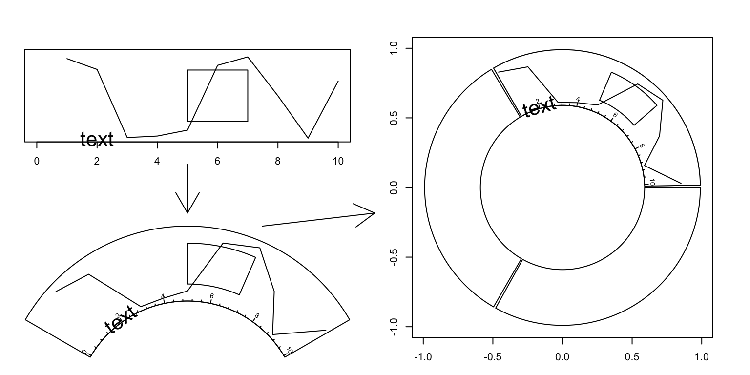
Figure 2.1: Transformation between different coordinates
The final canvas coordinate is in fact an ordinary coordinate in the base R
graphic system with x-range in (-1, 1) and y-range in (-1, 1) by default.
It should be noted that the circular plot is always drawn inside the circle which has
radius of 1 (which means it is always a unit circle), and from outside to
inside.
2.2 Rules for making the circular plot
The rule for making the circular plot is rather simple. It follows the sequence of
initialize layout -> create track -> add graphics -> create track -> add graphics - ... -> clear.
Graphics can be added at any time as long as the tracks are created.
Details are shown in Figure 2.2 and as follows:
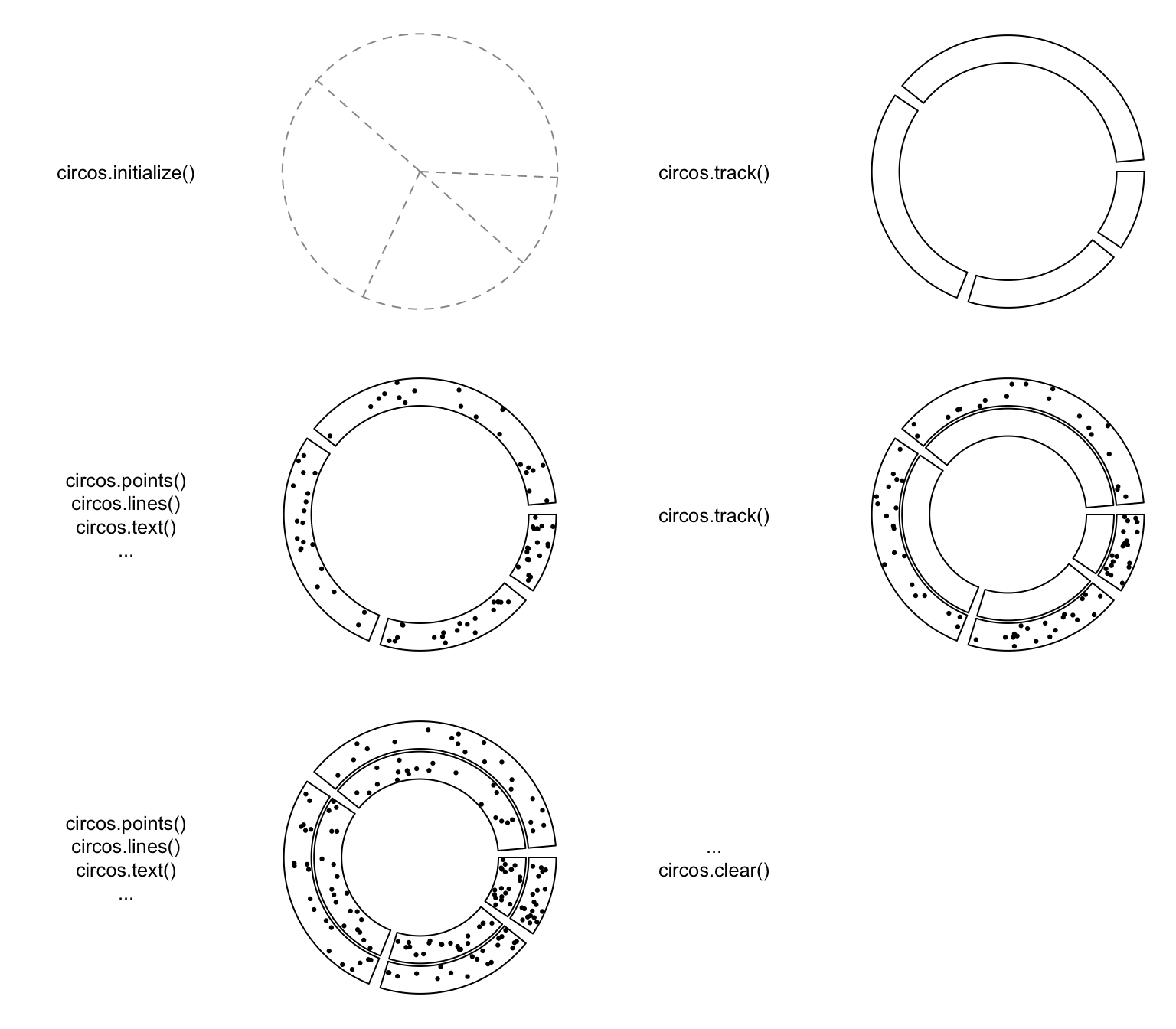
Figure 2.2: Order of drawing circular layout.
Initialize the layout using
circos.initialize(). Since circular layout in fact visualizes data which is in categories, there must be at least a categorical variable. Ranges of x values on each category can be specified as a vector or the range itself. See Section 2.3.Create plotting regions for the new track and add graphics. The new track is created just inside the previously created one. Only after the creation of the track can you add other graphics on it. There are three ways to add graphics in cells.
- After the creation of the track, use low-level graphic function like
circos.points(),circos.lines(), … to add graphics cell by cell. It always involves aforloop and you need to subset the data by the categorical variable manually. - Use
circos.trackPoints(),circos.trackLines(), … to add simple graphics through all cells simultaneously. - Use
panel.funargument incircos.track()to add graphics immediately after the creation of a certain cell.panel.funneeds two argumentsxandywhich are x values and y values that are in the current cell. This subset operation is applied automatically. This is the most recommended way. Section 2.7 gives detailed explanation of usingpanel.funargument.
- After the creation of the track, use low-level graphic function like
Repeat step 2 to add more tracks on the circle unless it reaches the center of the circle.
Call
circos.clear()to clean up.
As mentioned above, there are three ways to add graphics on a track.
Create plotting regions for the whole track first and then add graphics by specifying
sector.index. In the following pseudo code,x1,y1are data points in a given cell, which means you need to do data subsetting manually.In following code,
circos.points()andcircos.lines()are used separatedly fromcircos.track(), thus, the index for the sector needs to be explicitly specified bysector.indexargument. There is also atrack.indexargument for both functions, however, the default value is the “current” track index and as the two functions are used just aftercircos.track(), the “current” track index is what the two functions expect and it can be ommited when calling the two functions.
circos.initialize(sectors, xlim)
circos.track(ylim)
for(sector.index in all.sector.index) {
    circos.points(x1, y1, sector.index)
    circos.lines(x2, y2, sector.index)
}
Add graphics in a batch mode. In following code,
circos.trackPoints()andcircos.trackLines()need a categorical variable, a vector of x values and a vector of y values. X and y values will be split by the categorical variable and sent to corresponding cell to add the graphics. Internally, this is done by usingcircos.points()orcircos.lines()in aforloop. This way to add graphics would be convenient if users only want to add a specific type of simple graphics (e.g. only points) to the track, but it is not recommended for making complex graphics.circos.trackPoints()andcircos.trackLines()need atrack.indexto specify which track to add the graphics. Similarly, since these two are called just aftercircos.track(), the graphics are added in the newly created track right away.
circos.initialize(sectors, xlim)
circos.track(ylim)
circos.trackPoints(sectors, x, y)
circos.trackLines(sectors, x, y)
Use a panel function to add self-defined graphics as soon as the cell has been created. This is the way recommended and you can find most of the code in this book uses
panel.fun.circos.track()creates cells one by one and after the creation of a cell, andpanel.funis executed on this cell immediately. In this case, the “current” sector and “current” track are marked to this cell that you can directly use low-level functions without specifying sector index and track index.If you look at following code, you will find the code inside
panel.funis as natural as usingpoints()orlines()in the normal R graphic system. This is a way to help you think a cell is an “imaginary rectangular plotting region.”
circos.initialize(sectors, xlim)
circos.track(sectors, all_x, all_y, ylim,
    panel.fun = function(x, y) {
        circos.points(x, y)
        circos.lines(x, y)
})
There are several internal variables keeping tracing of the current sector and
track when applying circos.track() and circos.update(). Thus, although
functions like circos.points(), circos.lines() need to specify the index
of sector and track, they will take the current one by default. As a result,
if you draw points, lines, text et al just after the creation of the track
or cell, you do not need to set the sector index and the track index
explicitly and it will be added in the most recently created or updated cell.
2.3 Sectors and tracks
A circular layout is composed of sectors and tracks. As illustrated in Figure 2.3, the red circle is one track and the blue represents one sector. The intersection of a sector and a track is called a cell which can be thought as an imaginary plotting region for data points. In this section, we introduce how to set data ranges on x and y directions in cells.
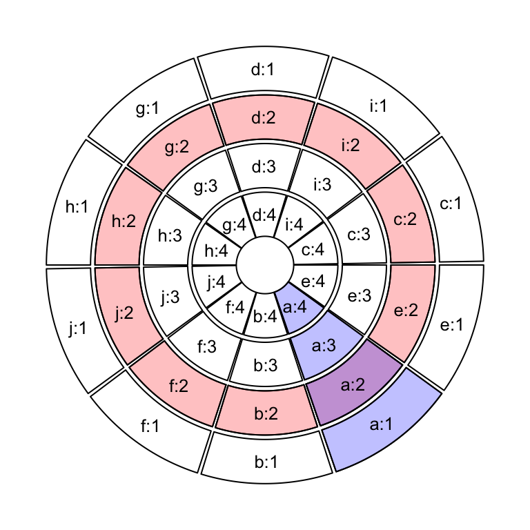
Figure 2.3: Sectors and tracks in circular layout.
Sectors are first allocated on the circle by circos.initialize(). There must
be a categorical variable (say sectors) that on the circle, each sector
corresponds to one category. The width of sectors (measured by degree) are proportional to the data
range in sectors on x direction (or the circular direction). The data range can be specified as a numeric
vector x which has same length as sectors, then x is split by sectors
and data ranges are calculated for each sector internally.
Data ranges can also be specified directly by xlim argument. The valid value
for xilm is a two-column matrix with same number of rows as number of
sectors that each row in xlim corresponds to one sector. If xlim has row
names which already cover sector names, row order of xlim is automatically
adjusted. If xlim is a vector of length two, all sectors have the same x range.
circos.initialize(sectors, x = x)
circos.initialize(sectors, xlim = xlim)
If sectors is not specified, the row names of xlim are taken as the value for sectors.
circos.initialize(xlim = xlim)After the initialization of the layout, you may not see anything drawn or only an empty graphical device is opened. That is because no track has been created yet, however, the layout has already been recorded internally.
In the initialization step, not only the width of each sector is assigned, but
also the order of sectors on the circle is determined. Order of the sectors
are determined by the order of levels of the input factor. If the value for
sectors is not a factor, the order of sectors is unique(sectors). Thus, if
you want to change the order of sectors, you can just change of the level of
sectors variable. The following code generates plots with different
sector orders (Figure 2.4).
sectors = c("d", "f", "e", "c", "g", "b", "a")
s1 = factor(sectors)
circos.initialize(s1, xlim = c(0, 1))
s2 = factor(sectors, levels = sectors)
circos.initialize(s2, xlim = c(0, 1))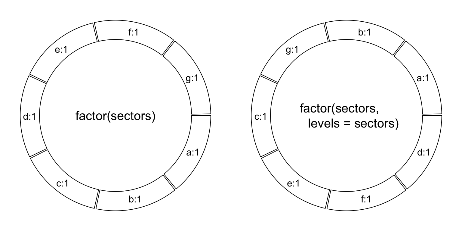
Figure 2.4: Different sector orders.
In different tracks, cells in the same sector share the same data range on
x-axes. Then, for each track, we only need to specify the data range on y
direction (or the radical direction) for cells. Similar as circos.initialize(), circos.track() also
receives either y or ylim argument to specify the range of y-values. Since
all cells in a same track share a same y range, ylim is just a vector of
length two if it is specified.
x can also be specified in circos.track(), but it is only used to send to
panel.fun. In Section 2.7, we will introduce how x and y
are sent to each cell and how the graphics are added.
circos.track(sectors, y = y)
circos.track(sectors, ylim = c(0, 1))
circos.track(sectors, x = x, y = y)
In the track creation step, since all sectors have already been allocated in
the circle, if sectors argument is not set, circos.track() would create
plotting regions for all available sectors. Also, levels of sectors do
not need to be specified explicitly because the order of sectors has already
be determined in the initialization step. If users only create cells for a subset
of sectors in the track (not all sectors), in fact, cells in remaining
unspecified sectors are created as well, but with no borders (pretending they
are not created).
# assume `sectors` only covers a subset of sectors
# You will only see cells that are covered in `sectors` have borders
circos.track(sectors, y = y)
# You will see all cells have borders
circos.track(ylim = c(0, 1))
circos.track(ylim = ranges(y))
Cells are basic units in the circular plot and are independent from each other. After the creation of cells, they have self-contained meta values of x-lim and y-lim (data range measured in data coordinate). So if you are adding graphics in one cell, you do not need to consider things outside the cell and also you do not need to consider you are in the circle. Just pretending it is normal rectangle region with its own coordinate.
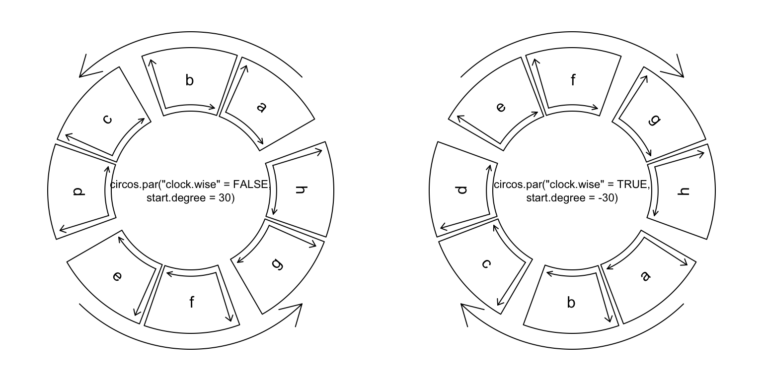
Figure 2.5: Sector directions.
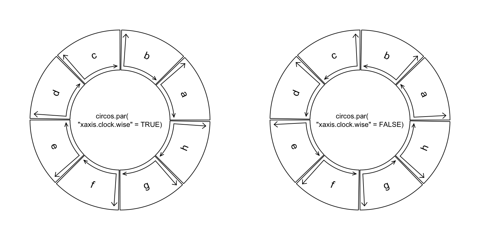
Figure 2.6: Axes directions.
2.4 Graphic parameters
Some basic parameters for the circular layout can be set by circos.par().
These parameters are listed as follows. Note some parameters can only be
modified before the initialization of the circular layout.
start.degree: The starting degree where the first sector is put. Note this degree is measured in the standard polar coordinate system which means it is always reverse clockwise. E.g. if it is set to 90, sectors start from the top center of the circle. See Figure 2.5.gap.degree: Gap between two neighbour sectors. It can be a single value which means all gaps share same degree, or a vector which has same number as sectors. Note the first gap is after the first sector. See Figure 2.5 and Figure 2.7.gap.after: Same asgap.degree, but more understandable. Modifying values ofgap.afterwill also modifygap.degreeand vice versa.track.margin: Likemarginin Cascading Style Sheets (CSS), it is the blank area out of the plotting region, also outside of the borders. Since left and right margin are controlled bygap.after, only bottom and top margin need to be set. The value fortrack.marginis the percentage to the radius of the unit circle. The value can also be set bymm_h()/cm_h()/inches_h()functions with absolute units. See Figure 2.7.cell.padding: Padding of the cell. Likepaddingin Cascading Style Sheets (CSS), it is the blank area around the plotting regions, but within the borders. The parameter has four values, which control the bottom, left, top and right padding respectively. The first and the third padding values are the percentages to the radius of the unit circle, and the second and fourth values are the degrees. The first and the third value can be set bymm_h()/cm_h()/inches_h()with absolute units. See Figure 2.7.unit.circle.segments: Since curves are simulated by a series of straight lines, this parameter controls the amount of segments to represent a curve. The minimal length of the line segment is the length of the unit circle (\(2\pi\)) divided byunit.circle.segments. More segments means better approximation for the curves, while generate larger file size if figures are in PDF format. See explanantion in Section 3.3.track.height: The default height of tracks. It is the percentage to the radius of the unit circle. The height includes the top and bottom cell paddings but not the margins. The value can be set bymm_h()/cm_h()/inches_h()with absolute units.points.overflow.warning: Since each cell is in fact not a real plotting region but only an ordinary rectangle (or more precisely, a circular rectangle), it does not remove points that are plotted outside of the region. So if some points (or lines, text) are out of the plotting region, by default, the package would continue drawing the points but with warning messages. However, in some circumstances, drawing something out of the plotting region is useful, such as adding some text annotations (like the first track in Figure 1.2). Set this value toFALSEto turn off the warnings.canvas.xlim: The ranges in the canvas coordinate in x direction. circlize is forced to put everything inside the unit circle, socanvas.xlimandcanvas.ylimisc(-1, 1)by default. However, you can set it to a more broad interval if you want to leave more spaces out of the circle. By choosing propercanvas.xlimandcanvas.ylim, actually you can customize the circle. E.g. settingcanvas.xlimtoc(0, 1)andcanvas.ylimtoc(0, 1)would only draw 1/4 of the circle.canvas.ylim: The ranges in the canvas coordinate in y direction.circle.margin: Margin in the horizontal and vertical direction. The value should be a positive numeric vector and the length of it should be either 1, 2, or 4. When it has length of 1, it controls the margin on the four sides of the circle. When it has length of 2, the first value controls the margin on the left and right, and the second value controls the margin on the bottom and top side. When it has length of 4, the four values controls the margins on the left, right, bottom and top sides of the circle. So A value ofc(x1, x2, y1, y2)meanscircos.par(canvas.xlim = c(-(1+x1), 1+x2), canvas.ylim = c(-(1+y1), 1+y2)).clock.wise: The order for drawing sectors. Default isTRUEwhich means clockwise (Figure 2.5.xaxis.clock.wise: The direction of x-axis in each cell. By default it is clockwise. Note this new parameter was only available from version 0.4.11 (Figure 2.6). Also see more details on this blog post.
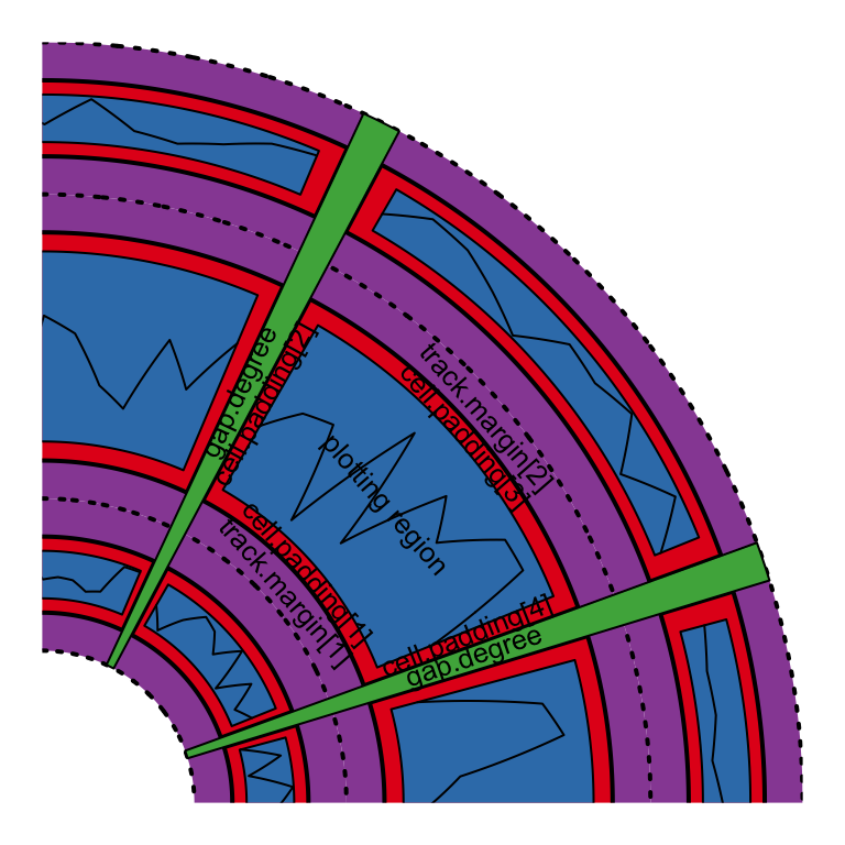
Figure 2.7: Regions in a cell.
Default values for graphic parameters are listed in following table.
start.degree |
0 |
gap.degree/gap.after |
1 |
track.margin |
c(0.01, 0.01) |
cell.padding |
c(0.02, 1.00, 0.02, 1.00) |
unit.circle.segments |
500 |
track.height |
0.2 |
points.overflow.warning |
TRUE |
canvas.xlim |
c(-1, 1) |
canvas.ylim |
c(-1, 1) |
circle.margin |
c(0, 0, 0, 0) |
clock.wise |
TRUE |
xaxis.clock.wise |
TRUE |
Parameters related to the allocation of sectors cannot be changed after the
initialization of the circular layout. Thus, start.degree,
gap.degree/gap.after, canvas.xlim, canvas.ylim, circle.margin, clock.wise and xaxis.clock.wise can
only be modified before circos.initialize(). The second and the fourth
values of cell.padding (left and right paddings) can not be modified neither
(or will be ignored).
Similar reason, since some of the parameters are defined before the initialization
of the circular layout, after making each plot, you need to call circos.clear()
to manually reset all the parameters.
circos.par() can be used in the same way as options():
circos.par("start.degree" = 30)Or use the $ symbol:
circos.par$start.degree = 30Use RESET to reset all the options to their default values:
circos.par(RESET = TRUE)Simply enter circos.par prints the current values of all parameters:
circos.par## Option Value
## -----------------------:------------------
## start.degree 0
## gap.degree 1
## gap.after 1
## track.margin 0.01, 0.01
## unit.circle.segments 500
## cell.padding 0.02, 1, 0.02, 1
## track.height 0.2
## points.overflow.warning TRUE
## circle.margin 0, 0, 0, 0
## canvas.xlim -1, 1
## canvas.ylim -1, 1
## major.by.degree 10
## clock.wise TRUE
## xaxis.clock.wise TRUE
## message TRUE
## help TRUEcircos.par() is aimed to be designed to be independent to the number or the
order of sectors, however, there is an exception. The gap.degree/gap.after parameter
controls the spaces between two neighbouring sectors. When it is set as a
scalar, the gap is the same to every two neighbouring sectors and it works
fine. It can also be a vector which has the same length as the number of
sectors and it can cause problems:
- When you change the order of the sectors, you also need to manually change
the order of
gap.degree/gap.after. - In
chordDiagram()function which will be introduced in Section 14, by default the tiny sectors are removed to improve the visualization, which means, the gap.degree should be adjusted. - Also in
chordDiagram(), sometimes it is not very straightforward to find out the order of sectors, thus, it is difficult to set a propergap.degree/gap.after.
Now, from version 0.4.10, the value of gap.degree/gap.after can be set as a
named vector where the names are the names of the sectors. In this case, the
gap.degree/gap.after vector can be automatically reordered or subsetted according to the
sector ordering in the plot.
2.5 Create plotting regions
As described above, only after creating the plotting region can you add low-level
graphics in it. The minimal set of arguments for circos.track() is to set
either y or ylim which assigns range of y values for this track.
circos.track() creates tracks for all sectors although in some case only
parts of them are visible.
If sectors is not specified, all cells in the track will be created with the
same settings. If sectors, x and y are set, they need to be vectors with
the same length. Proper values of x and y that correspond to current cell
will be passed to panel.fun by subsetting sectors internally. Section
2.7 explains the usage of panel.fun.
Graphic arguments such as bg.border and bg.col can either be a scalar or a
vector. If it is a vector, the length must be equal to the number of sectors and the order
corresponds to the order of sectors.
Thus, you can create plot regions with different styles of borders and
background colors.
If you are confused with the sectors orders, you can also customize the
borders and background colors inside panel.fun.
get.cell.meta.data("cell.xlim")/CELL_META$cell.xlim and
get.cell.meta.data("cell.ylim")/CELL_META$cell.ylim give you dimensions of
the plotting region and you can customize plot regions directly by e.g.
circos.rect(CELL_META$cell.xlim[1], CELL_META$cell.ylim[1],
            CELL_META$cell.xlim[2], CELL_META$cell.ylim[2],
            col = "#FF000040", border = 1)
circos.track() provides track.margin and cell.padding arguments that
they only control track margins and cell paddings for the current track. Of course
the second and fourth value (the left and the right padding) in cell.padding are ignored.
2.6 Update plotting regions
circos.track() creates new tracks, however, if track.index argument is set
to a track which already exists, circos.track() actually re-creates this
track. In this case, coordinates on y directions can be re-defined, but
settings related to the positions of the track such as the height of the track
can not be modified.
circos.track(sectors, ylim = c(0, 1), track.index = 1, ...)For a single cell, circos.update() can be used to erase all graphics that
have been already added in the cell. However, the data coordinate in the cell
keeps unchanged.
circos.update(sector.index, track.index)
circos.points(x, y, sector.index, track.index)
2.7 panel.fun argument
The panel.fun argument in circos.track() is extremely useful to apply plotting
as soon as the cell has been created. This self-defined function needs two
arguments x and y which are data points that belong to this cell. The
value for x and y are automatically extracted from x and y in
circos.track() according to the category defined in sectors. In the
following example, inside panel.fun, in sector a, the value of x is
1:3 and in sector b, value of x is 4:5. If x or y in
circos.track() is NULL, then x or y inside panel.fun is also NULL.
sectors = c("a", "a", "a", "b", "b")
x = 1:5
y = 5:1
circos.track(sectors, x = x, y = y,
    panel.fun = function(x, y) {
        circos.points(x, y)
})
Since you can obtain the current sector index in panel.fun, you can ignore the values
from the x and y arguments, while do subsetting by your own:
sectors = c("a", "a", "a", "b", "b")
x2 = 1:5
y2 = 5:1
circos.track(ylim = range(y),
    panel.fun = function(x, y) { # here x and y are useless
        l = sectors == CELL_META$sector.index
        circos.points(x2[l], y2[l])
})
In panel.fun, one thing important is that if you use any low-level graphic
functions, you don’t need to specify sector.index and track.index
explicitly. Remember that when applying circos.track(), cells in the track
are created one after one. When a cell is created, circlize would set the
sector index and track index of the cell as the ‘current’ index. When the cell
is created, panel.fun is executed immediately. Without specifying
sector.index and track.index, the ‘current’ ones are used and that’s
exactly what you need.
The advantage of panel.fun is that it makes you feel you are using graphic
functions in the base graphic engine (You can see it is almost the same of
using circos.points(x, y) and points(x, y)). It will be much easier for
users to understand and customize new graphics.
Inside panel.fun, information of the ‘current’ cell can be obtained through
get.cell.meta.data(). Also this function takes the ‘current’ sector and
‘current’ track by default.
get.cell.meta.data(name)
get.cell.meta.data(name, sector.index, track.index)
Information that can be extracted by get.cell.meta.data() are:
sector.index: The name for the sector.sector.numeric.index: Numeric index for the sector.track.index: Numeric index for the track.xlim: Minimal and maximal values on the x-axis.ylim: Minimal and maximal values on the y-axis.xcenter: mean ofxlim.ycenter: mean ofylim.xrange: defined asxlim[2] - xlim[1].yrange: defined asylim[2] - ylim[1].cell.xlim: Minimal and maximal values on the x-axis extended by cell paddings.cell.ylim: Minimal and maximal values on the y-axis extended by cell paddings.xplot: Degree of right and left borders in the plotting region. The values ignore the direction of the circular layout (i.e. whether it is clock wise or not).xplot[1]is always upstream ofxplot[2]in the clock-wise direction.yplot: Radius of bottom and top radius in the plotting region.cell.width: Width of the cell, measured in degree. It is calculated as(xplot[1] - xplot[2]) %% 360.cell.height: Height of the cell. Simplyyplot[2] - yplot[1].cell.start.degree: Same asxplot[1].cell.end.degree: Same asxplot[2].cell.bottom.radius: Same asyplot[1].cell.top.radius: Same asyplot[2].track.margin: Margins of the cell.cell.padding: Paddings of the cell.
Following example code uses get.cell.meta.data() to add sector index in the
center of each cell.
circos.track(ylim = ylim, panel.fun = function(x, y) {
    sector.index = get.cell.meta.data("sector.index")
    xcenter = get.cell.meta.data("xcenter")
    ycenter = get.cell.meta.data("ycenter")
    circos.text(xcenter, ycenter, sector.index)
})
get.cell.meta.data() can also be used outside panel.fun, but you need to
explictly specify sector.index and track.index arguments unless the current
index is what you want.
There is a companion variable CELL_META which is identical to
get.cell.meta.data() to get cell meta information, but easier and shorter to
write. Actually, the value of CELL_META itself is meaningless, but e.g.
CELL_META$sector.index is automatically redirected to
get.cell.meta.data("sector.index"). Following code rewrites previous example
code with CELL_META.
circos.track(ylim = ylim, panel.fun = function(x, y) {
    circos.text(CELL_META$xcenter, CELL_META$ycenter,
        CELL_META$sector.index)
})
Please note CELL_META only extracts information for the “current” cell, thus,
it is recommended to use only in panel.fun.
Nevertheless, if you have several lines of code which need to be executed out of panel.fun,
you can flag the specified cell as the “current” cell by set.current.cell(), which can save you from typing
too many sector.index = ..., track.index = .... E.g. following code
circos.text(get.cell.meta.data("xcenter", sector.index, track.index),
            get.cell.meta.data("ycenter", sector.index, track.index),
            get.cell.meta.data("sector.index", sector.index, track.index),
            sector.index, track.index)
can be simplified to:
set.current.cell(sector.index, track.index)
circos.text(get.cell.meta.data("xcenter"),
            get.cell.meta.data("ycenter"),
            get.cell.meta.data("sector.index"))
# or even simpler
circos.text(CELL_META$xcenter, CELL_META$ycenter, CELL_META$sector.index)
2.8 Other utilities
2.8.1 circlize() and reverse.circlize()
circlize transforms data points in several coordinate systems and it is
basically done by the core function circlize(). The function transforms from data
coordinate (coordinate in the cell) to the polar coordinate and its companion
reverse.circlize() transforms from polar coordinate to a specified data coordinate. The
default transformation is applied in the current cell.
sectors = c("a", "b")
circos.initialize(sectors, xlim = c(0, 1))
circos.track(ylim = c(0, 1))
# x = 0.5, y = 0.5 in sector a and track 1
circlize(0.5, 0.5, sector.index = "a", track.index = 1)
## theta rou
## [1,] 270.5 0.89# theta = 90, rou = 0.9 in the polar coordinate
reverse.circlize(90, 0.9, sector.index = "a", track.index = 1)## x y
## [1,] 1.519774 0.56reverse.circlize(90, 0.9, sector.index = "b", track.index = 1)## x y
## [1,] 0.5028249 0.56You can see the results are different for two reverse.circlize()
although it is the same points in the polar coordinate, because they are
mapped to different cells.
circlize() and reverse.circlize() can be used to connect two circular
plots if they are drawn on a same page. This provides a way to build more
complex plots. Basically, the two circular plots share a same polar
coordiante, then, the manipulation of circlize->reverse.circlize->circlize
can transform coordinate for data points from the first circular plot to the
second. In Chapter 13, we use this technique to combine two
circular plots where one zooms subset of regions in the other one.
The transformation between polar coordinate and canvas coordinate is simple.
circlize has a circlize:::polar2Cartesian() function but this function
is not exported.
Following example (Figure 2.8) adds raster image to the circular plot. The raster image is added
by rasterImage() which is applied in the canvas coordinate. Note how we change
coordinate from data coordinate to canvas coordinate by using circlize()
and circlize:::polar2Cartesian().
library(yaml)
data = yaml.load_file("https://raw.githubusercontent.com/Templarian/slack-emoji-pokemon/master/pokemon.yaml")
pokemon_list = data$emojis[1:40]
pokemon_name = sapply(pokemon_list, function(x) x$name)
pokemon_src = sapply(pokemon_list, function(x) x$src)

library(EBImage)
circos.par("points.overflow.warning" = FALSE)
circos.initialize(pokemon_name, xlim = c(0, 1))
circos.track(ylim = c(0, 1), panel.fun = function(x, y) {
    pos = circlize:::polar2Cartesian(circlize(CELL_META$xcenter, CELL_META$ycenter))
    image = EBImage::readImage(pokemon_src[CELL_META$sector.numeric.index])
    circos.text(CELL_META$xcenter, CELL_META$cell.ylim[1] - mm_y(2),
        CELL_META$sector.index, facing = "clockwise", niceFacing = TRUE,
        adj = c(1, 0.5), cex = 0.6)
    rasterImage(image,
        xleft = pos[1, 1] - 0.05, ybottom = pos[1, 2] - 0.05,
        xright = pos[1, 1] + 0.05, ytop = pos[1, 2]+ 0.05)
}, bg.border = 1, track.height = 0.15)
Figure 2.8: Add raster image to the circular plot.
circos.clear()In circlize package, there is a circos.raster() function which directly
adds raster images. It is introduced in Section 3.11.
2.8.2 Absolute units
For the functions in circlize package, they needs arguments which are
lengths measured either in the canvas coordinate or in the data coordinate.
E.g. track.height argument in circos.track() corresponds to percent of
radius of the unit circle. circlize package is built in the R base graphic
system which is not straightforward to define a length with absolute units
(e.g. a line of length 2 cm). To solve this problem, circlize provides
several functions which convert absolute units to the canvas coordinate or the
data coordinate accordingly.
mm_h(), cm_h(), inches_h()/inch_h() functions convert absolute units
to the canvas coordinate in the radical direction, which normally define the
heights of e.g. tracks. If users want to convert a string height or width to
the canvas coordinate, directly use strheight() or strwidth() functions.
mm_h(2) # 2mm
cm_h(1) # 1cmmm_x(), cm_x(), inches_x()/inch_x(), mm_y(), cm_y(),
inches_y()/inch_y() convert absolute units to the data coordinate in the x
or y direction. By default, the conversion is applied in the “current” cell,
but it can still be used in other cells by specifying sector.index and
track.index arguments.
mm_x(2)
mm_x(1, sector.index, track.index)
mm_y(2)
mm_y(1, sector.index, track.index)
Since the width of the cell is not identical from the top to the bottom in the
cell, for *_x() function, the position on y direction where the convert is
applied can be specified by the h argument (measured in data coordinate). By
default it is converted at the middle point on y-axis.
mm_x(2, h)Normally the difference of e.g. mm_x(2) at different y positions in a track
is very small (unless the track has very big track.height), so in most
cases, you can ignore the setting of h argument.
Following plot (Figure 2.9) is an example of setting absolute units.
sectors = letters[1:10]
circos.par(cell.padding = c(0, 0, 0, 0), track.margin = c(0, 0))
circos.initialize(sectors, xlim = cbind(rep(0, 10), runif(10, 0.5, 1.5)))
circos.track(ylim = c(0, 1), track.height = mm_h(5),
    panel.fun = function(x, y) {
        circos.lines(c(0, 0 + mm_x(5)), c(0.5, 0.5), col = "blue")
    })
circos.track(ylim = c(0, 1), track.height = cm_h(1),
    track.margin = c(0, mm_h(2)),
    panel.fun = function(x, y) {
        xcenter = get.cell.meta.data("xcenter")
        circos.lines(c(xcenter, xcenter), c(0, cm_y(1)), col = "red")
    })
circos.track(ylim = c(0, 1), track.height = inch_h(1),
    track.margin = c(0, mm_h(5)),
    panel.fun = function(x, y) {
        line_length_on_x = cm_x(1*sqrt(2)/2)
        line_length_on_y = cm_y(1*sqrt(2)/2)
        circos.lines(c(0, line_length_on_x), c(0, line_length_on_y), col = "orange")
    })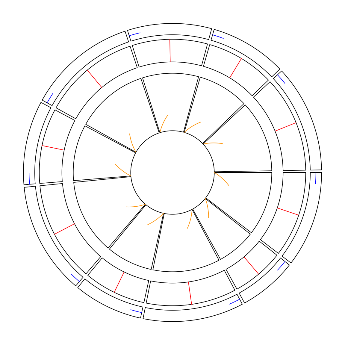
Figure 2.9: Setting absolute units
circos.clear()2.8.3 circos.info() and circos.clear()
You can get basic information of your current circular plot by
circos.info(). The function can be called at any time.
sectors = letters[1:3]
circos.initialize(sectors, xlim = c(1, 2))
circos.info()
## All your sectors:
## [1] "a" "b" "c"
##
## No track has been created
##
## Your current sector.index is acircos.track(ylim = c(0, 1))
circos.info(sector.index = "a", track.index = 1)## sector index: 'a'
## track index: 1
## xlim: [1, 2]
## ylim: [0, 1]
## cell.xlim: [0.991453, 2.008547]
## cell.ylim: [-0.1, 1.1]
## xplot (degree): [360, 241]
## yplot (radius): [0.79, 0.99]
## cell.width (degree): 119
## cell.height (radius): 0.2
## track.margin: c(0.01, 0.01)
## cell.padding: c(0.02, 1, 0.02, 1)
##
## Your current sector.index is c
## Your current track.index is 1circos.clear()It can also add labels to all cells by circos.info(plot = TRUE).
You should always call circos.clear() at the end of every circular plot.
There are several parameters for circular plot which can only be set before
circos.initialize(), thus, before you draw the next circular plot, you need
to reset all these parameters.
2.9 Set gaps between tracks
In the older versions, you need to set track.height parameter either in
circos.par() or in circos.track() to control the space between tracks. Now
there is a new set_track_gap() function which simplifies the setting of gaps
between two tracks. With the mm_h()/cm_h()/inch_h() functions, it is very easy
to set the gaps with physical units (Figure 2.10).
circos.initialize(letters[1:10], xlim = c(0, 1))
circos.track(ylim = c(0, 1))
set_track_gap(mm_h(2)) # 2mm
circos.track(ylim = c(0, 1))
set_track_gap(cm_h(0.5)) # 0.5cm
circos.track(ylim = c(0, 1))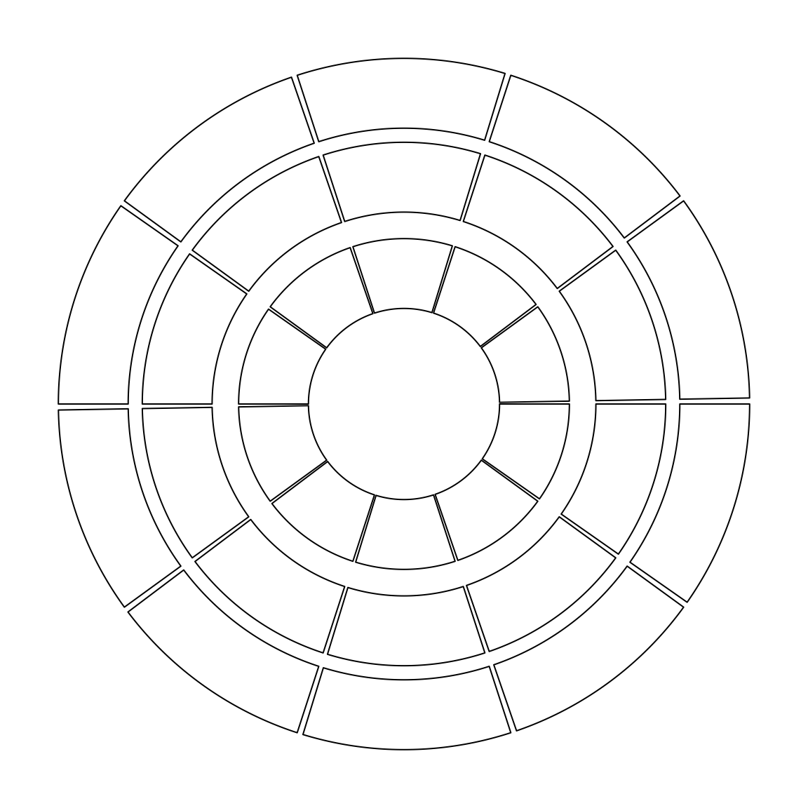
Figure 2.10: Setting gaps between tracks.
circos.clear()