Chapter 15 Advanced usage of chordDiagram()
The default style of chordDiagram() is somehow enough for most visualization
tasks, still you can have more configurations on the plot.
The usage is same for both ajacency matrix and ajacency list, so we only demonstrate with the matrix.
15.1 Organization of tracks
By default, chordDiagram() creates two tracks, one track for labels and one
track for grids with axes.
chordDiagram(mat)
circos.info()
## All your sectors:
## [1] "S1" "S2" "S3" "E1" "E2" "E3" "E4" "E5" "E6"
##
## All your tracks:
## [1] 1 2
##
## Your current sector.index is E6
## Your current track.index is 2These two tracks can be controlled by annotationTrack argument. Available
values for this argument are grid, name and axis. The height of
annotation tracks can be set by annotationTrackHeight which is the
percentage to the radius of unit circle and can be set by mm_h() function with
an absolute unit. Axes are only added if grid is set in annotationTrack
(Figure 15.1).
chordDiagram(mat, grid.col = grid.col, annotationTrack = "grid")
chordDiagram(mat, grid.col = grid.col, annotationTrack = c("name", "grid"),
    annotationTrackHeight = c(0.03, 0.01))
chordDiagram(mat, grid.col = grid.col, annotationTrack = NULL)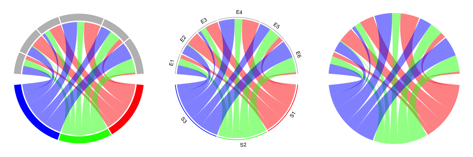
Figure 15.1: Track organization in chordDiagram().
Several empty tracks can be allocated before Chord diagram is drawn. Then self-defined graphics can
be added to these empty tracks afterwards. The number of pre-allocated tracks can be set
through preAllocateTracks.
chordDiagram(mat, preAllocateTracks = 2)
circos.info()
## All your sectors:
## [1] "S1" "S2" "S3" "E1" "E2" "E3" "E4" "E5" "E6"
##
## All your tracks:
## [1] 1 2 3 4
##
## Your current sector.index is E6
## Your current track.index is 4The default settings for pre-allocated tracks are:
list(ylim = c(0, 1),
     track.height = circos.par("track.height"),
     bg.col = NA,
     bg.border = NA,
     bg.lty = par("lty"),
     bg.lwd = par("lwd"))
The default settings for pre-allocated tracks can be overwritten by specifying preAllocateTracks
as a list.
chordDiagram(mat, annotationTrack = NULL,
    preAllocateTracks = list(track.height = 0.3))
If more than one tracks need to be pre-allocated, just specify preAllocateTracks
as a list which contains settings for each track:
chordDiagram(mat, annotationTrack = NULL,
    preAllocateTracks = list(list(track.height = 0.1),
                             list(bg.border = "black")))
By default chordDiagram() provides poor supports for customization of sector
labels and axes, but with preAllocateTracks it is rather easy to customize
them. Such customization will be introduced in next section.
15.2 Customize sector labels
In chordDiagram(), there is no argument to control the style of sector
labels, but this can be done by first pre-allocating an empty track and
customizing the labels in it later. In the following example, one track is
firstly allocated and a Chord diagram is added without label track and axes.
Later, the first track is updated with adding labels with clockwise facings
(Figure 15.2).
chordDiagram(mat, grid.col = grid.col, annotationTrack = "grid",
    preAllocateTracks = list(track.height = max(strwidth(unlist(dimnames(mat))))))
# we go back to the first track and customize sector labels
circos.track(track.index = 1, panel.fun = function(x, y) {
    circos.text(CELL_META$xcenter, CELL_META$ylim[1], CELL_META$sector.index,
        facing = "clockwise", niceFacing = TRUE, adj = c(0, 0.5))
}, bg.border = NA) # here set bg.border to NA is important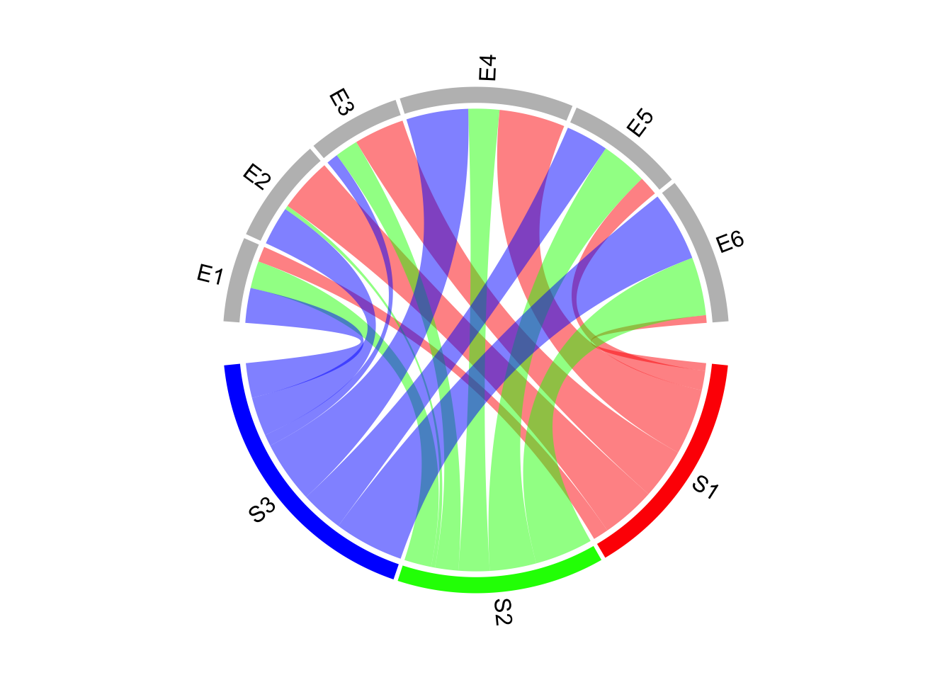
Figure 15.2: Change label directions.
In the following example, the labels are put on the grids (Figure 15.3).
Please note circos.text() and
get.cell.meta.data() can be used outside panel.fun if the sector index and
track index are specified explicitly.
chordDiagram(mat, grid.col = grid.col,
    annotationTrack = c("grid", "axis"), annotationTrackHeight = mm_h(5))
for(si in get.all.sector.index()) {
    xlim = get.cell.meta.data("xlim", sector.index = si, track.index = 1)
    ylim = get.cell.meta.data("ylim", sector.index = si, track.index = 1)
    circos.text(mean(xlim), mean(ylim), si, sector.index = si, track.index = 1,
        facing = "bending.inside", niceFacing = TRUE, col = "white")
}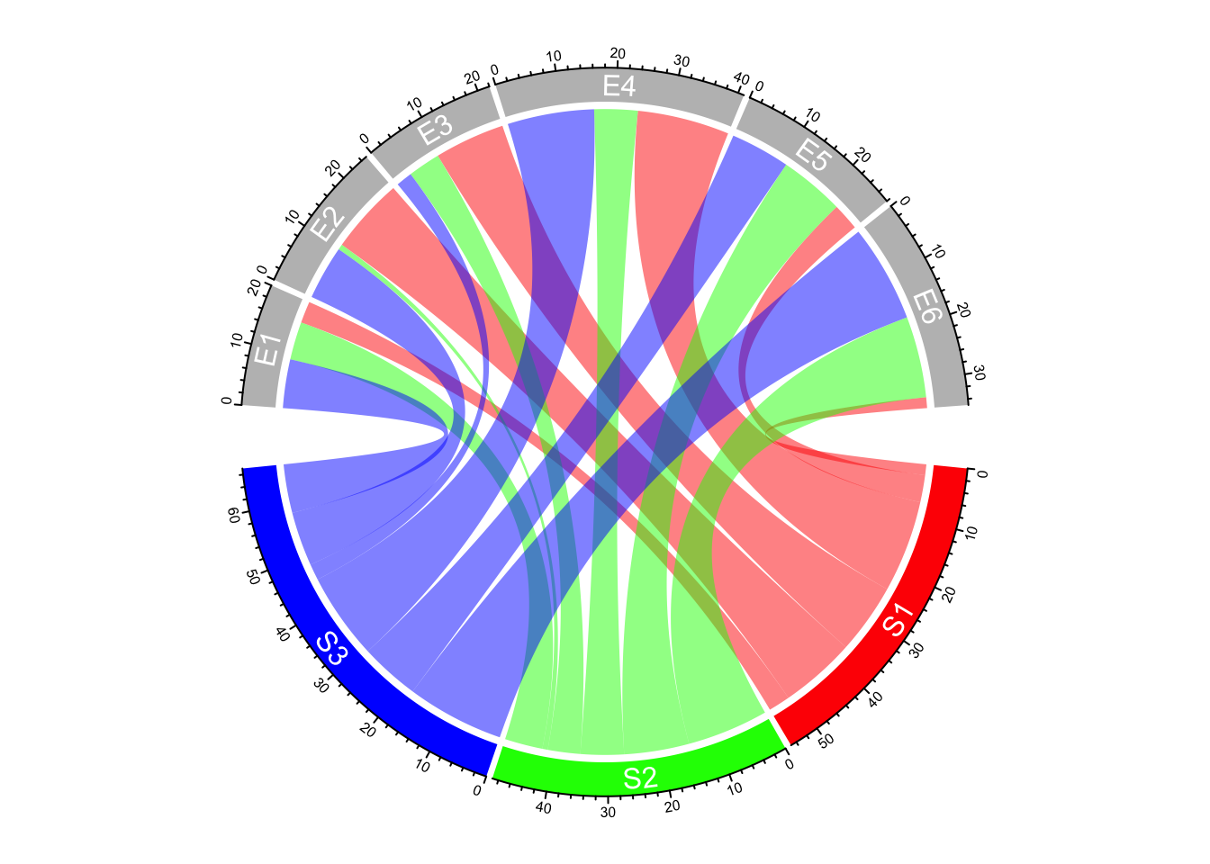
Figure 15.3: Put sector labels to the grid.
For the last example in this section, if the width of the sector is less than 10 degree, the labels are added in the radical direction (Figure 15.4).
set.seed(123)
mat2 = matrix(rnorm(100), 10)
chordDiagram(mat2, annotationTrack = "grid",
    preAllocateTracks = list(track.height = max(strwidth(unlist(dimnames(mat))))))
circos.track(track.index = 1, panel.fun = function(x, y) {
    xlim = get.cell.meta.data("xlim")
    xplot = get.cell.meta.data("xplot")
    ylim = get.cell.meta.data("ylim")
    sector.name = get.cell.meta.data("sector.index")

    if(abs(xplot[2] - xplot[1]) < 10) {
        circos.text(mean(xlim), ylim[1], sector.name, facing = "clockwise",
            niceFacing = TRUE, adj = c(0, 0.5), col = "red")
    } else {
        circos.text(mean(xlim), ylim[1], sector.name, facing = "inside",
            niceFacing = TRUE, adj = c(0.5, 0), col= "blue")
    }
}, bg.border = NA)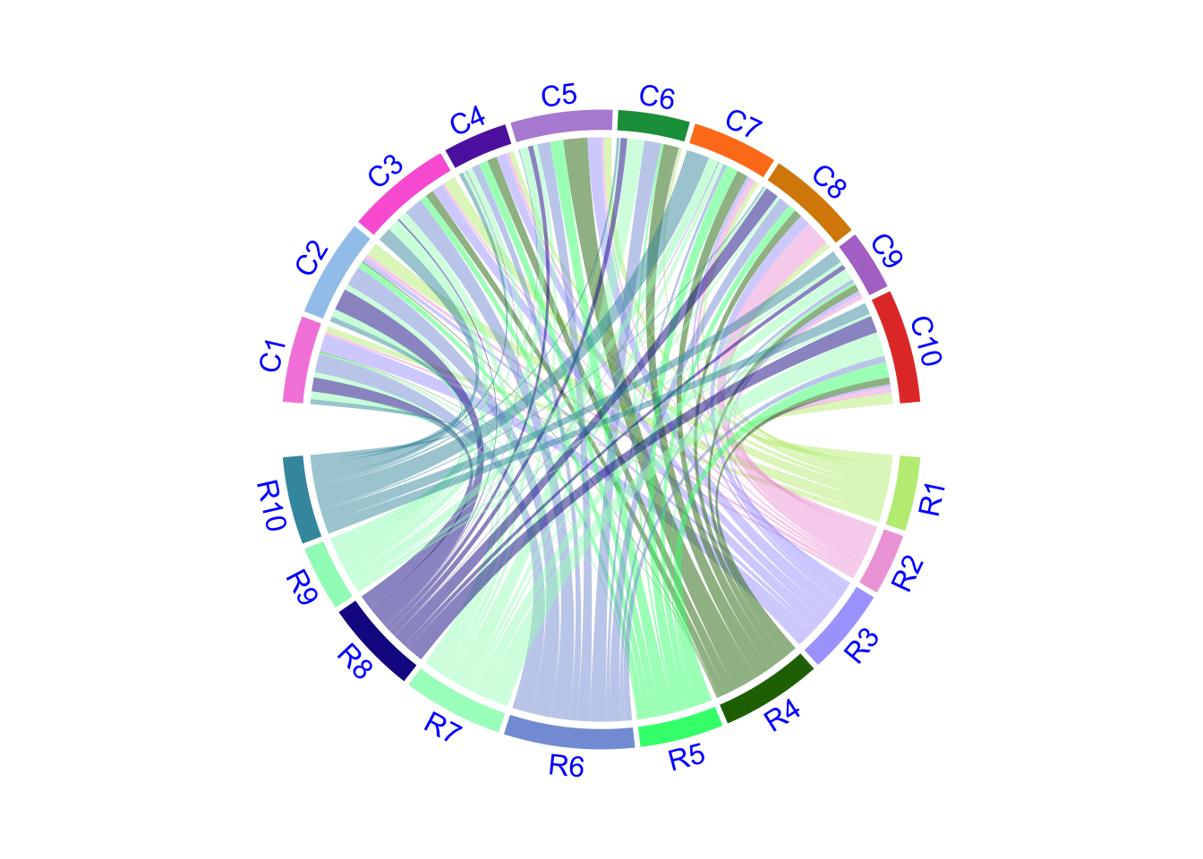
Figure 15.4: Adjust label direction according to the width of sectors.
When you set direction of sector labels as radical (clockwise or
reverse.clockwise), if the labels are too long and exceed your figure
region, you can either decrease the size of the font or set canvas.xlim and
canvas.ylim parameters in circos.par() to wider intervals.
15.3 Customize sector axes
Axes are helpful to correspond to the absolute values of links. By default
chordDiagram() adds axes on the grid track. But it is easy to customize one
with self-defined code.
In following example code, we draw another type of axes which show relative
percent on sectors. We first pre-allocate an empty track by
preAllocateTracks and come back to this track to add axes later.
You may see we add the first axes to the top of second track. You can also put them to the bottom of the first track.
# similar as the previous example, but we only plot the grid track
chordDiagram(mat, grid.col = grid.col, annotationTrack = "grid",
    preAllocateTracks = list(track.height = mm_h(5)))
for(si in get.all.sector.index()) {
    circos.axis(h = "top", labels.cex = 0.3, sector.index = si, track.index = 2)
}
Now we go back to the first track to add the second type of axes and sector names.
In panel.fun, if the sector is less than 30 degree, the break for the axis is set to 0.5
(Figure 15.5).
# the second axis as well as the sector labels are added in this track
circos.track(track.index = 1, panel.fun = function(x, y) {
    xlim = get.cell.meta.data("xlim")
    ylim = get.cell.meta.data("ylim")
    sector.name = get.cell.meta.data("sector.index")
    xplot = get.cell.meta.data("xplot")

    circos.lines(xlim, c(mean(ylim), mean(ylim)), lty = 3) # dotted line
    by = ifelse(abs(xplot[2] - xplot[1]) > 30, 0.2, 0.5)
    for(p in seq(by, 1, by = by)) {
        circos.text(p*(xlim[2] - xlim[1]) + xlim[1], mean(ylim) + 0.1,
            paste0(p*100, "%"), cex = 0.3, adj = c(0.5, 0), niceFacing = TRUE)
    }

    circos.text(mean(xlim), 1, sector.name, niceFacing = TRUE, adj = c(0.5, 0))
}, bg.border = NA)
circos.clear()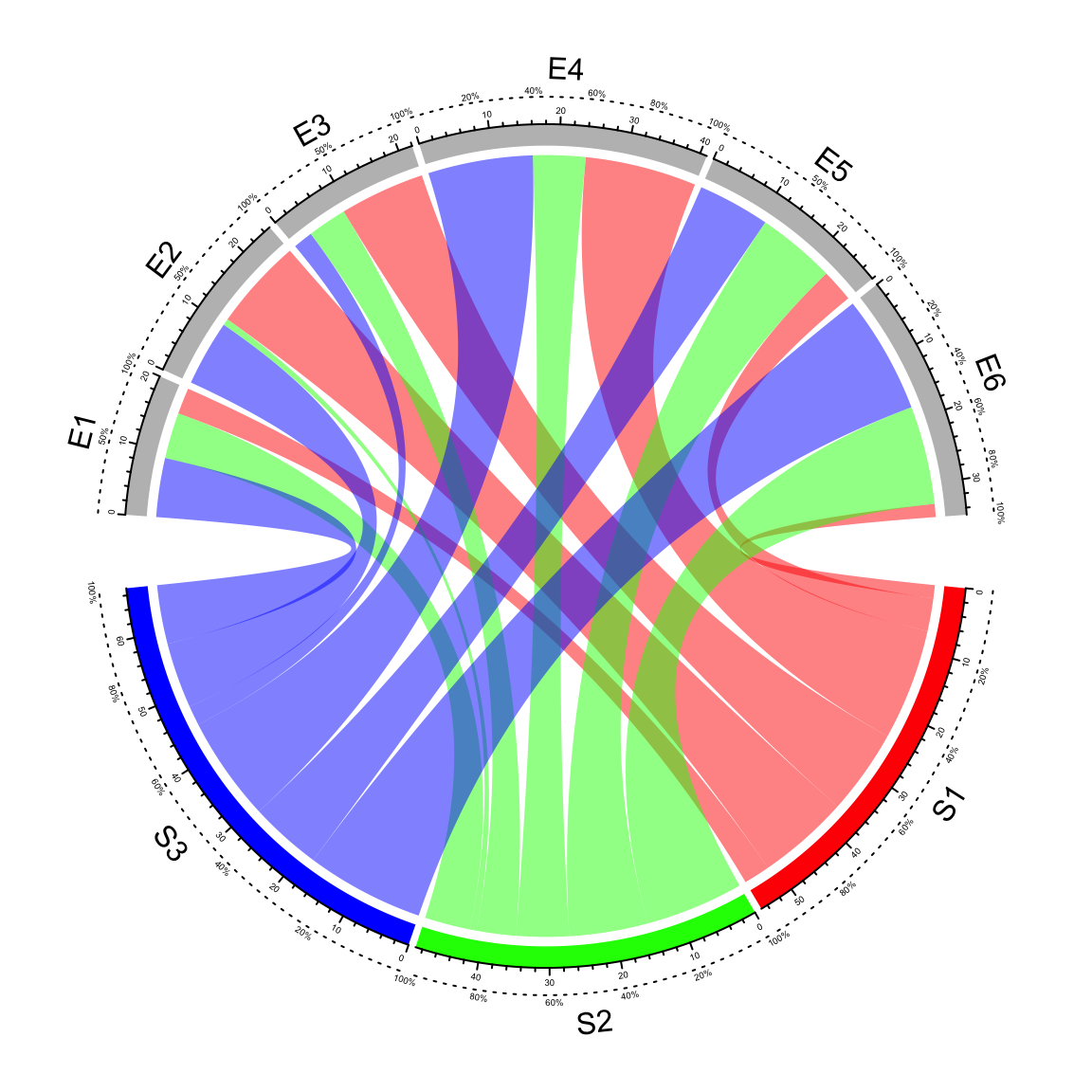
Figure 15.5: Customize sector axes for Chord diagram.
15.4 Put horizontally or vertically symmetric
In Chord diagram, when there are two groups (which correspond to rows and columns if the input is an adjacency matrix), it is always visually beautiful to rotate the diagram to be symmetric on horizontal direction or vertical direction. See following example:
par(mfrow = c(1, 2))
circos.par(start.degree = 0)
chordDiagram(mat, grid.col = grid.col, big.gap = 20)
abline(h = 0, lty = 2, col = "#00000080")
circos.clear()

circos.par(start.degree = 90)
chordDiagram(mat, grid.col = grid.col, big.gap = 20)
abline(v = 0, lty = 2, col = "#00000080")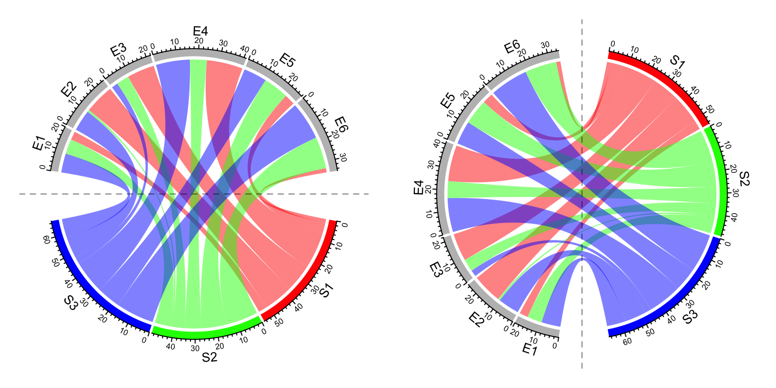
Figure 15.6: Rotate Chord diagram.
circos.clear()15.5 Compare two Chord diagrams
Normally, in Chord diagram, values in mat are normalized to the summation of
the absolute values in the matrix, which means the width for links only
represents relative values. Then, when comparing two Chord diagrams, it is
necessary that unit width of links in the two plots should be represented in a
same scale. This problem can be solved by adding larger gaps to the Chord
diagram which has smaller matrix.
First we make the “big” Chord diagram.
mat1 = matrix(sample(20, 25, replace = TRUE), 5)
chordDiagram(mat1, directional = 1, grid.col = rep(1:5, 2), transparency = 0.5,
    big.gap = 10, small.gap = 1) # 10 and 1 are default values for the two arguments
The second matrix only has half the values in mat1.
mat2 = mat1 / 2calc_gap() can be used to calculate the gap for the second Chord diagram
to make the scale of the two Chord diagram the same.
gap = calc_gap(mat1, mat2, big.gap = 10, small.gap = 1)
chordDiagram(mat2, directional = 1, grid.col = rep(1:5, 2), transparency = 0.5,
    big.gap = gap, small.gap = 1)
Now the scale of the two Chord diagrams (Figure 15.7) are the same if you compare the scale of axes in the two diagrams.
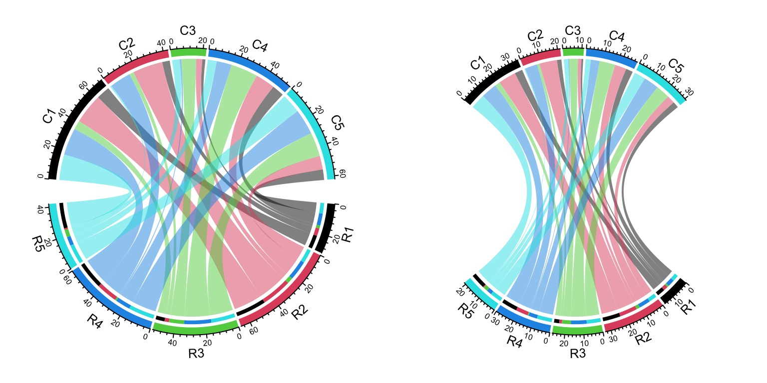
Figure 15.7: Compare two Chord Diagrams in a same scale.
To correctly use the functionality of calc_gap(), the two Chord diagram should
have same value for small.gap and there should be no overlap between the two
sets of the sectors.
15.6 Multiple-group Chord diagram
From verion 0.4.10 of the circlize package, there is a new group
argument in chordDiagram() function which is very convenient for making
multiple-group Chord diagrams.
I first generate a random matrix where there are three groups (A, B, and C).
Note this new functionality works the same for the input as a data frame.
mat1 = matrix(rnorm(25), nrow = 5)
rownames(mat1) = paste0("A", 1:5)
colnames(mat1) = paste0("B", 1:5)

mat2 = matrix(rnorm(25), nrow = 5)
rownames(mat2) = paste0("A", 1:5)
colnames(mat2) = paste0("C", 1:5)

mat3 = matrix(rnorm(25), nrow = 5)
rownames(mat3) = paste0("B", 1:5)
colnames(mat3) = paste0("C", 1:5)

mat = matrix(0, nrow = 10, ncol = 10)
rownames(mat) = c(rownames(mat2), rownames(mat3))
colnames(mat) = c(colnames(mat1), colnames(mat2))
mat[rownames(mat1), colnames(mat1)] = mat1
mat[rownames(mat2), colnames(mat2)] = mat2
mat[rownames(mat3), colnames(mat3)] = mat3
mat
## B1 B2 B3 B4 B5 C1
## A1 0.0377884 1.2631852 1.10992029 -0.32468591 0.6007088 1.3124130
## A2 0.3104807 -0.3496504 0.08473729 0.09458353 -1.2512714 -0.2651451
## A3 0.4365235 -0.8655129 0.75405379 -0.89536336 -0.6111659 0.5431941
## A4 -0.4583653 -0.2362796 -0.49929202 -1.31080153 -1.1854801 -0.4143399
## A5 -1.0633261 -0.1971759 0.21444531 1.99721338 2.1988103 -0.4762469
## B1 0.0000000 0.0000000 0.00000000 0.00000000 0.0000000 -0.7045965
## B2 0.0000000 0.0000000 0.00000000 0.00000000 0.0000000 -0.7172182
## B3 0.0000000 0.0000000 0.00000000 0.00000000 0.0000000 0.8846505
## B4 0.0000000 0.0000000 0.00000000 0.00000000 0.0000000 -1.0155926
## B5 0.0000000 0.0000000 0.00000000 0.00000000 0.0000000 1.9552940
## C2 C3 C4 C5
## A1 -0.78860284 0.2436874 -0.4411632 0.61798582
## A2 -0.59461727 1.2324759 -0.7230660 1.10984814
## A3 1.65090747 -0.5160638 -1.2362731 0.70758835
## A4 -0.05402813 -0.9925072 -1.2847157 -0.36365730
## A5 0.11924524 1.6756969 -0.5739735 0.05974994
## B1 -0.09031959 -0.1829254 -0.5021987 -0.10097489
## B2 0.21453883 0.4189824 1.4960607 -1.35984070
## B3 -0.73852770 0.3243043 -1.1373036 -0.66476944
## B4 -0.57438869 -0.7815365 -0.1790516 0.48545998
## B5 -1.31701613 -0.7886220 1.9023618 -0.37560287The main thing is to create “a grouping variable.” The variable contains the group labels and the sector names are used as the names in the vector.
nm = unique(unlist(dimnames(mat)))
group = structure(gsub("\\d", "", nm), names = nm)
group
## A1 A2 A3 A4 A5 B1 B2 B3 B4 B5 C1 C2 C3 C4 C5
## "A" "A" "A" "A" "A" "B" "B" "B" "B" "B" "C" "C" "C" "C" "C"Assign group variable to the group argument:
grid.col = structure(c(rep(2, 5), rep(3, 5), rep(4, 5)),
                names = c(paste0("A", 1:5), paste0("B", 1:5), paste0("C", 1:5)))
chordDiagram(mat, group = group, grid.col = grid.col)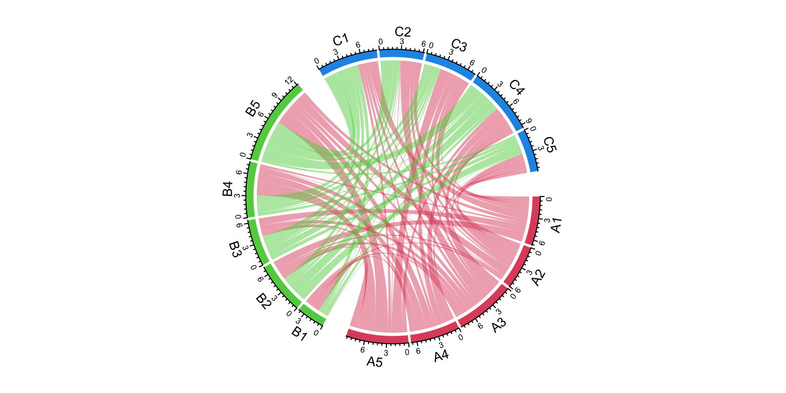
Figure 15.8: Grouped Chord diagram.
circos.clear()We can try another grouping:
group = structure(gsub("^\\w", "", nm), names = nm)
group
## A1 A2 A3 A4 A5 B1 B2 B3 B4 B5 C1 C2 C3 C4 C5
## "1" "2" "3" "4" "5" "1" "2" "3" "4" "5" "1" "2" "3" "4" "5"chordDiagram(mat, group = group, grid.col = grid.col)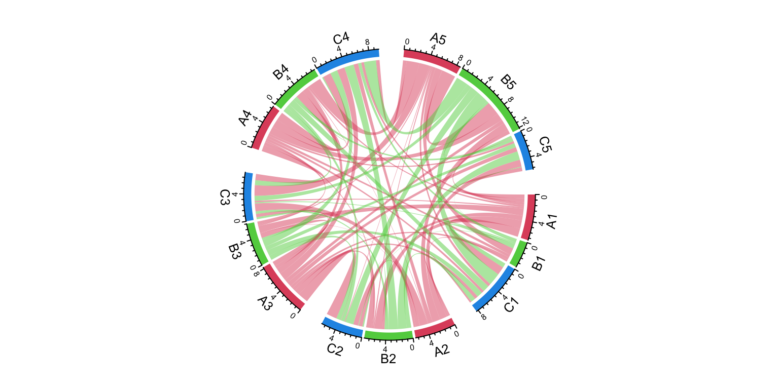
Figure 15.9: Grouped Chord diagram. A different grouping.
circos.clear()The order of group controls the sector orders and if group is set as a factor,
the order of levels controls the order of groups.
group = structure(gsub("\\d", "", nm), names = nm)
group = factor(group[sample(length(group), length(group))], levels = c("C", "A", "B"))
group
## B5 A3 C1 C4 A1 B3 C3 C5 C2 A4 B1 B4 A2 B2 A5
## B A C C A B C C C A B B A B A
## Levels: C A BchordDiagram(mat, group = group, grid.col = grid.col)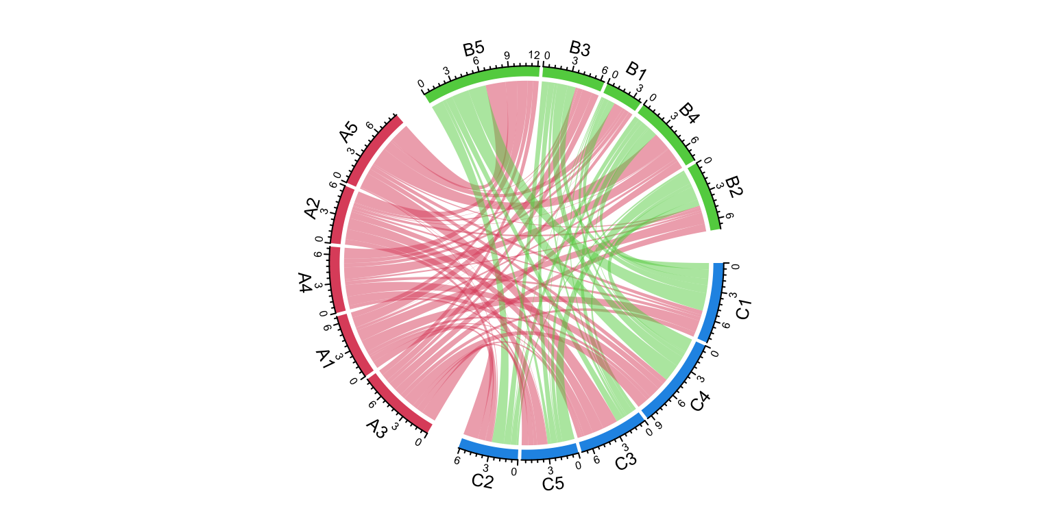
Figure 15.10: Grouped Chord diagram. Control the orders of groups.
circos.clear()The gap between groups is controlled by big.gap argument and the gap between
sectors is controlled by small.gap argument.
group = structure(gsub("\\d", "", nm), names = nm)
chordDiagram(mat, group = group, grid.col = grid.col, big.gap = 20, small.gap = 5)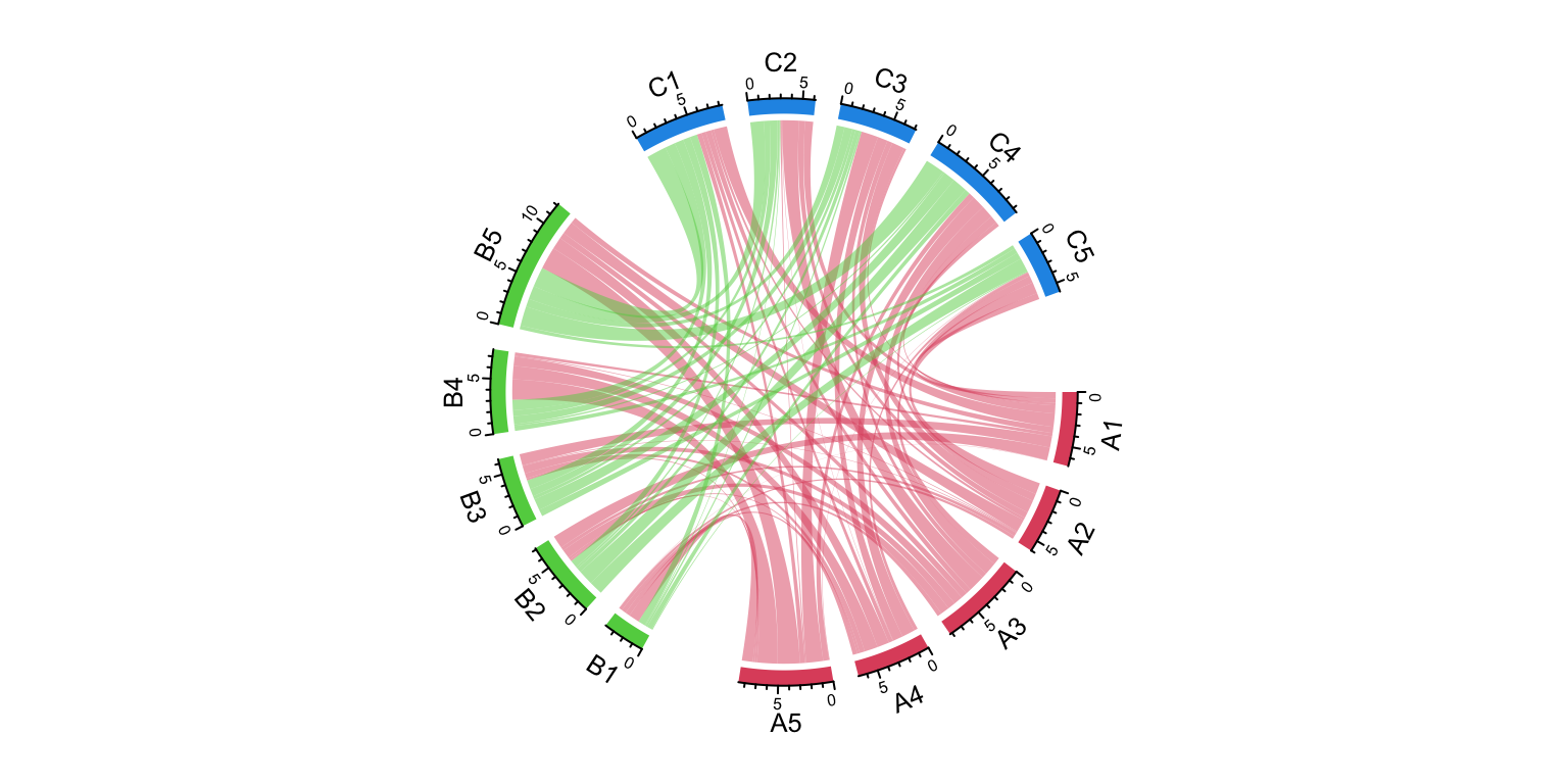
Figure 15.11: Grouped Chord diagram. Control the gaps between groups.
circos.clear()As a normal Chord diagram, the labels and other tracks can be manually adjusted:
group = structure(gsub("\\d", "", nm), names = nm)
chordDiagram(mat, group = group, grid.col = grid.col,
    annotationTrack = c("grid", "axis"),
    preAllocateTracks = list(
        track.height = mm_h(4),
        track.margin = c(mm_h(4), 0)
))
circos.track(track.index = 2, panel.fun = function(x, y) {
    sector.index = get.cell.meta.data("sector.index")
    xlim = get.cell.meta.data("xlim")
    ylim = get.cell.meta.data("ylim")
    circos.text(mean(xlim), mean(ylim), sector.index, cex = 0.6, niceFacing = TRUE)
}, bg.border = NA)

highlight.sector(rownames(mat1), track.index = 1, col = "red",
    text = "A", cex = 0.8, text.col = "white", niceFacing = TRUE)
highlight.sector(colnames(mat1), track.index = 1, col = "green",
    text = "B", cex = 0.8, text.col = "white", niceFacing = TRUE)
highlight.sector(colnames(mat2), track.index = 1, col = "blue",
    text = "C", cex = 0.8, text.col = "white", niceFacing = TRUE)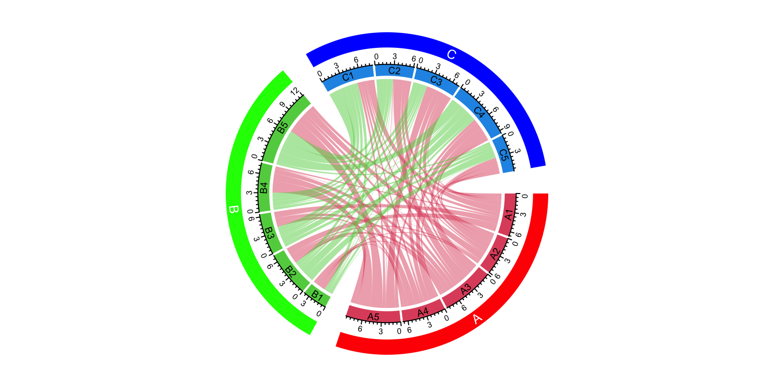
Figure 15.12: A more customized grouped Chord diagram.
circos.clear()The implementation of multi-group Chord diagram is very simple. It can also be done
by setting a proper sector order (by order argument) and a gap.after parameter.
The previous example can be implemented without the group argument by the following code,
but you need to manually calculate the proper value for gap.after. Setting group
argument automatically does this for you.
circos.par(gap.after = c(rep(1, 4), 5, rep(1, 4), 5, rep(1, 4), 5))
chordDiagram(mat, order = names(sort(group)), grid.col = grid.col)
circos.clear()