Chapter 13 Nested zooming
13.1 Basic idea
In Section 7.1 we introduced how to zoom sectors to the same circle in the same track. This works fine if there are only a few regions that need to be zoomed. However, when the regions that need to be zoomed is too many, the method will not work efficiently. In this chapter, we introduce another zooming method which puts zoomed regions in a different circular plot.
To illustrate the basic idea, we first generate a random data set.
set.seed(123)
df = data.frame(cate = sample(letters[1:8], 400, replace = TRUE),
                x = runif(400),
                y = runif(400),
                stringsAsFactors = FALSE)
df = df[order(df[[1]], df[[2]]), ]
rownames(df) = NULL
df$interval_x = as.character(cut(df$x, c(0, 0.2, 0.4, 0.6, 0.8, 1.0)))
df$name = paste(df$cate, df$interval_x, sep = ":")
df$start = as.numeric(gsub("^\\((\\d(\\.\\d)?).*(\\d(\\.\\d)?)]", "\\1", df$interval_x))
df$end = as.numeric(gsub("^\\((\\d(\\.\\d)?),(\\d(\\.\\d)?)]$", "\\3", df$interval_x))
nm = sample(unique(df$name), 20)
df2 = df[df$name %in% nm, ]

correspondance = unique(df2[, c("cate", "start", "end", "name", "start", "end")])
zoom_sector = unique(df2[, c("name", "start", "end", "cate")])
zoom_data = df2[, c("name", "x", "y")]

data = df[, 1:3]
sector = data.frame(cate = letters[1:8], start = 0, end = 1, stringsAsFactors = FALSE)

sector_col = structure(rand_color(8, transparency = 0.5), names = letters[1:8])
Following variables are used for downstream visualization. sector contains sector names
and coordinates at the x direction:
head(sector, n = 4)## cate start end
## 1 a 0 1
## 2 b 0 1
## 3 c 0 1
## 4 d 0 1data contains data points for a track.
head(data, n = 4)## cate x y
## 1 a 0.02314449 0.2170480
## 2 a 0.03978064 0.8062479
## 3 a 0.06893260 0.6284048
## 4 a 0.07997291 0.5835629In sector, we randomly sampled several intervals which will be used for
zooming. The zoomed intervals are stored in zoom_sector. In the zooming
track, each interval is treated as an independent sector, thus, the name for
each zoomed interval uses combination of the original sector name and the
interval itself, just for easy reading.
head(zoom_sector, n = 4)## name start end cate
## 17 a:(0.4,0.6] 0.4 0.6 a
## 48 a:(0.8,1] 0.8 1.0 a
## 57 b:(0,0.2] 0.0 0.2 b
## 76 b:(0.4,0.6] 0.4 0.6 bAnd the subset of data which are in the zoomed intervals.
head(zoom_data, n = 4)## name x y
## 17 a:(0.4,0.6] 0.4072693 0.3972460
## 18 a:(0.4,0.6] 0.4186692 0.2021846
## 19 a:(0.4,0.6] 0.4481431 0.3554347
## 20 a:(0.4,0.6] 0.4597852 0.6696035The correspondance between the original sectors and the zoomed intervals are
in correspondance. The value is a data frame with six columns. The value is
the position of the intervals in the second circular plot in the first plot.
head(correspondance, n = 4)## cate start end name start.1 end.1
## 17 a 0.4 0.6 a:(0.4,0.6] 0.4 0.6
## 48 a 0.8 1.0 a:(0.8,1] 0.8 1.0
## 57 b 0.0 0.2 b:(0,0.2] 0.0 0.2
## 76 b 0.4 0.6 b:(0.4,0.6] 0.4 0.6The zooming is actually composed of two circulat plots where one for the
original track and one for the zoomed intervals. There is an additional connection track
which identifies which intervals that are zoomed belong to which sector. The
circos.nested() function in circlize puts the two circular plots
together, arranges them and automatically draws the connection lines.
To define “the circular plot,” the code for generating the plot needs to be wrapped into a function.
f1 = function() {
    circos.par(gap.degree = 10)
    circos.initialize(sector[, 1], xlim = sector[, 2:3])
    circos.track(data[[1]], x = data[[2]], y = data[[3]], ylim = c(0, 1),
        panel.fun = function(x, y) {
            circos.points(x, y, pch = 16, cex = 0.5, col = "red")
    })
}

f2 = function() {
    circos.par(gap.degree = 2, cell.padding = c(0, 0, 0, 0))
    circos.initialize(zoom_sector[[1]], xlim = as.matrix(zoom_sector[, 2:3]))
    circos.track(zoom_data[[1]], x = zoom_data[[2]], y = zoom_data[[3]],
        panel.fun = function(x, y) {
            circos.points(x, y, pch = 16, cex = 0.5)
        })
}
In above, f1() is the code for generating the original plot and f2() is
the code for generating the zoomed plot. They can be executed independently.
To combine the two plots, simply put f1(), f2() and corresponance to
circos.nested() (Figure 13.1).
circos.nested(f1, f2, correspondance)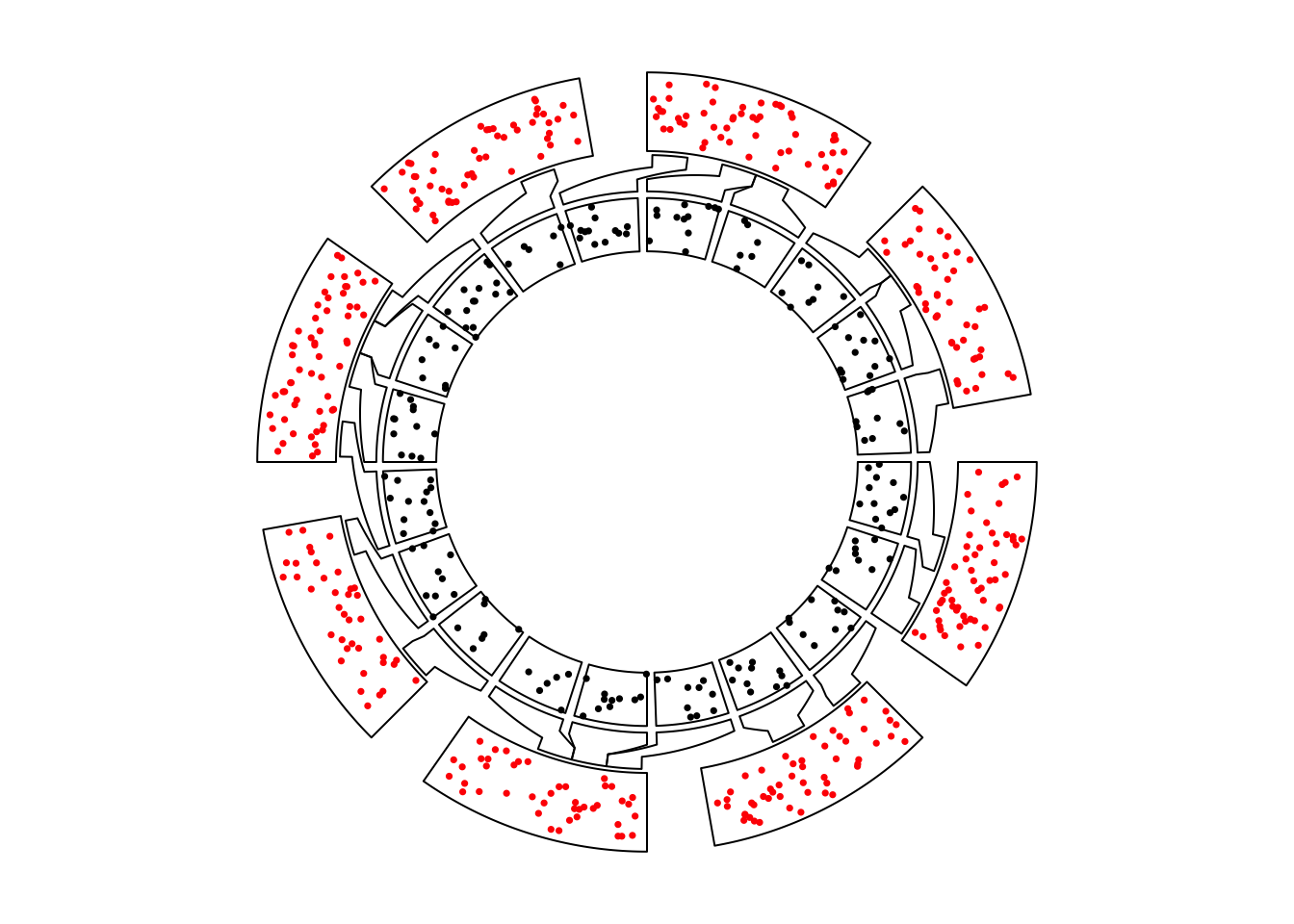
Figure 13.1: Nested zooming between two circular plots.
In the plot, the zoomed circle is put inside the original circle and the start degree for the second plot is automatically adjusted.
Zoomed circle can also be put outside by swtiching f1() and f2().
Actually, for circos.nested(), It doesn’t care which one is zoomed or not,
they are just two circular plots and a correspondance (Figure 13.2).
circos.nested(f2, f1, correspondance[, c(4:6, 1:3)])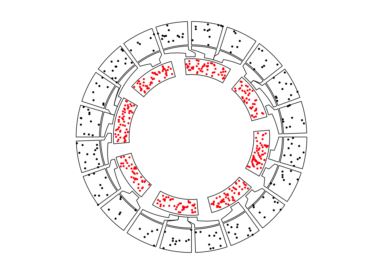
Figure 13.2: Nested zooming between two circular plots, zoomed plot is put outside.
There are some points that need to be noted while doing nested zoomings:
- It can only be applied to the full circle.
- If
canvas.xlimandcanvas.ylimare adjusted in the first plot, same value should be set to the second plot. - By default the start degree of the second plot is automatically adjusted to
make the difference between the original positions and zoomed sectors to a
minimal. However, users can also manually adjusted the start degree for the
second plot by setting
circos.par("start.degree" = ...)andadjust_start_degreemust be set toTRUEincircos.nested(). - Since the function needs to know some information for the two circular
plots, do not put
circos.clear()at the end of each plot. They will be added internally.
f1() and f2() are just normal code for implementing circular plot. There is no problem
to make it more complex (Figure 13.3).
sector_col = structure(rand_color(8, transparency = 0.5), names = letters[1:8])

f1 = function() {
    circos.par(gap.degree = 10)
    circos.initialize(sector[, 1], xlim = sector[, 2:3])
    circos.track(data[[1]], x = data[[2]], y = data[[3]], ylim = c(0, 1),
        panel.fun = function(x, y) {
            l = correspondance[[1]] == CELL_META$sector.index
            if(sum(l)) {
                for(i in which(l)) {
                    circos.rect(correspondance[i, 2], CELL_META$cell.ylim[1],
                                correspondance[i, 3], CELL_META$cell.ylim[2],
                                col = sector_col[CELL_META$sector.index],
                                border = sector_col[CELL_META$sector.index])
                }
            }
            circos.points(x, y, pch = 16, cex = 0.5)
            circos.text(CELL_META$xcenter, CELL_META$ylim[2] + mm_y(2),
                CELL_META$sector.index, niceFacing = TRUE, adj = c(0.5, 0))
    })
}

f2 = function() {
    circos.par(gap.degree = 2, cell.padding = c(0, 0, 0, 0))
    circos.initialize(zoom_sector[[1]], xlim = as.matrix(zoom_sector[, 2:3]))
    circos.track(zoom_data[[1]], x = zoom_data[[2]], y = zoom_data[[3]],
        panel.fun = function(x, y) {
            circos.points(x, y, pch = 16, cex = 0.5)
        }, bg.col = sector_col[zoom_sector$cate],
        track.margin = c(0, 0))
}
circos.nested(f1, f2, correspondance, connection_col = sector_col[correspondance[[1]]])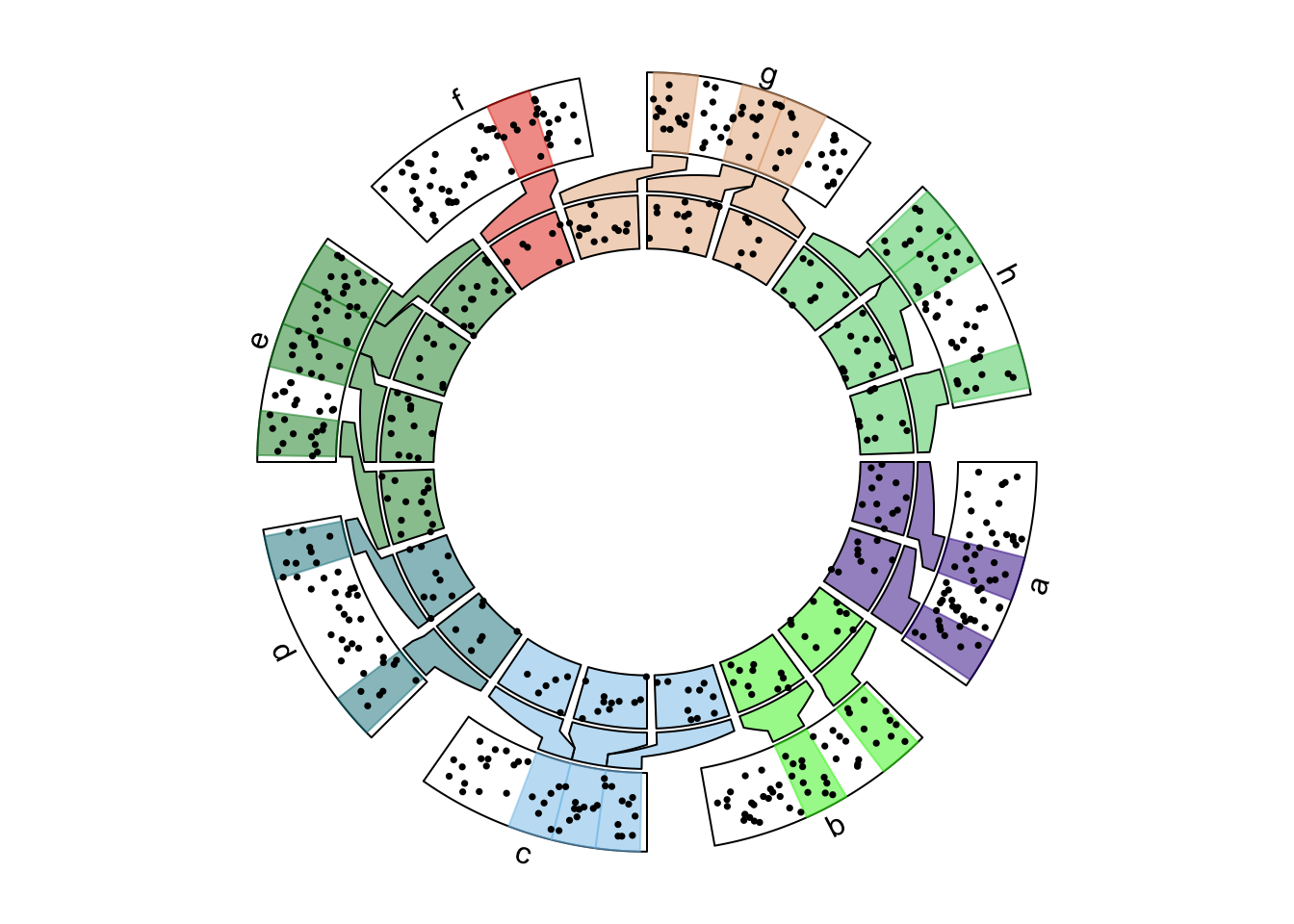
Figure 13.3: Nested zooming between two circular plots, slightly complex plots.
13.2 Visualization of DMRs from tagmentation-based WGBS
Tagmentation-based whole-genome bisulfite sequencing (T-WGBS) is a technology which can examine only a minor fraction of methylome of interest. In this section, we demonstrate how to visualize DMRs which are detected from T-WGBS data in a circular plot by circlize package.
In the example data loaded, tagments contains regions which are sequenced,
DMR1 contains DMRs for one patient detectd in tagment regions. Correspondance between tagment regions
and original genome is stored in correspondance.
load(system.file(package = "circlize", "extdata", "tagments_WGBS_DMR.RData"))
head(tagments, n = 4)
## tagments start end chr
## 1 chr1-44876009-45016546 44876009 45016546 chr1
## 2 chr1-90460304-90761641 90460304 90761641 chr1
## 3 chr1-211666507-211692757 211666507 211692757 chr1
## 4 chr2-46387184-46477385 46387184 46477385 chr2head(DMR1, n = 4)## chr start end methDiff
## 1 chr1-44876009-45016546 44894352 44894643 -0.2812889
## 2 chr1-44876009-45016546 44902069 44902966 -0.3331170
## 3 chr1-90460304-90761641 90535428 90536046 -0.3550701
## 4 chr1-90460304-90761641 90546991 90547262 -0.4310808head(correspondance, n = 4)## chr start end tagments start.1 end.1
## 1 chr1 44876009 45016546 chr1-44876009-45016546 44876009 45016546
## 2 chr1 90460304 90761641 chr1-90460304-90761641 90460304 90761641
## 3 chr1 211666507 211692757 chr1-211666507-211692757 211666507 211692757
## 4 chr2 46387184 46477385 chr2-46387184-46477385 46387184 46477385In Figure 13.4, the tagment regions are actually zoomed from the genome. In following code,
f1() only makes a circular plot with whole genome and f2() makes circular plot for the tagment regions.
chr_bg_color = rand_color(22, transparency = 0.8)
names(chr_bg_color) = paste0("chr", 1:22)

f1 = function() {
    circos.par(gap.after = 2, start.degree = 90)
    circos.initializeWithIdeogram(chromosome.index = paste0("chr", 1:22),
        plotType = c("ideogram", "labels"), ideogram.height = 0.03)
}

f2 = function() {
    circos.par(cell.padding = c(0, 0, 0, 0), gap.after = c(rep(1, nrow(tagments)-1), 10))
    circos.genomicInitialize(tagments, plotType = NULL)
    circos.genomicTrack(DMR1, ylim = c(-0.6, 0.6),
        panel.fun = function(region, value, ...) {
            for(h in seq(-0.6, 0.6, by = 0.2)) {
                circos.lines(CELL_META$cell.xlim, c(h, h), lty = 3, col = "#AAAAAA")
            }
            circos.lines(CELL_META$cell.xlim, c(0, 0), lty = 3, col = "#888888")

            circos.genomicPoints(region, value,
                col = ifelse(value[[1]] > 0, "#E41A1C", "#377EB8"),
                pch = 16, cex = 0.5)
    }, bg.col = chr_bg_color[tagments$chr], track.margin = c(0.02, 0))
    circos.yaxis(side = "left", at = seq(-0.6, 0.6, by = 0.3),
        sector.index = get.all.sector.index()[1], labels.cex = 0.4)
    circos.track(ylim = c(0, 1), track.height = mm_h(2),
        bg.col = add_transparency(chr_bg_color[tagments$chr], 0))
}

circos.nested(f1, f2, correspondance, connection_col = chr_bg_color[correspondance[[1]]])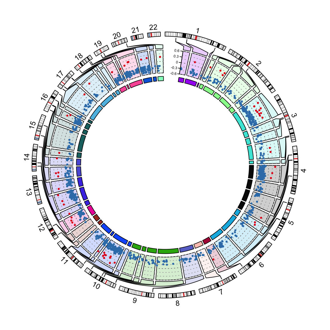
Figure 13.4: Visualization of DMRs.