Chapter 12 High-level genomic functions
In this chapter, several high-level functions which create tracks are introduced.
12.1 Ideograms
circos.initializeWithIdeogram() initializes the circular plot and adds ideogram track
if the cytoband data is available. Actually, the ideograms are drawn by circos.genomicIdeogram().
circos.genomicIdeogram() creates a small track of ideograms and can be used anywhere
in the circle. By default it adds ideograms for human genome hg19 (Figure 12.1).
circos.initializeWithIdeogram(plotType = c("labels", "axis"))
circos.track(ylim = c(0, 1))
circos.genomicIdeogram() # put ideogram as the third track
circos.genomicIdeogram(track.height = 0.2)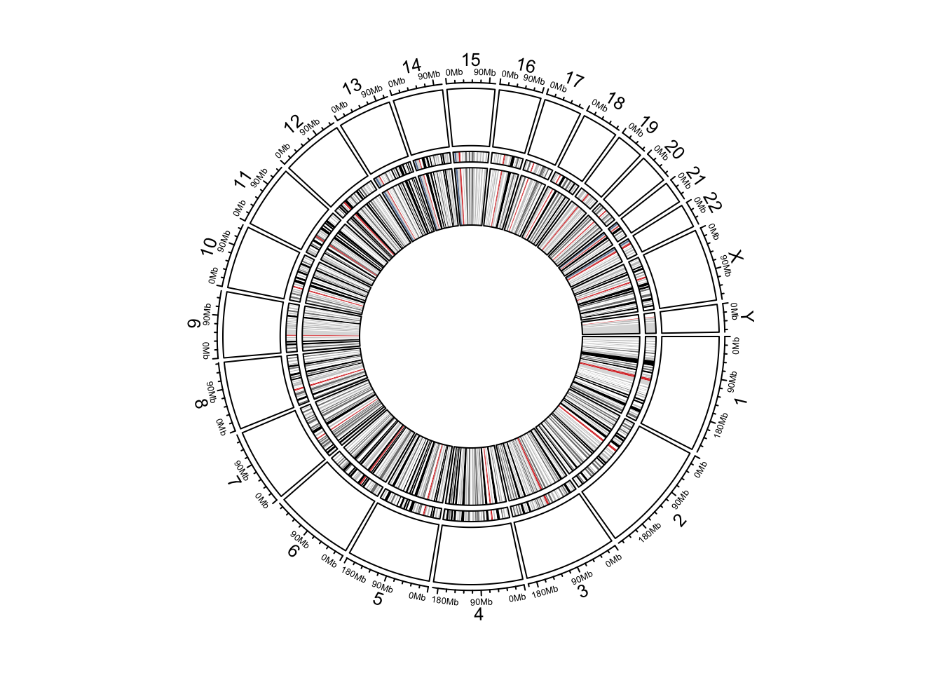
Figure 12.1: Circular ideograms.
12.2 Heatmaps
Matrix which corresponds to genomic regions can be visualized as heatmaps. Heatmaps
completely fill the track and there are connection lines connecting heatmaps and original positions
in the genome. circos.genomicHeatmap() draws connection lines and heatmaps as two tracks
and combines them as an integrated track.
Generally, all numeric columns (excluding the first three columns) in the
input data frame are used to make the heatmap. Columns can also be specified
by numeric.column which is either an numeric vector or a character vector.
Colors can be specfied as a color matrix or a color mapping function generated
by colorRamp2().
The height of the connection line track and the heatmap track can be set by connection_height
and heatmap_height arguments. Also parameters for the styles of lines and rectangle borders
can be adjusted, please check the help page of circos.genomicHeatmap().
circos.initializeWithIdeogram()
bed = generateRandomBed(nr = 100, nc = 4)
col_fun = colorRamp2(c(-1, 0, 1), c("green", "black", "red"))
circos.genomicHeatmap(bed, col = col_fun, side = "inside", border = "white")
circos.clear()
In the left figure in Figure 12.2, the heatmaps are put inside the
normal genomic track. Heatmaps are also be put outside the normal genomic track by setting
side = "outside" (Figure 12.2, right).
circos.initializeWithIdeogram(plotType = NULL)
circos.genomicHeatmap(bed, col = col_fun, side = "outside",
    line_col = as.numeric(factor(bed[[1]])))
circos.genomicIdeogram()
circos.clear()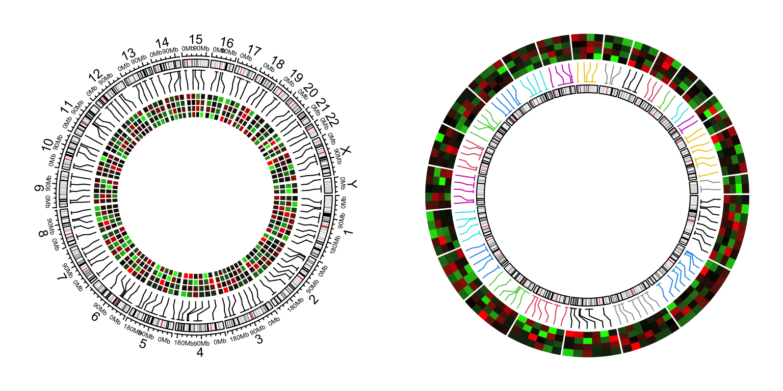
Figure 12.2: Genomic heamtaps.
12.3 Labels
circos.genomicLabels() adds text labels for regions that are specified.
Positions of labels are automatically adjusted so that they do not
overlap to each other.
Similar as circos.genomicHeatmap(), circos.genomicLabels() also
creates two tracks where one for the connection lines and one for the
labels. You can set the height of the labels track to be the maximum
width of labels by labels_height = max(strwidth(labels)). padding
argument controls the gap between two neighbouring labels.
circos.initializeWithIdeogram()
bed = generateRandomBed(nr = 50, fun = function(k) sample(letters, k, replace = TRUE))
bed[1, 4] = "aaaaa"
circos.genomicLabels(bed, labels.column = 4, side = "inside")
circos.clear()
Similarlly, labels can be put outside of the normal genomic track (Figure 12.3 right).
circos.initializeWithIdeogram(plotType = NULL)
circos.genomicLabels(bed, labels.column = 4, side = "outside",
    col = as.numeric(factor(bed[[1]])), line_col = as.numeric(factor(bed[[1]])))
circos.genomicIdeogram()
circos.clear()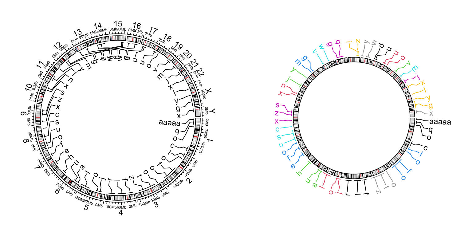
Figure 12.3: Genomic labels.
12.4 Genomic axes
The genomic axes are not really high-level graphics, but it is better to also introduce
here. For circos.initializeWithIdeogram(), by default it draws axes with tick labels properly
formatted. The axes are internally implemented by circos.genomicAxis() and it can be
used to add genomic axes at any track (Figure 12.4).
circos.initializeWithIdeogram(plotType = NULL)
circos.genomicIdeogram()
# still work on the ideogram track
circos.track(track.index = get.current.track.index(), panel.fun = function(x, y) {
    circos.genomicAxis(h = "top")
})
circos.track(ylim = c(0, 1), track.height = 0.1)
circos.track(track.index = get.current.track.index(), panel.fun = function(x, y) {
    circos.genomicAxis(h = "bottom", direction = "inside")
})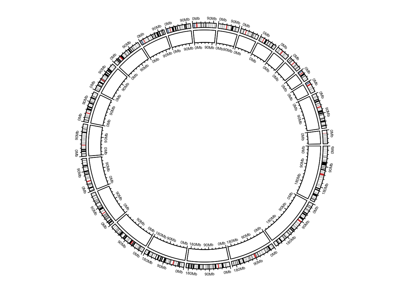
Figure 12.4: Add genomic axes.
circos.clear()12.5 Genomic density and Rainfall plot
Rainfall plots are used to visualize the distribution of genomic regions in the genome. Rainfall plots are particularly useful to identify clusters of regions. In the rainfall plot, each dot represents a region. The x-axis corresponds to the genomic coordinate, and the y-axis corresponds to the minimal distance (log10 transformed) of the region to its two neighbouring regions. A cluster of regions will appear as a “rainfall” in the plot.
circos.genomicRainfall() calculates neighbouring distance for each region
and draw as points on the plot. Since circos.genomicRainfall() generates data on
y-direction (log10(distance)), it is actually a high-level function which
creates a new track.
The input data can be a single data frame or a list of data frames.
circos.genoimcRainfall(bed)
circos.genoimcRainfall(bed_list, col = c("red", "green"))
However, if the amount of regions in a cluster is high, dots will overlap, and direct assessment of the number and density of regions in the cluster will be impossible. To overcome this limitation, additional tracks are added which visualize the genomic density of regions (defined as the fraction of a genomic window that is covered by genomic regions).
circos.genomicDensity() calculates how much a genomic window is covered by
regions in bed. It is also a high-level function and creates a new track.
The input data can be a single data frame or a list of data frames.
circos.genomicDensity(bed)
circos.genomicDensity(bed, baseline = 0)
circos.genomicDensity(bed, window.size = 1e6)
circos.genomicDensity(bedlist, col = c("#FF000080", "#0000FF80"))
Following example makes a rainfall plot for differentially methylated regions (DMR) and their genomic densities. In the plot, red corresponds to hyper-methylated DMRs (gain of methylation) and blue corresponds to hypo-methylated DMRs (loss of methylation). You may see how the combination of rainfall track and genomic density track helps to get a more precise inference of the distribution of DMRs on genome (Figure 12.5).
load(system.file(package = "circlize", "extdata", "DMR.RData"))
circos.initializeWithIdeogram(chromosome.index = paste0("chr", 1:22))

bed_list = list(DMR_hyper, DMR_hypo)
circos.genomicRainfall(bed_list, pch = 16, cex = 0.4, col = c("#FF000080", "#0000FF80"))
circos.genomicDensity(DMR_hyper, col = c("#FF000080"), track.height = 0.1)
circos.genomicDensity(DMR_hypo, col = c("#0000FF80"), track.height = 0.1)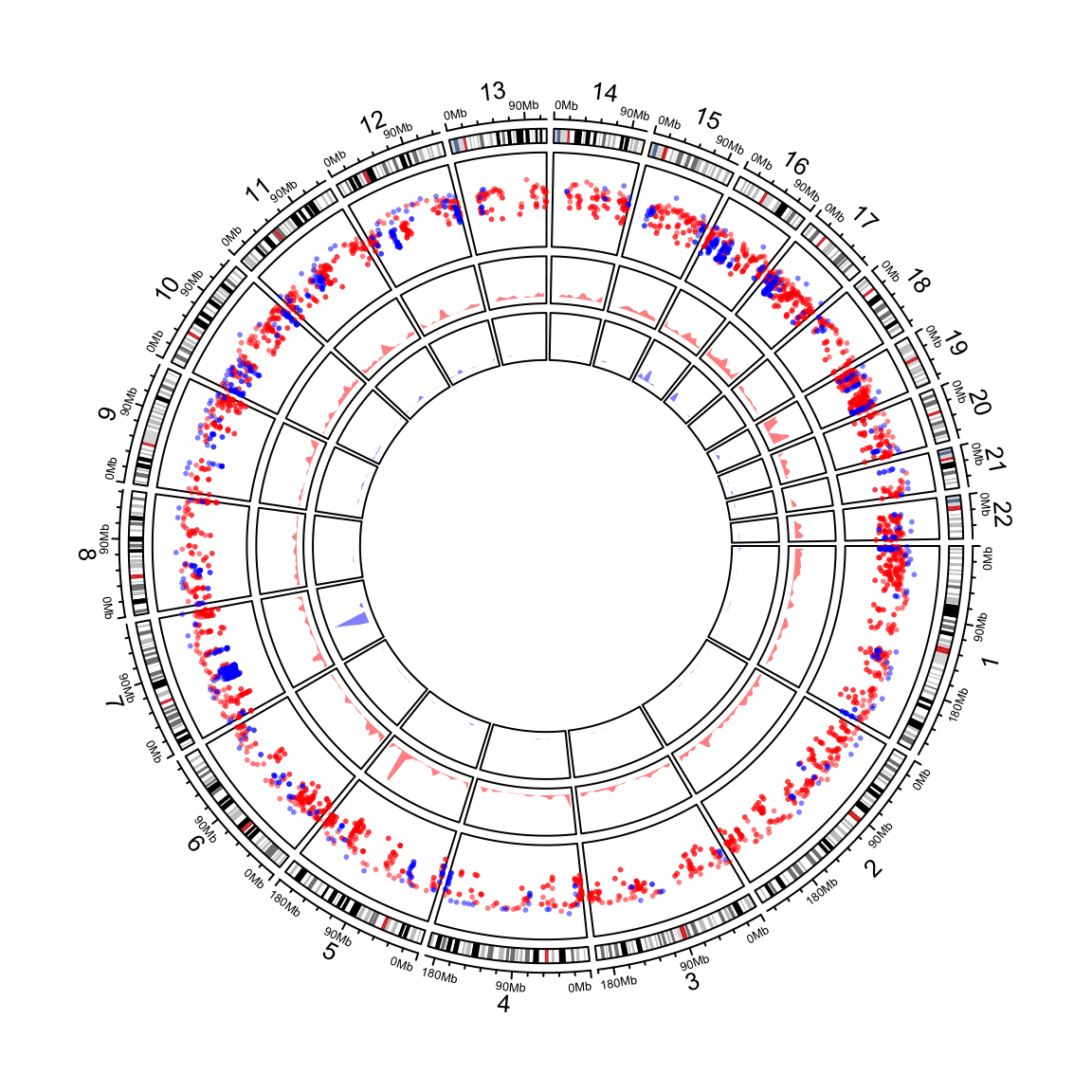
Figure 12.5: Genomic rainfall plot and densities.
circos.clear()circos.genomicDensity() also supports to calculate the overlap as the number of the regions
that overlap to each window by setting count_by = "number".
circos.initializeWithIdeogram(chromosome.index = paste0("chr", 1:22))
circos.genomicDensity(DMR_hyper, col = c("#FF000080"), track.height = 0.1)
circos.genomicDensity(DMR_hyper, col = c("#FF000080"), count_by = "number", track.height = 0.1)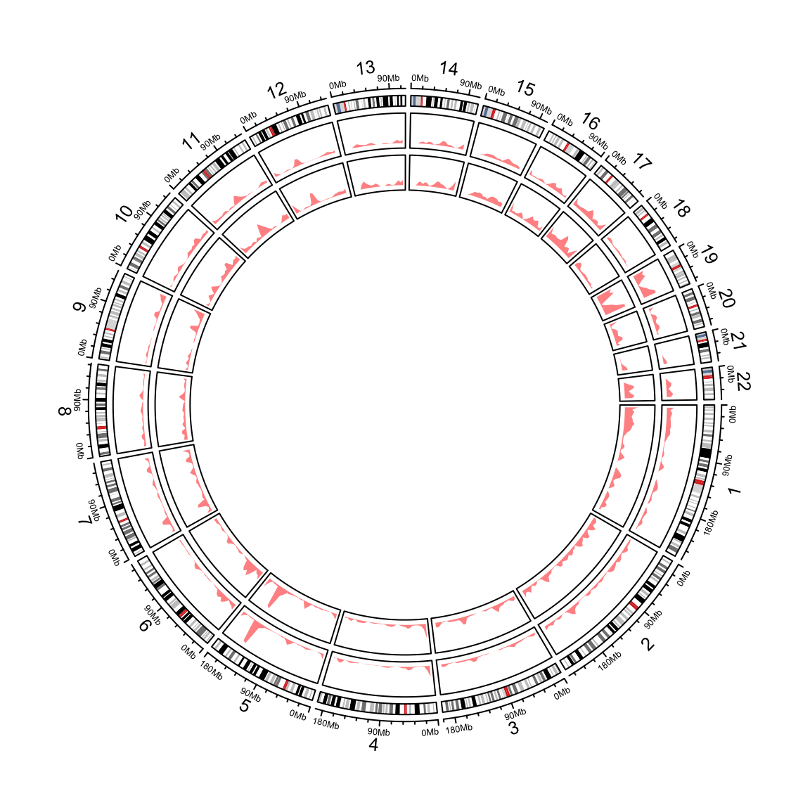
Figure 12.6: Genomic densities.
circos.clear()Internally, rainfallTransform() and genomicDensity() are used to the neighbrouing distance
and the genomic density values.
head(rainfallTransform(DMR_hyper))## chr start end dist
## 70 chr1 933445 934443 35323
## 104 chr1 969766 970362 4909
## 105 chr1 975271 976767 4909
## 154 chr1 1108819 1109923 31522
## 155 chr1 1141445 1142405 31522
## 157 chr1 1181550 1182782 39145head(genomicDensity(DMR_hyper, window.size = 1e6))## chr start end value
## 1 chr1 1 1000000 0.003093
## 2 chr1 500001 1500000 0.007592
## 3 chr1 1000001 2000000 0.008848
## 4 chr1 1500001 2500000 0.010155
## 5 chr1 2000001 3000000 0.011674
## 6 chr1 2500001 3500000 0.007783