Chapter 1 Introduction
Circular layout is very useful to represent complicated information. First, it elegantly represents information with long axes or a large amount of categories; second, it intuitively shows data with multiple tracks focusing on the same object; third, it easily demonstrates relations between elements. It provides an efficient way to arrange information on the circle and it is beautiful.
Circos is a pioneer tool widely used for circular layout representations implemented in Perl. It greatly enhances the visualization of scientific results (especially in Genomics field). Thus, plots with circular layout are normally named as “circos plot”. Here the circlize package aims to implement Circos in R. One important advantage for the implementation in R is that R is an ideal environment which provides seamless connection between data analysis and data visualization. circlize is not a front-end wrapper to generate configuration files for Circos, while completely coded in R style by using R’s elegant statistical and graphic engine. We aim to keep the flexibility and configurability of Circos, but also make the package more straightforward to use and enhance it to support more types of graphics.
In this book, chapters in Part I give detailed overviews of the general circlize functionalities. Part II introduces functions specifically designed for visualizing genomic datasets. Part III gives comprehensive guilds on visualizing relationships by Chord diagram.
1.1 Principle of design
A circular layout is composed of sectors and tracks. For data in different categories, they are allocated into different sectors, and for multiple measurements on the same category, they are represented as stacked tracks from outside of the circle to the inside. The intersection of a sector and a track is called a cell (or a grid, a panel), which is the basic unit in a circular layout. It is an imaginary plotting region for drawing data points.
Since most of the figures are composed of simple graphics, such as points, lines, polygon, circlize implements low-level graphic functions for adding graphics in the circular plotting regions, so that more complicated graphics can be easily generated by different combinations of low-level graphic functions. This principle ensures the generality that types of high-level graphics are not restricted by the software itself and high-level packages focusing on specific interests can be built on it.
Currently there are following low-level graphic functions that can be used for
adding graphics. The usage is very similar to the functions without circos.
prefix from the base graphic engine, except there are some enhancement
specifically designed for circular visualization.
circos.points(): adds points in a cell.circos.lines(): adds lines in a cell.circos.segments(): adds segments in a cell.circos.rect(): adds rectangles in a cell.circos.polygon(): adds polygons in a cell.circos.text(): adds text in a cell.circos.axis()andscircos.yaxis(): add axis in a cell.
Following function draws links between two positions in the circle:
circos.link()
Following functions draw high-level graphics:
circos.barplot(): draw barplots.circos.boxplot(): draw boxplots.circos.violin(): draws violin plots.circos.heatmap(): draw circular heatmaps.circos.raster(): draw raster images.circos.arrow(): draw circular arrows.
Following functions arrange the circular layout.
circos.initialize(): allocates sectors on the circle.circos.track(): creates plotting regions for cells in one single track.circos.update(): updates an existed cell.circos.par(): graphic parameters.circos.info(): prints general parameters of current circular plot.circos.clear(): resets graphic parameters and internal variables.
Thus, theoretically, you are able to draw most kinds of circular figures by the above functionalities. Figure 1.1 lists several complex circular plots made by circlize. After going through this book, you will definitely be able to implement yours.
Figure 1.1: Examples by circlize
1.2 A quick glance
Before we go too deep into the details, I first demonstrate a simple example with using basic functionalities in circlize package to help you to get a basic idea of how the package works.
First let’s generate some random data. There needs a character vector to represent categories, a numeric vector of x values and a vectoe of y values.
set.seed(999)
n = 1000
df = data.frame(sectors = sample(letters[1:8], n, replace = TRUE),
    x = rnorm(n), y = runif(n))
First we initialize the circular layout. The circle is split into sectors
based on the data range on x-axes in each category. In following code, df$x
is split by df$sectors and the width of sectors are automatically calculated
based on data ranges in each category. Be default, sectors are positioned
started from \(\theta = 0\) (in the polar coordinate system) and go along the circle
clock-wisely. You may not see anything after running following code because no
track has been added yet.
library(circlize)
circos.par("track.height" = 0.1)
circos.initialize(df$sectors, x = df$x)
We set a global parameter track.height to 0.1 by the option function
circis.par() so that all tracks which will be added have a default height of
0.1. The circle used by circlize always has a radius of 1, so a height of
0.1 means 10% of the circle radius. In later chapters, you can find how to set the
height with physical units, e.g. cm.
Note that the allocation of sectors only needs values on x direction (or on the circular direction), the values on y direction (radical direction) will be used in the step of creating tracks.
After the circular layout is initialized, graphics can be added to the plot in
a track-by-track manner. Before drawing anything, we need to know that all
tracks should be first created by circos.trackPlotRegion() or, for short,
circos.track(), then the low-level functions can be added afterwards. Just
think in the base R graphic engine, you need first call plot() then you can
use functions such as points() and lines() to add graphics. Since x-ranges
for cells in the track have already been defined in the initialization step,
here we only need to specify the y-range for each cell. The y-ranges can be
specified by y argument as a numeric vector (so that y-range will be
automatically extracted and calculated in each cell) or ylim argument as a
vector of length two. In principle, y-ranges should be same for all cells in a
same track. (See Figure 1.2)
circos.track(df$sectors, y = df$y,
    panel.fun = function(x, y) {
        circos.text(CELL_META$xcenter,
            CELL_META$cell.ylim[2] + mm_y(5),
            CELL_META$sector.index)
        circos.axis(labels.cex = 0.6)
})
col = rep(c("#FF0000", "#00FF00"), 4)
circos.trackPoints(df$sectors, df$x, df$y, col = col, pch = 16, cex = 0.5)
circos.text(-1, 0.5, "text", sector.index = "a", track.index = 1)
Figure 1.2: First example of circlize, add the first track.
Axes for the circular plot are normally drawn on the most outside of the
circle. Here we add axes in the first track by putting circos.axis() inside
the self-defined function panel.fun (see the code above). circos.track()
creates plotting region in a cell-by-cell manner and the panel.fun is
actually executed immediately after the plotting region for a certain cell is
created. Thus, panel.fun actually means adding graphics in the “current
cell” (Usage of panel.fun is further discussed in Section 2.7).
Without specifying any arguments, circos.axis() draws x-axes
on the top of each cell (or the outside of each cell).
Also, we add sector name outside the first track by using circos.text().
CELL_META provides “meta information” for the current cell. There are
several parameters which can be retrieved by CELL_META. All its usage is
explained in Section 2.7. In above code, the sector names are
drawn outside the cells and you may see warning messages saying data points
exceeding the plotting regions. That is total fine and no worry about it. You
can also add sector names by creating an empty track without borders as the
first track and add sector names in it (like what
circos.initializeWithIdeogram() and chordDiagram() do, after you go through
following chapters).
When specifying the position of text on the y direction, an offset of
mm_y(5) (5mm) is added to the y position of the text. In circos.text(), x and y
values are measured in the data coordinate (the coordinate in cell), and there
are some helper functions that convert absolute units to corresponding values
in data coordinate. Section
2.8.2 provides more information of converting units in
different coordinates.
After the track is created, points are added to the first track by
circos.trackPoints(). circos.trackPoints() simply adds points in all cells
simultaneously. As further explained in Section 3.2, it can be
replaced by putting circos.text() in panel.fun, however,
circos.trackPoints() would be more convenient if only the points are needed
to put in the cells (but I don’t really recommend). It is quite straightforward to understand that this
function needs a categorical variable (df$sectors), values on x direction
and y direction (df$x and df$y).
Low-level functions such as circos.text() can also be used outside
panel.fun as shown in above code. If so, sector.index and track.index
need to be specified explicitly because the “current” sector and “current”
track may not be what you want. If the graphics are directly added to the
track which are most recently created, track.index can be ommitted because
this track is just marked as the “current” track.
OK, now we add histograms to the second track. Here circos.trackHist() is a
high-level function which means it creates a new track (as you can imagin hist()
is also a high-level function). bin.size is explicitly set so that the bin
size for histograms in all cells are the same and can be compared to each
other. (See Figure 1.3)
bgcol = rep(c("#EFEFEF", "#CCCCCC"), 4)
circos.trackHist(df$sectors, df$x, bin.size = 0.2, bg.col = bgcol, col = NA)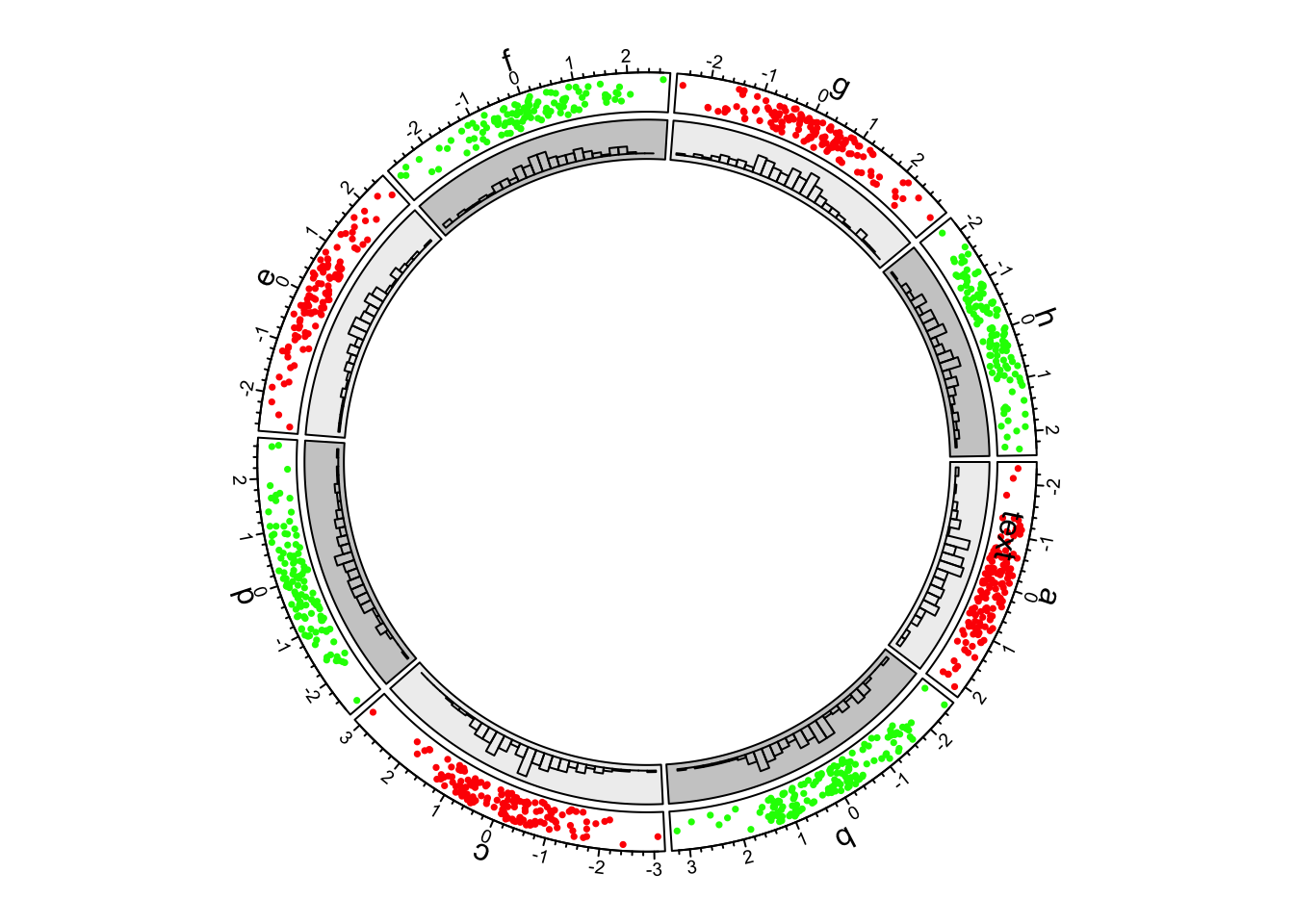
Figure 1.3: First example of circlize, add the second track.
In the third track and in panel.fun, we randomly picked 10 data points in
each cell, sort them by x-values and connect them with lines. In following
code, when sectors (the first unnamed argument), x and y arguments are set in
circos.track(), x values and y values are split by df$sectors and
corresponding subset of x and y values are sent to panel.fun through
panel.fun’s x and y arguments. Thus, x an y in panel.fun are
exactly the values in the “current” cell. (See Figure
1.4)
circos.track(df$sectors, x = df$x, y = df$y,
    panel.fun = function(x, y) {
        ind = sample(length(x), 10)
        x2 = x[ind]
        y2 = y[ind]
        od = order(x2)
        circos.lines(x2[od], y2[od])
})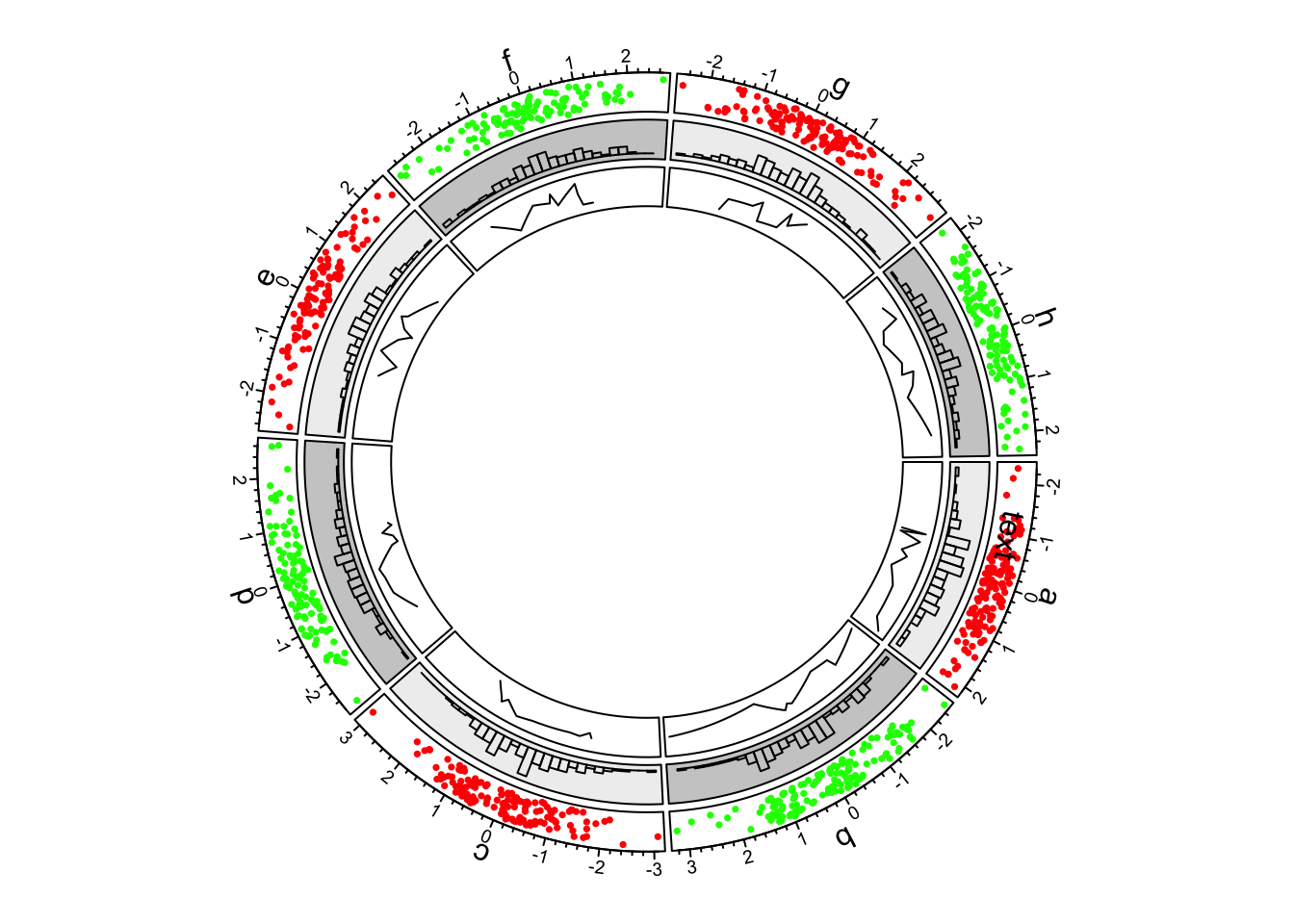
Figure 1.4: First example of circlize, add the third track.
Now we go back to the second track and update the cell in sector “d.”
This is done by circos.updatePlotRegion() or the short version
circos.update(). The function erases graphics which have been added.
circos.update() can not modify the xlim and ylim of the cell as well as
other settings related to the position of the cell. circos.update() needs
to explicitly specify the sector index and track index unless the “current”
cell is what you want to update. After the calling of circos.update(),
the “current” cell is redirected to the cell you just specified and you
can use low-level graphic functions to add graphics directly into it.
(See Figure 1.5)
circos.update(sector.index = "d", track.index = 2,
    bg.col = "#FF8080", bg.border = "black")
circos.points(x = -2:2, y = rep(0.5, 5), col = "white")
circos.text(CELL_META$xcenter, CELL_META$ycenter, "updated", col = "white")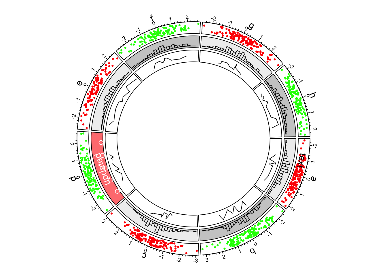
Figure 1.5: First example of circlize, update the second track.
Next we continue to create new tracks. Although we have gone back to the
second track, when creating a new track, the new track is still created after
the track which is most inside. In this new track, we add heatmaps by
circos.rect(). Note here we haven’t set the input data, while simply set
ylim argument because heatmaps just fill the whole cell from the most left
to right and from bottom to top. Also the exact value of ylim is not
important and x, y in panel.fun() are not used (actually they are both
NULL). (See Figure 1.6)
circos.track(ylim = c(0, 1), panel.fun = function(x, y) {
    xlim = CELL_META$xlim
    ylim = CELL_META$ylim
    breaks = seq(xlim[1], xlim[2], by = 0.1)
    n_breaks = length(breaks)
    circos.rect(breaks[-n_breaks], rep(ylim[1], n_breaks - 1),
                breaks[-1], rep(ylim[2], n_breaks - 1),
                col = rand_color(n_breaks), border = NA)
})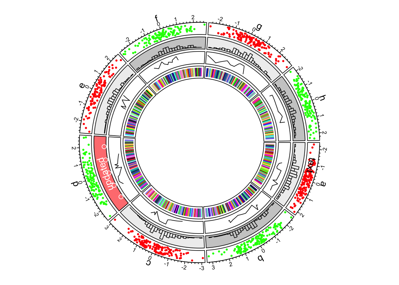
Figure 1.6: First example of circlize, add the fourth track.
In the most inside of the circle, links or ribbons are added. There can be links from single point to point, point to interval or interval to interval. Section 3.12 gives detailed usage of links. (See Figure 1.7)
circos.link("a", 0, "b", 0, h = 0.4)
circos.link("c", c(-0.5, 0.5), "d", c(-0.5,0.5), col = "red",
    border = "blue", h = 0.2)
circos.link("e", 0, "g", c(-1,1), col = "green", border = "black", lwd = 2, lty = 2)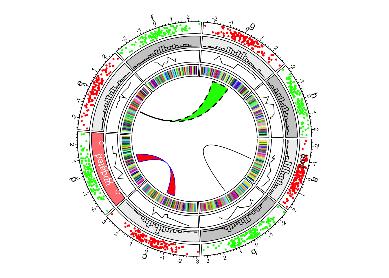
Figure 1.7: First example of circlize, add links.
Finally we need to reset the graphic parameters and internal variables, so that it will not mess up your next plot.
circos.clear()