Chapter 14 The chordDiagram() function
One unique feature of circular layout is the circular visualization of relations between objects by links. See examples in http://circos.ca/intro/tabular_visualization/. Such type of plot is called Chord diagram. In circlize, it is easy to plot Chord diagram in a straightforward or in a highly customized way.
There are two data formats that represent relations, either adjacency matrix or adjacency list. In adjacency matrix, value in \(i^{th}\) row and \(j^{th}\) column represents the relation from object in the \(i^{th}\) row and the object in the \(j^{th}\) column where the absolute value measures the strength of the relation. In adjacency list, relations are represented as a three-column data frame in which relations come from the first column and to the second column, and the third column represents the strength of the relation.
Following code shows an example of an adjacency matrix.
mat = matrix(1:9, 3)
rownames(mat) = letters[1:3]
colnames(mat) = LETTERS[1:3]
mat
## A B C
## a 1 4 7
## b 2 5 8
## c 3 6 9And the code in below is an example of an adjacency list.
df = data.frame(from = letters[1:3], to = LETTERS[1:3], value = 1:3)
df
## from to value
## 1 a A 1
## 2 b B 2
## 3 c C 3Actually, it is not difficult to convert between these two formats. There are
also R packages and functions do the conversion such as in reshape2
package, melt() converts a matrix to a data frame and dcast() converts the
data frame back to the matrix.
Chord diagram shows the information of the relation from several levels. 1. the links are straightforward to show the relations between objects; 2. width of links are proportional to the strength of the relation which is more illustrative than other graphic mappings; 3. colors of links can be another graphic mapping for relations; 4. width of sectors represents total strength for an object which connects to other objects or is connected from other objects. You can find an interesting example of using Chord diagram to visualize leagues system of players clubs by their national team from https://gjabel.wordpress.com/2014/06/05/world-cup-players-representation-by-league-system/ and the adapted code is at https://jokergoo.github.io/circlize_examples/example/wc2014.html.
In circlize package, there is a chordDiagram() function that supports
both adjacency matrix and adjacency list. For different formats of input, the
corresponding format of graphic parameters will be different either. E.g. when
the input is a matrix, since information of the links in the Chord diagram is
stored in the matrix, corresponding graphics for the links sometimes should
also be specified as a matrix, while if the input is a data frame, the graphic
parameters for links only need to be specified as an additional column to the
data frame. Using the matrix is very straightforward and makes goodlooking
plots, while using the data frame provides more flexibility for controlling
the Chord diagram. Thus, in this chapter, we will show usage for both
adjacency matrix and list.
Since the usage for the two types of inputs are highly similar, in this chapter, we mainly show figures generated from the matrix, but still show the code which uses adjacency list.
14.1 Basic usage of making Chord diagram
First let’s generate a random matrix and the corresponding adjacency list.
set.seed(999)
mat = matrix(sample(18, 18), 3, 6)
rownames(mat) = paste0("S", 1:3)
colnames(mat) = paste0("E", 1:6)
mat
## E1 E2 E3 E4 E5 E6
## S1 4 14 13 17 5 2
## S2 7 1 6 8 12 15
## S3 9 10 3 16 11 18df = data.frame(from = rep(rownames(mat), times = ncol(mat)),
to = rep(colnames(mat), each = nrow(mat)),
value = as.vector(mat),
stringsAsFactors = FALSE)
df## from to value
## 1 S1 E1 4
## 2 S2 E1 7
## 3 S3 E1 9
## 4 S1 E2 14
## 5 S2 E2 1
## 6 S3 E2 10
## 7 S1 E3 13
## 8 S2 E3 6
## 9 S3 E3 3
## 10 S1 E4 17
## 11 S2 E4 8
## 12 S3 E4 16
## 13 S1 E5 5
## 14 S2 E5 12
## 15 S3 E5 11
## 16 S1 E6 2
## 17 S2 E6 15
## 18 S3 E6 18The simplest usage is just calling chordDiagram() with
mat (Figure 14.1).
chordDiagram(mat)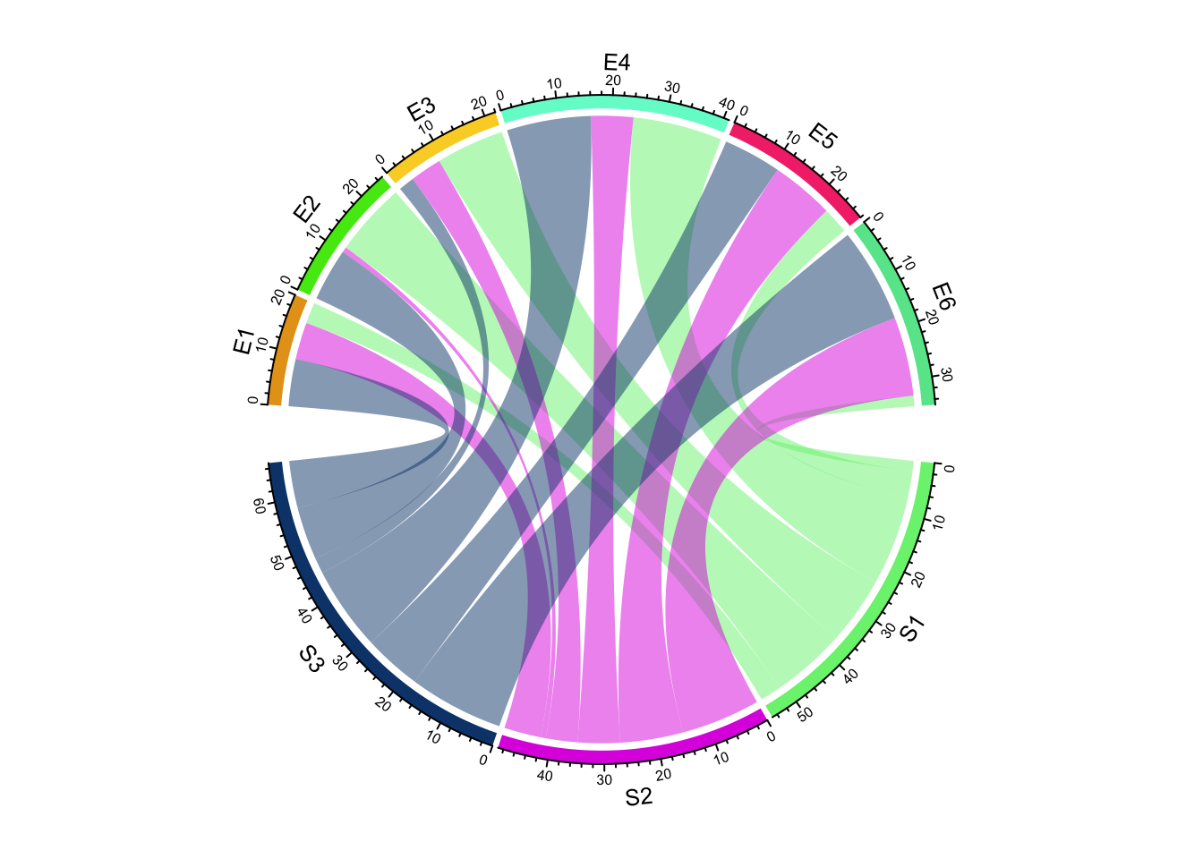
Figure 14.1: Basic usages of chordDiagram().
circos.clear()or call with df:
chordDiagram(df)
circos.clear()
The default Chord Diagram consists of a track of labels, a track of grids (or
you can call it lines, rectangles) with axes, and links. Sectors which correspond to rows in
the matrix locate at the bottom half of the circle. The order of sectors is
the order of union(rownames(mat), colnames(mat)) or union(df[[1]], df[[2]]) if input is a data frame. The order of sectors can be controlled by
order argument (Figure 14.2, left). Of course, the
length of order vector should be same as the number of sectors.
In following code, S1, S2 and S3 should better be put together since
they belong to a same group, which is same for E* sectors. Of course, you
can give a order which mix S* and E* (Figure
14.2, right), but it is not recommended
because it is bad for reading the plot. You can find more information of
setting grouped Chord diagrams (two or more groups) in Section
15.6.
par(mfrow = c(1, 2))
chordDiagram(mat, order = c("S2", "S1", "S3", "E4", "E1", "E5", "E2", "E6", "E3"))
circos.clear()

chordDiagram(mat, order = c("S2", "S1", "E4", "E1", "S3", "E5", "E2", "E6", "E3"))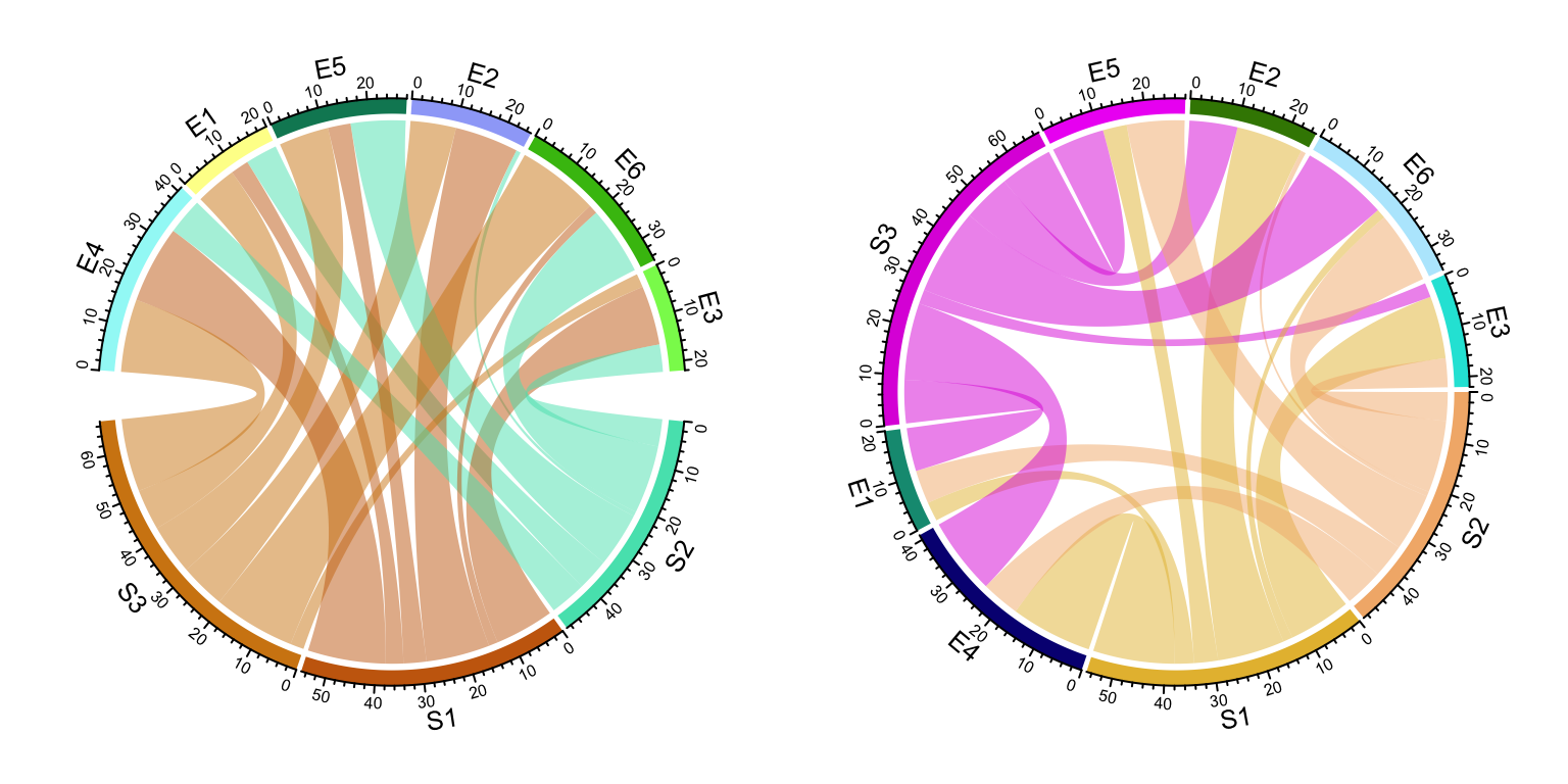
Figure 14.2: Adjust sector orders in Chord diagram. Left: sectors are still grouped after reordering; right: sectors are not grouped.
circos.clear()Under default settings, the grid colors which represent sectors are randomly generated, and the link colors are same as grid colors which correspond to rows (or the first column if the input is an adjacency list) but with 50% transparency.
14.2 Adjust by circos.par()
Since Chord Diagram is implemented by basic circlize functions, like normal circular plot,
the layout can be customized by circos.par().
The gaps between sectors can be set by circos.par(gap.after = ...) (Figure 14.3).
It is useful when you want to distinguish sectors between rows and columns.
Please note since you change default graphical settings, you need to
use circos.clear() in the end of the plot to reset it.
circos.par(gap.after = c(rep(5, nrow(mat)-1), 15, rep(5, ncol(mat)-1), 15))
chordDiagram(mat)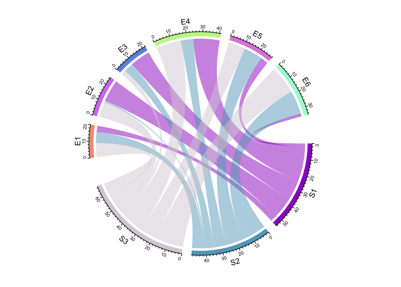
Figure 14.3: Set gaps in Chord diagram.
circos.clear()If the input is a data frame:
circos.par(gap.after = c(rep(5, length(unique(df[[1]]))-1), 15,
                         rep(5, length(unique(df[[2]]))-1), 15))
chordDiagram(df)
circos.clear()
As explained in Section 2.4, gap.after can also specified
as a named vector:
circos.par(gap.after = c("S1" = 5, "S2" = 5, "S3" = 15, "E1" = 5, "E2" = 5,
                         "E3" = 5, "E4" = 5, "E5" = 5, "E6" = 15))
chordDiagram(mat)
circos.clear()
To make it simpler, users can directly set big.gap in chordDiagram()
(Figure 14.4). The value of big.gap
corresponds to the gap between row sectors and column sectors (or first-column
sectors and second-column sectors in the input is a data frame). Internally a
proper gap.after is assigned to circos.par(). Note it will only work when
there is no overlap between row sectors and column sectors, or in other words,
rows and columns in the matrix, or the first column and the second column
in the data frame represent two different groups.
chordDiagram(mat, big.gap = 30)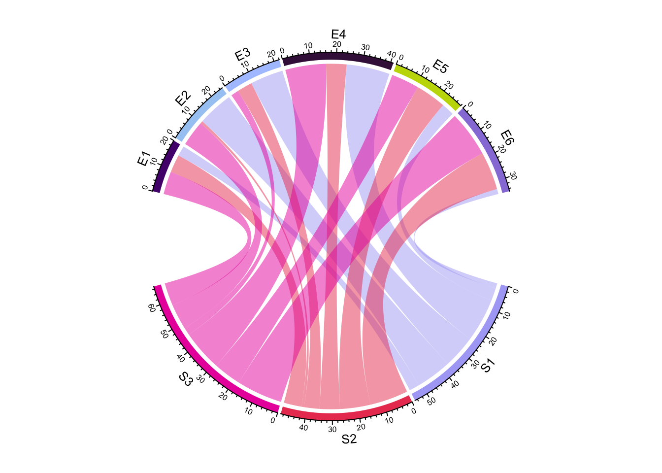
Figure 14.4: Directly set big.gap in chordDiagram().
circos.clear()small.gap argument controls the gap between sectors corresponding to either
matrix rows or columns. The default value is 1 degree and normally you don’t
need to set it. big.gap and small.gap can also be set in the scenarios
where number of groups is larger than two, see Section
15.6 for more details.
Similar to a normal circular plot, the first sector (which is the first row in
the adjacency matrix or the first row in the adjacency list) starts from right
center of the circle and sectors are arranged clock-wisely. The start degree
for the first sector can be set by circos.par(start.degree = ...) and the
direction can be set by circos.par(clock.wise = ...) (Figure
14.5).
In Figure 14.5 (left), setting
circos.par(clock.wise = FALSE) makes the link so twisted. Actually making
the direction reverse clock wise can also be done by setting a reversed order
of all sectors (Figure 14.5, right). As
we can see, the links in the left plot are very twisted, while it still looks
fine in the right plot. The reason is chordDiagram() automatically optimizes
the positions of links according to the arrangement of sectors.
par(mfrow = c(1, 2))
circos.par(start.degree = 85, clock.wise = FALSE)
chordDiagram(mat)
circos.clear()

circos.par(start.degree = 85)
chordDiagram(mat, order = c(rev(colnames(mat)), rev(rownames(mat))))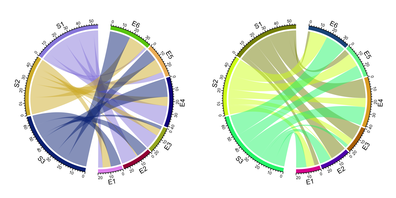
Figure 14.5: Change position and orientation of Chord diagram.
circos.clear()14.3 Colors
14.3.1 Set grid colors
Grids have different colors to represent different sectors. Generally, sectors are divided into two groups. One contains sectors defined in rows of the matrix or the first column in the data frame, and the other contains sectors defined in columns of the matrix or the second column in the data frame. Thus, links connect objects in the two groups. By default, link colors are same as the color for the corresponding sectors in the first group.
Changing colors of grids may change the colors of links as well. Colors for
grids can be set through grid.col argument. Values of grid.col better be a
named vector of which names correspond to sector names. If it is has no name
index, the order of grid.col is assumed to have the same order as sectors
(Figure 14.6). If you want to colors to be the same
as the sectors from the matrix columns or the second column in the data frame,
simply transpose the matrix (Figure 14.6 right).
grid.col = c(S1 = "red", S2 = "green", S3 = "blue",
    E1 = "grey", E2 = "grey", E3 = "grey", E4 = "grey", E5 = "grey", E6 = "grey")
chordDiagram(mat, grid.col = grid.col)
chordDiagram(t(mat), grid.col = grid.col)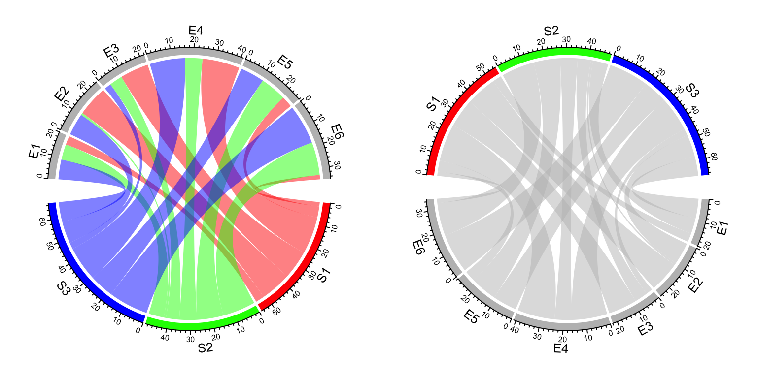
Figure 14.6: Set grid colors in Chord diagram.
14.3.2 Set link colors
Transparency of link colors can be set by transparency argument (Figure 14.7).
The value should between 0 to 1 in which 0 means no transparency and 1 means full transparency.
Default transparency is 0.5.
chordDiagram(mat, grid.col = grid.col, transparency = 0)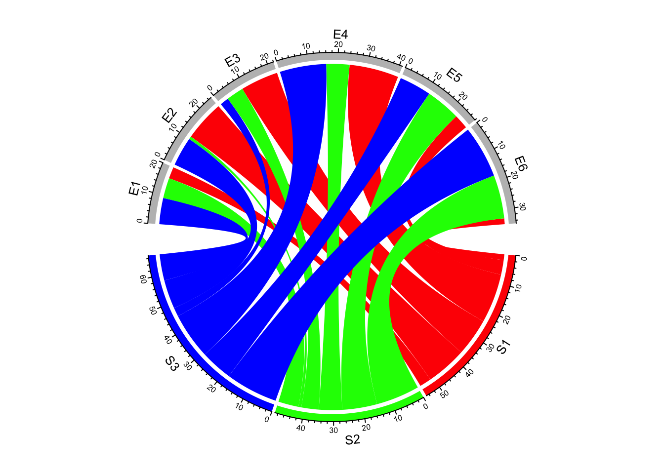
Figure 14.7: Transparency for links in Chord diagram.
For adjacecy matrix, colors for links can be customized by providing a matrix
of colors. In the following example, we use rand_color() to generate a
random color matrix. Note since col_mat already contains transparency,
transparency will be ignored if it is set (Figure 14.8).
col_mat = rand_color(length(mat), transparency = 0.5)
dim(col_mat) = dim(mat)  # to make sure it is a matrix
chordDiagram(mat, grid.col = grid.col, col = col_mat)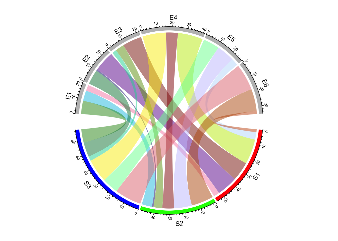
Figure 14.8: Set a color matrix for links in Chord diagram.
While for ajacency list, colors for links can be customized as a vector.
col = rand_color(nrow(df))
chordDiagram(df, grid.col = grid.col, col = col)
When the strength of the relation (e.g. correlations) represents as continuous values,
col can also be specified as a self-defined color mapping function. chordDiagram()
accepts a color mapping generated by colorRamp2() (Figure 14.9).
col_fun = colorRamp2(range(mat), c("#FFEEEE", "#FF0000"), transparency = 0.5)
chordDiagram(mat, grid.col = grid.col, col = col_fun)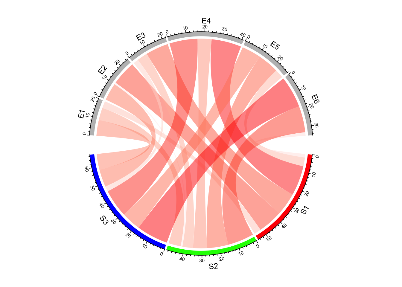
Figure 14.9: Set a color mapping function for links in Chord diagram.
The color mapping function also works for adjacency list, but it will be applied to the third column in the data frame, so you need to make sure the third column has the proper values.
chordDiagram(df, grid.col = grid.col, col = col_fun)
# or
chordDiagram(df, grid.col = grid.col, col = col_fun(df[, 3]))
When the input is a matrix, sometimes you don’t need to generate the whole color matrix. You can just provide colors which correspond to rows or columns so that links from a same row/column will have the same color (Figure 14.10). Here note values of colors can be set as numbers, color names or hex code, same as in the base R graphics.
chordDiagram(mat, grid.col = grid.col, row.col = 1:3)
chordDiagram(mat, grid.col = grid.col, column.col = 1:6)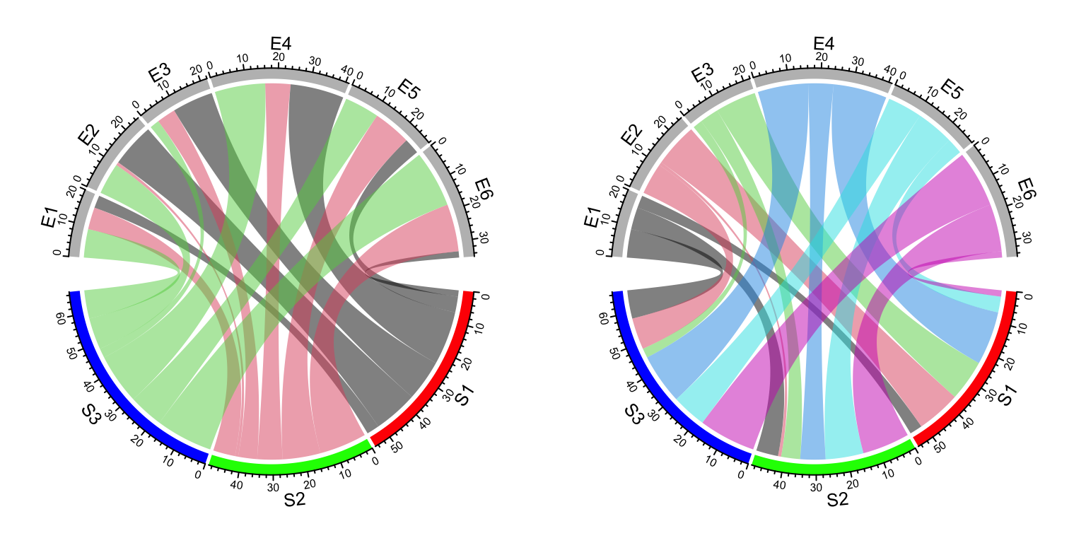
Figure 14.10: Set link colors same as row sectors or column sectors in Chord diagram.
row.col and column.col is specifically designed for matrix. There is no
similar settings for ajacency list.
To emphasize again, transparency of links can be included in col, row.col
or column.col, if transparency is already set there, transparency argument
will be ignored.
In Section 14.5, we will introduce how to highlight subset of links by only assigning colors to them.
14.4 Link border
link.lwd, link.lty and link.border control the line width, the line
style and the color of the link border. All these three parameters can be set
either a single scalar or a matrix if the input is adjacency matrix.
If it is set as a single scalar, it means all links share the same style (Figure 14.11).
chordDiagram(mat, grid.col = grid.col, link.lwd = 2, link.lty = 2, link.border = "red")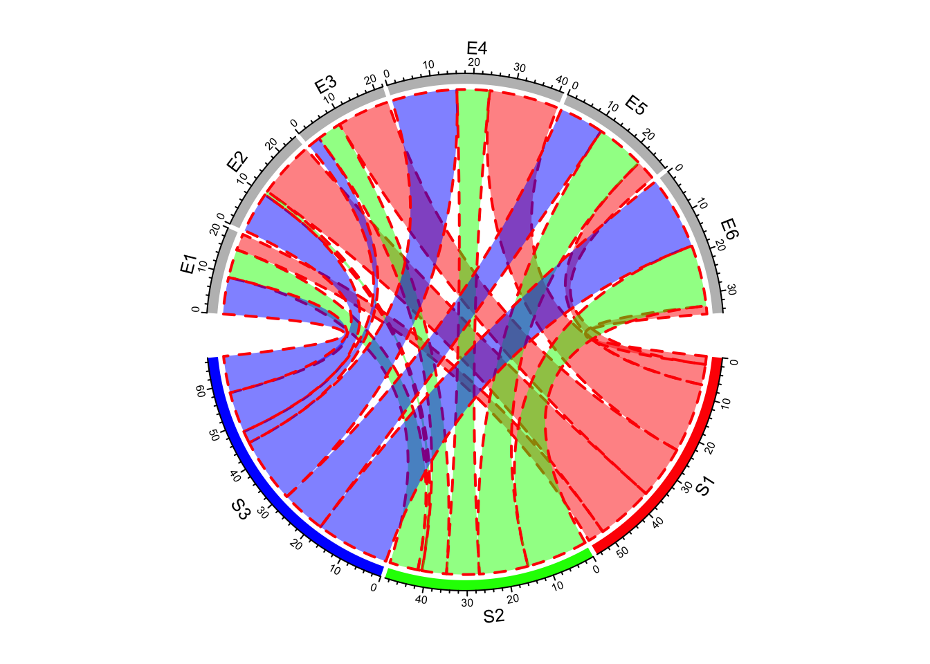
Figure 14.11: Line style for Chord diagram.
If it is set as a matrix, it should have same dimension as mat
(Figure 14.12).
lwd_mat = matrix(1, nrow = nrow(mat), ncol = ncol(mat))
lwd_mat[mat > 12] = 2
border_mat = matrix(NA, nrow = nrow(mat), ncol = ncol(mat))
border_mat[mat > 12] = "red"
chordDiagram(mat, grid.col = grid.col, link.lwd = lwd_mat, link.border = border_mat)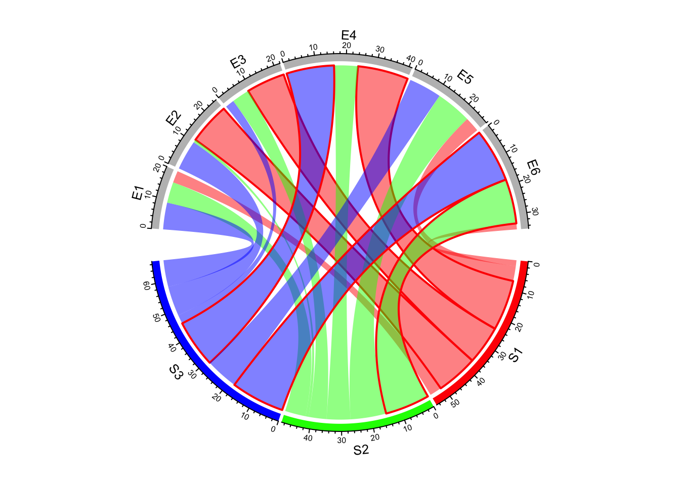
Figure 14.12: Set line style as a matrix.
The matrix is not necessary to have same dimensions as in mat. It can also
be a sub matrix (Figure 14.13). For rows or
columns of which the corresponding values are not specified in the matrix,
default values are filled in. It must have row names and column names so that
the settings can be mapped to the correct links.
border_mat2 = matrix("black", nrow = 1, ncol = ncol(mat))
rownames(border_mat2) = rownames(mat)[2]
colnames(border_mat2) = colnames(mat)
chordDiagram(mat, grid.col = grid.col, link.lwd = 2, link.border = border_mat2)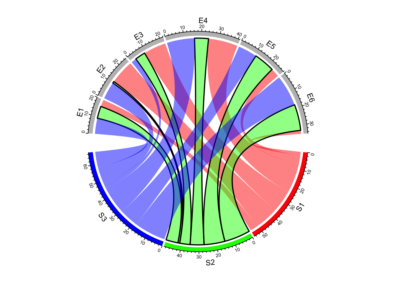
Figure 14.13: Set line style as a sub matrix.
To be more convenient, graphic parameters can be set as a three-column data frame in which the first two columns correspond to row names and column names in the matrix, and the third column corresponds to the graphic parameters (Figure 14.14).
lty_df = data.frame(c("S1", "S2", "S3"), c("E5", "E6", "E4"), c(1, 2, 3))
lwd_df = data.frame(c("S1", "S2", "S3"), c("E5", "E6", "E4"), c(2, 2, 2))
border_df = data.frame(c("S1", "S2", "S3"), c("E5", "E6", "E4"), c(1, 1, 1))
chordDiagram(mat, grid.col = grid.col, link.lty = lty_df, link.lwd = lwd_df,
    link.border = border_df)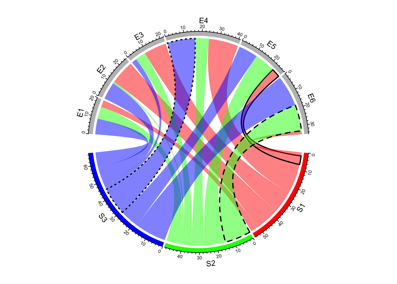
Figure 14.14: Set line style as a data frame.
It is much easier if the input is a data frame, you only need to set graphic settings as a vecotr.
chordDiagram(df, grid.col = grid.col, link.lty = sample(1:3, nrow(df), replace = TRUE),
    link.lwd = runif(nrow(df))*2, link.border = sample(0:1, nrow(df), replace = TRUE))
14.5 Highlight links
Sometimes we want to highlight some links to emphasize the importance of such relations. Highlighting by different border styles are introduced in Section 14.4 and here we focus on highlighting by colors.
There are two ways to highlight links, one is to set different transparency to different links
and the other is to only draw links that needs to be highlighted. Based on this rule and
ways to assign colors to links (introduced in Section 14.3.2), we can
highlight links which come from a same sector by assigning colors with different transparency
by row.col argument (Figure 14.15).
chordDiagram(mat, grid.col = grid.col, row.col = c("#FF000080", "#00FF0010", "#0000FF10"))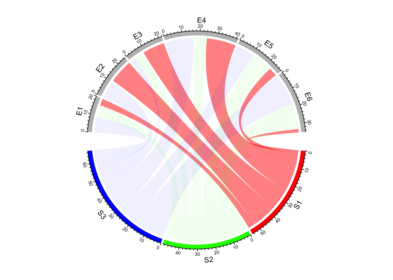
Figure 14.15: Highlight links by transparency.
We can also highlight links with values larger than a cutoff. There are at least three ways to do it. First, construct a color matrix and set links with small values to full transparency.
Since link colors can be specified as a matrix, we can set the transparency of
those links to a high value or even set to full transparency (Figure 14.16).
In following example, links with value less than 12 is set to #00000000.
col_mat[mat < 12] = "#00000000"
chordDiagram(mat, grid.col = grid.col, col = col_mat) 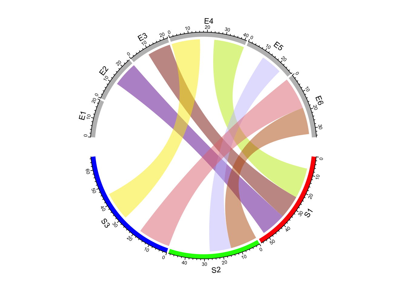
Figure 14.16: Highlight links by color matrix.
Following code demonstrates using a color mapping function to map values to different transparency. Note this is also workable for adjacency list.
col_fun = function(x) ifelse(x < 12, "#00000000", "#FF000080")
chordDiagram(mat, grid.col = grid.col, col = col_fun)
For both color matrix and color mapping function, actually all links are all
drawn and the reason why you cannot see some of them is they are assigned with
full transparency. If a three-column data frame is used to assign colors to
links of interest, links which are not defined in col_df are not drawn (Figure 14.17).
col_df = data.frame(c("S1", "S2", "S3"), c("E5", "E6", "E4"),
    c("#FF000080", "#00FF0080", "#0000FF80"))
chordDiagram(mat, grid.col = grid.col, col = col_df)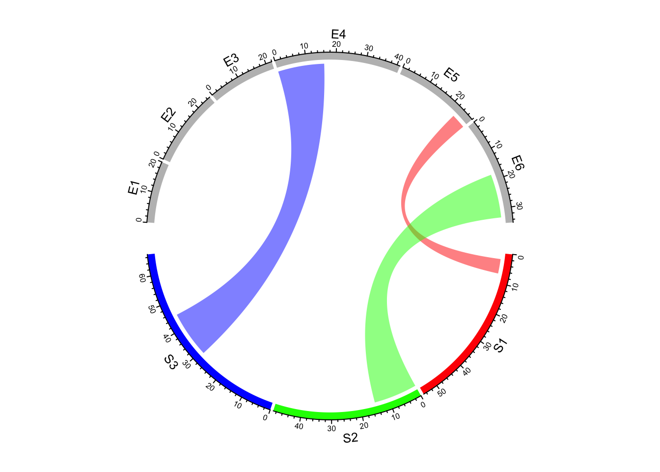
Figure 14.17: Highlight links by data frame.
Highlighting links is relatively simple for adjacency list that you only need to construct a vector of colors according to what links you want to highlight.
col = rand_color(nrow(df))
col[df[[3]] < 10] = "#00000000"
chordDiagram(df, grid.col = grid.col, col = col)
Some figure formats do not support transparency such as GIF format. Here the
other argument link.visible is recently introduced to circlize package
which may provide a simple way to control the visibility of links. The value can
be set as an logical matrix for adjacency matrix or a logical vector for
adjacency list (Figure 14.18).
col = rand_color(nrow(df))
chordDiagram(df, grid.col = grid.col, link.visible = df[[3]] >= 10)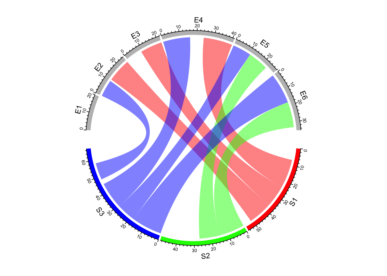
Figure 14.18: Highlight links by setting link.visible.
14.6 Orders of links
Orders of links on every sector are adjusted automatically to make them look
nice. But sometimes sorting links according to the width on the sector is
useful for detecting potential features. link.sort and link.decreasing can
be set to control the order of positioning links on sectors
(Figure 14.19).
chordDiagram(mat, grid.col = grid.col, link.sort = TRUE, link.decreasing = TRUE)
title("link.sort = TRUE, link.decreasing = TRUE", cex = 0.6)
chordDiagram(mat, grid.col = grid.col, link.sort = TRUE, link.decreasing = FALSE)
title("link.sort = TRUE, link.decreasing = FALSE", cex = 0.6)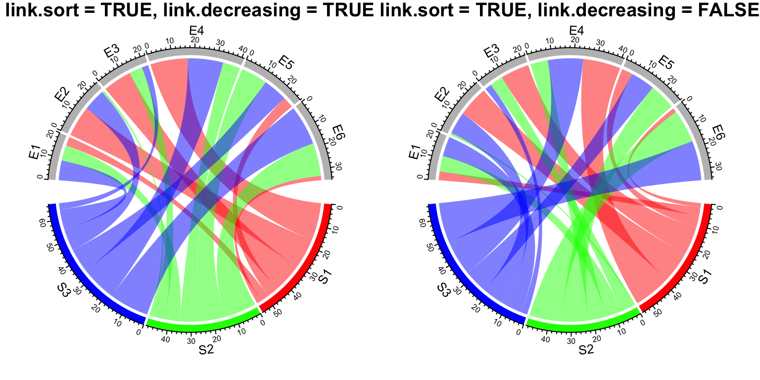
Figure 14.19: Order of positioning links on sectors.
14.7 z-index of adding links
The default order of adding links to the plot is based on their order in the
matrix or in the data frame. Normally, transparency should be set to the link
colors so that they will not overlap to each other. In most cases, this looks
fine, but sometimes, it improves the visualization to put wide links more
forward and to put small links more backward in the plot. This can be set by
link.zindex argument which defines the order of adding links one above the other. Larger value
means the corresponding link is added later (Figure 14.20).
chordDiagram(mat, grid.col = grid.col, transparency = 0)
chordDiagram(mat, grid.col = grid.col, transparency = 0, link.zindex = rank(mat))
Figure 14.20: z-index of adding links.
Similar code if the input is a data frame.
chordDiagram(df, grid.col = grid.col, transparency = 0, link.zindex = rank(df[[3]]))14.8 Self-links
How to set self links dependends on whether the information needs to be duplicated.
The self.link argument can be set to 1 or 2 for the two different scenarios.
Check the difference in Figure 14.21 (the black link on sector a).
df2 = data.frame(start = c("a", "b", "c", "a"), end = c("a", "a", "b", "c"))
chordDiagram(df2, grid.col = 1:3, self.link = 1)
title("self.link = 1")
chordDiagram(df2, grid.col = 1:3, self.link = 2)
title("self.link = 2")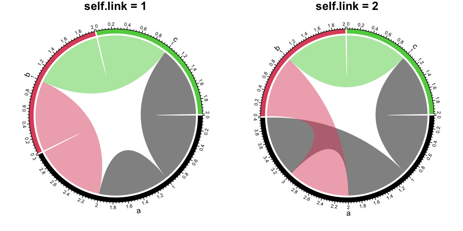
Figure 14.21: Self-links in Chord diagram.
14.9 Symmetric matrix
When the matrix is symmetric, by setting symmetric = TRUE, only lower
triangular matrix without the diagonal will be used (Figure 14.22).
mat3 = matrix(rnorm(25), 5)
colnames(mat3) = letters[1:5]
cor_mat = cor(mat3)
col_fun = colorRamp2(c(-1, 0, 1), c("green", "white", "red"))
chordDiagram(cor_mat, grid.col = 1:5, symmetric = TRUE, col = col_fun)
title("symmetric = TRUE")
chordDiagram(cor_mat, grid.col = 1:5, col = col_fun)
title("symmetric = FALSE")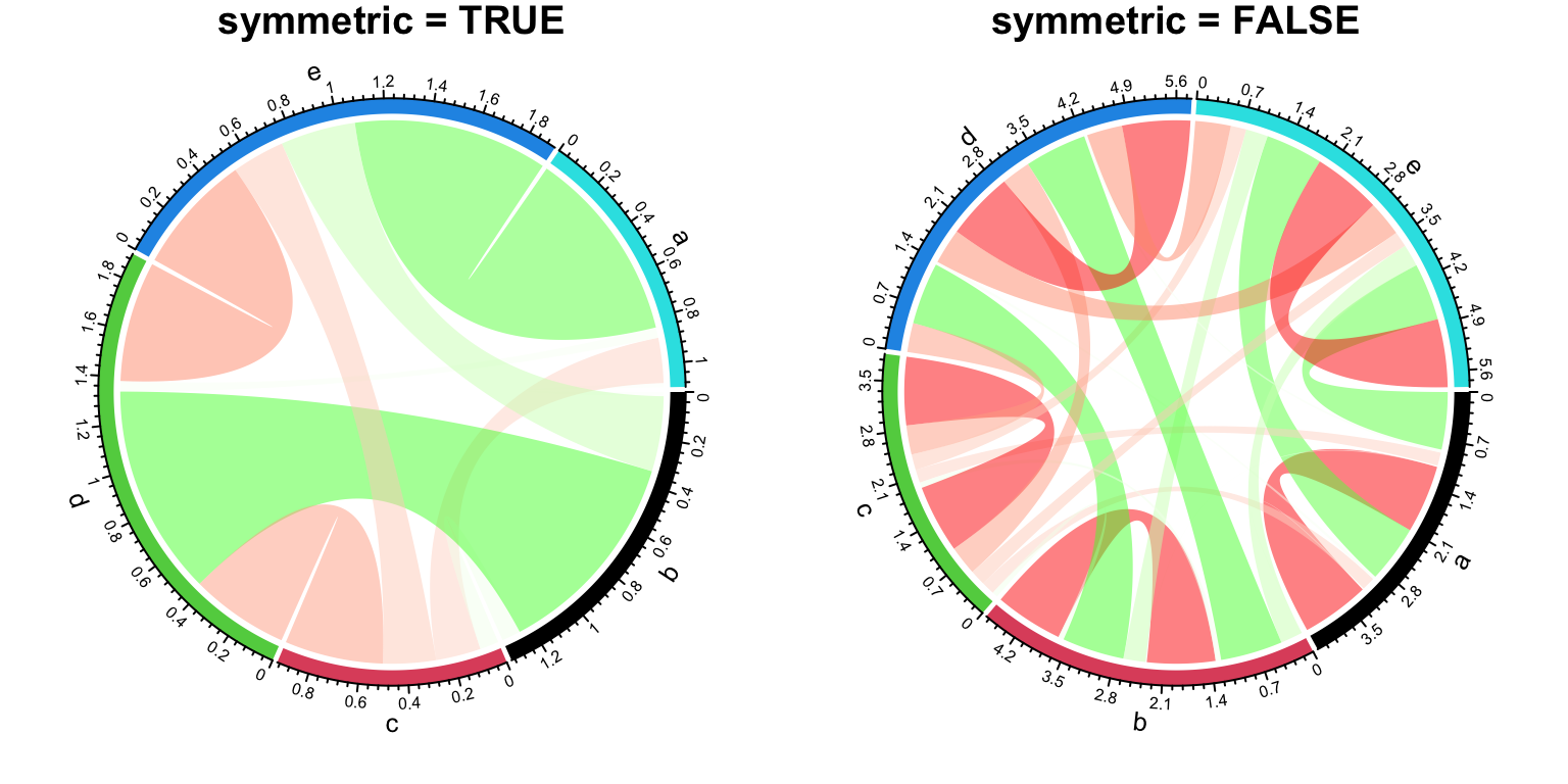
Figure 14.22: Symmetric matrix for Chord diagram.
14.10 Directional relations
In some cases, when the input is a matrix, rows and columns represent
directions, or when the input is a data frame, the first column and second
column represent directions. Argument directional is used to illustrate such
direction on the plot. directional with value 1 means the direction is
from rows to columns (or from the first column to the second column for the
adjacency list) while -1 means the direction is from columns to rows (or from
the second column to the first column for the adjacency list). A value of 2 means
bi-directional.
By default, the two ends of links have unequal height (Figure
14.23) to represent the directions.
The position of starting end of the link is shorter than the other end to give
users the feeling that the link is moving out. If this is not what your
correct feeling, you can set diffHeight to a negative value.
par(mfrow = c(1, 3))
chordDiagram(mat, grid.col = grid.col, directional = 1)
chordDiagram(mat, grid.col = grid.col, directional = 1, diffHeight = mm_h(5))
chordDiagram(mat, grid.col = grid.col, directional = -1)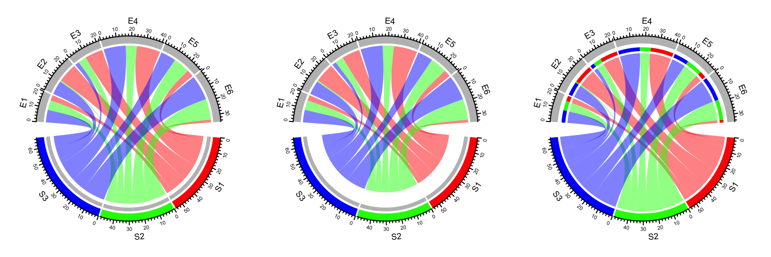
Figure 14.23: Represent directions by different height of link ends.
Row names and column names in mat can also overlap. In this case, showing
direction of the link is important to distinguish them
(Figure 14.24).
mat2 = matrix(sample(100, 35), nrow = 5)
rownames(mat2) = letters[1:5]
colnames(mat2) = letters[1:7]
mat2
## a b c d e f g
## a 60 14 33 27 70 2 45
## b 89 84 87 9 78 49 40
## c 26 7 42 74 36 76 4
## d 51 82 85 16 73 59 31
## e 30 90 23 38 68 11 35chordDiagram(mat2, grid.col = 1:7, directional = 1, row.col = 1:5)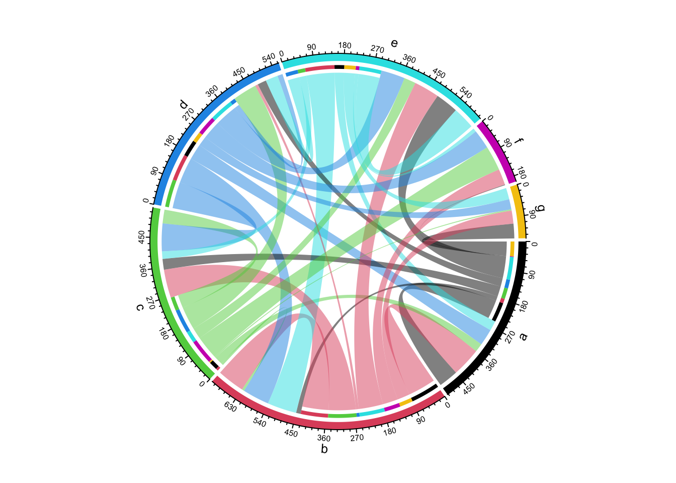
Figure 14.24: Chord diagram where row names and column names overlap.
If you do not need self-link for which two ends of a link are in a same sector, just set corresponding values to 0 in the matrix (Figure 14.25).
mat3 = mat2
for(cn in intersect(rownames(mat3), colnames(mat3))) {
    mat3[cn, cn] = 0
}
mat3
## a b c d e f g
## a 0 14 33 27 70 2 45
## b 89 0 87 9 78 49 40
## c 26 7 0 74 36 76 4
## d 51 82 85 0 73 59 31
## e 30 90 23 38 0 11 35chordDiagram(mat3, grid.col = 1:7, directional = 1, row.col = 1:5)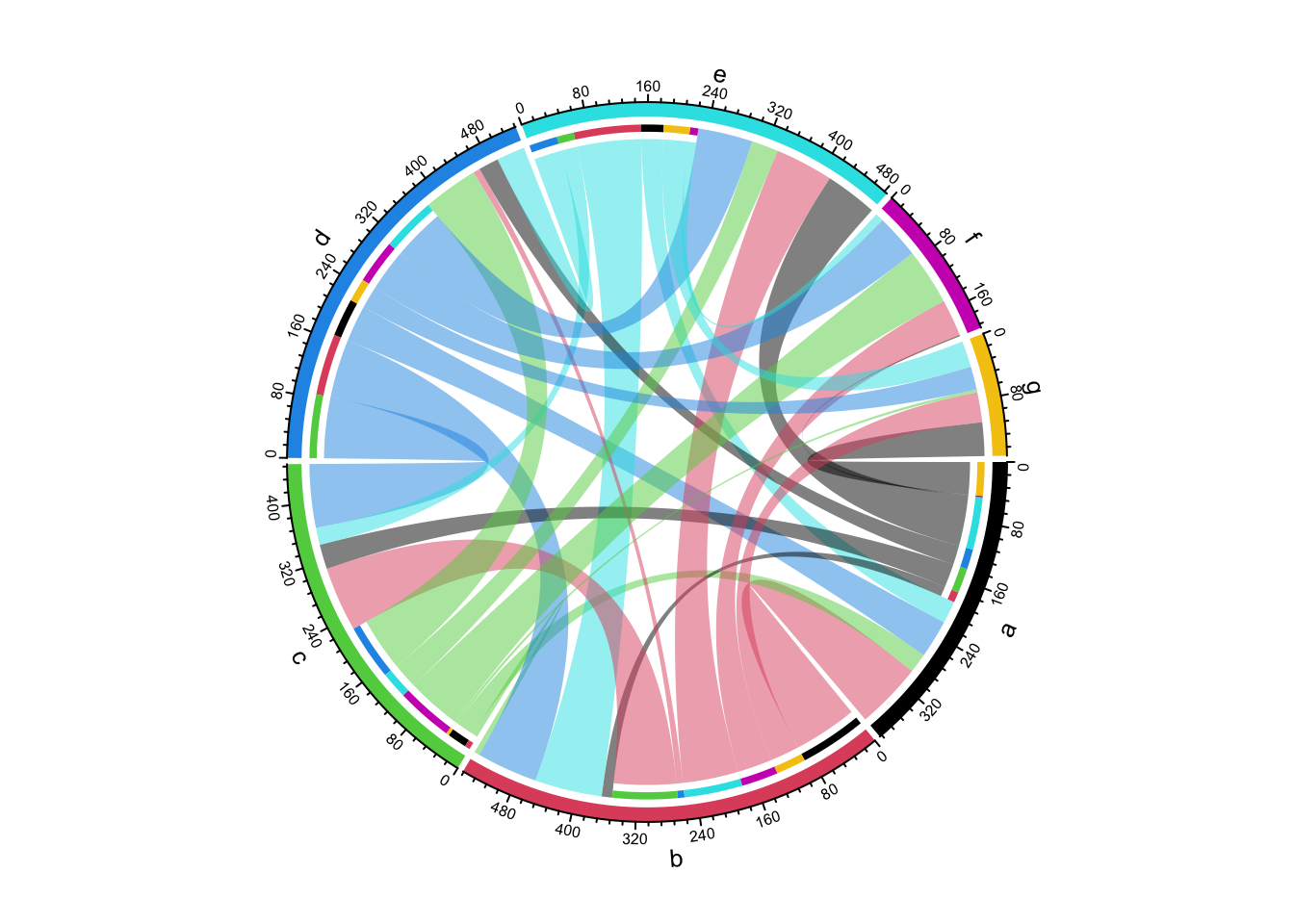
Figure 14.25: Directional Chord diagram without self links.
Links can have arrows to represent directions (Figure 14.26).
When direction.type is set to arrows, Arrows are added at
the center of links. Similar as other graphics parameters for links, the
parameters for drawing arrows such as arrow color and line type can either be
a scalar, a matrix, or a three-column data frame.
If link.arr.col is set as a data frame, only links specified in the data frame
will have arrows. Pleast note this is the only way to draw arrows to subset of links.
arr.col = data.frame(c("S1", "S2", "S3"), c("E5", "E6", "E4"),
    c("black", "black", "black"))
chordDiagram(mat, grid.col = grid.col, directional = 1, direction.type = "arrows",
    link.arr.col = arr.col, link.arr.length = 0.2)
Figure 14.26: Use arrows to represent directions in Chord diagram.
If combining both arrows and diffHeight, it will give you better visualization
(Figure 14.27).
arr.col = data.frame(c("S1", "S2", "S3"), c("E5", "E6", "E4"),
    c("black", "black", "black"))
chordDiagram(mat, grid.col = grid.col, directional = 1,
    direction.type = c("diffHeight", "arrows"),
    link.arr.col = arr.col, link.arr.length = 0.2)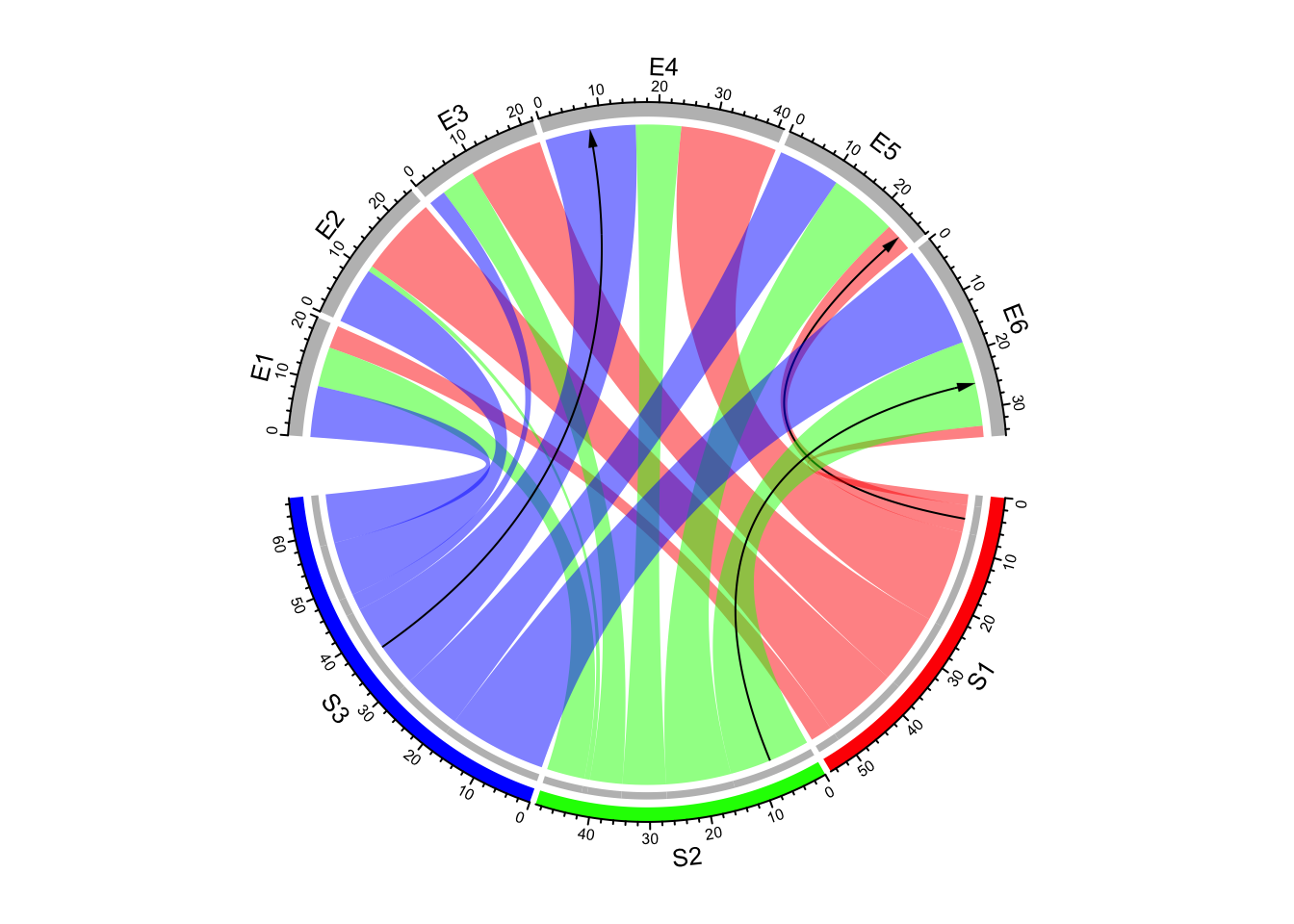
Figure 14.27: Use both arrows and link height to represent directions in Chord diagram.
There is another arrow type: big.arrow which is efficient to visualize
arrows when there are too many links (Figure 14.28).
matx = matrix(rnorm(64), 8)
chordDiagram(matx, directional = 1, direction.type = c("diffHeight", "arrows"),
    link.arr.type = "big.arrow")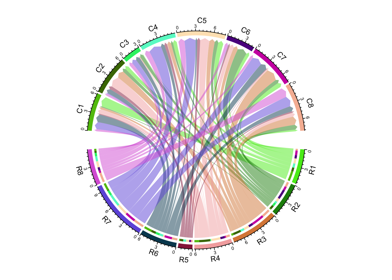
Figure 14.28: Use big arrows to represent directions in Chord diagram.
If diffHeight is set to a negative value, the start ends are longer than
the other ends (Figure 14.29).
chordDiagram(matx, directional = 1, direction.type = c("diffHeight", "arrows"),
    link.arr.type = "big.arrow", diffHeight = -mm_h(2))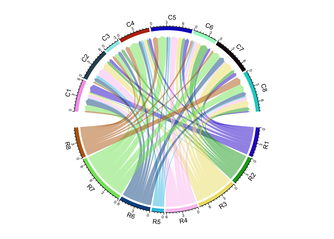
Figure 14.29: Use big arrows to represent directions in Chord diagram.
It is almost the same to visualize directional Chord diagram form a adjacency list.
chordDiagram(df, directional = 1)As shown in the previous Figures, there are bars on the source sector side
that show the proportion of target sectors (actually it is not necessarily to
be that, the bars are put on the side where the links are shorter and
diffHeight with a positive value). The bars can be removed by setting
link.target.prop = FALSE. The height of the bars is controlled by
target.prop.height argument.
par(mfrow = c(1, 2))
chordDiagram(mat, grid.col = grid.col, directional = 1,
    link.target.prop = FALSE)
chordDiagram(mat, grid.col = grid.col, directional = 1,
    diffHeight = mm_h(10), target.prop.height = mm_h(8))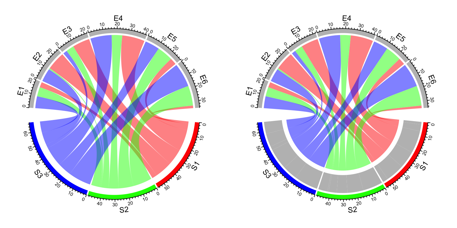
Figure 14.30: Control argument link.target.prop and target.prop.height.
14.11 Scaling
The link on Chord diagram represents the “absolute value” of the relations. Sometimes
for a certain sector, we might want to see relatively, how much of it goes to other
sectors. In this case, scale argument can be set to TRUE so that on each sector, the
value represents the fraction of the interaction going to one other sector (Figure 14.31).
set.seed(999)
mat = matrix(sample(18, 18), 3, 6)
rownames(mat) = paste0("S", 1:3)
colnames(mat) = paste0("E", 1:6)

grid.col = c(S1 = "red", S2 = "green", S3 = "blue",
    E1 = "grey", E2 = "grey", E3 = "grey", E4 = "grey", E5 = "grey", E6 = "grey")
par(mfrow = c(1, 2))
chordDiagram(mat, grid.col = grid.col)
title("Default")
chordDiagram(mat, grid.col = grid.col, scale = TRUE)
title("scale = TRUE")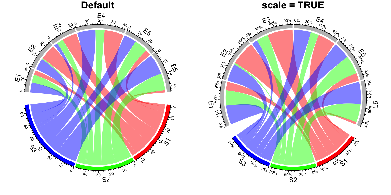
Figure 14.31: Scaling on sectors.
After scaling, all sectors have the same size and the data range of each sector
are all c(0, 1).
14.12 Reduce
If a sector in Chord Diagram is too small, it will be removed from the original matrix, since basically it can be ignored visually from the plot. In the following matrix, the second row and third column contain tiny values.
mat = matrix(rnorm(36), 6, 6)
rownames(mat) = paste0("R", 1:6)
colnames(mat) = paste0("C", 1:6)
mat[2, ] = 1e-10
mat[, 3] = 1e-10
In the Chord Diagram, categories corresponding to the second row and the third column will
be removed (R2 and C3 are removed).
chordDiagram(mat)
circos.info()
## All your sectors:
## [1] "R1" "R3" "R4" "R5" "R6" "C1" "C2" "C4" "C5" "C6"
##
## All your tracks:
## [1] 1 2
##
## Your current sector.index is C6
## Your current track.index is 2The reduce argument controls the size of sectors to be removed. The value is
a percent of the size of a sector to the total size of all sectors.
You can also explictly remove sectors by assigning corresponding values to 0.
mat[2, ] = 0
mat[, 3] = 0
All parameters for sectors such as colors or gaps between sectors are also automatically reduced accordingly by the function.
14.13 Input as a data frame
As mentioned before, both matrix and data frame can be used to represent relations
between two sets of features. In previous examples, we mainly demonstrate the use
of chordDiagram() with matrix as input. Also we show the code with data frame as
input for each functionality. Here we will go through these functionality again
with data frames and we also show some unique features which is only usable for
data frames.
When the input is a data frame, number of rows in the data frame corresponds to the number of links on the Chord diagram. Many arguments can be set as a vector which have the same length as the number of rows of the input data frame. They are:
transparencycol. Note,colcan also be a color mapping function generated fromcolorRamp2().link.borderlink.lwdlink.ltylink.arr.lengthlink.arr.widthlink.arr.typelink.arr.lwdlink.arr.ltylink.arr.collink.visiblelink.zindex
Since all of them are already demonstrated in previous sections, we won’t show them again here.
The following two sections list unique features only from data frames.
14.13.1 Multiple links between two sectors
If the input is a matrix, there can only be one link from sector A to B, but for the data frame, there can be mulitple links for a same pair of sectors. In following example, each pair of sectors have two links, one for positive value and the other for negative value.
df = expand.grid(letters[1:3], LETTERS[1:4])
df1 = df
df1$value = sample(10, nrow(df), replace = TRUE)
df2 = df
df2$value = -sample(10, nrow(df), replace = TRUE)
df = rbind(df1, df2)
grid.col = structure(1:7, names = c(letters[1:3], LETTERS[1:4]))
chordDiagram(df, col = ifelse(df$value > 0, "red", "green"), grid.col = grid.col)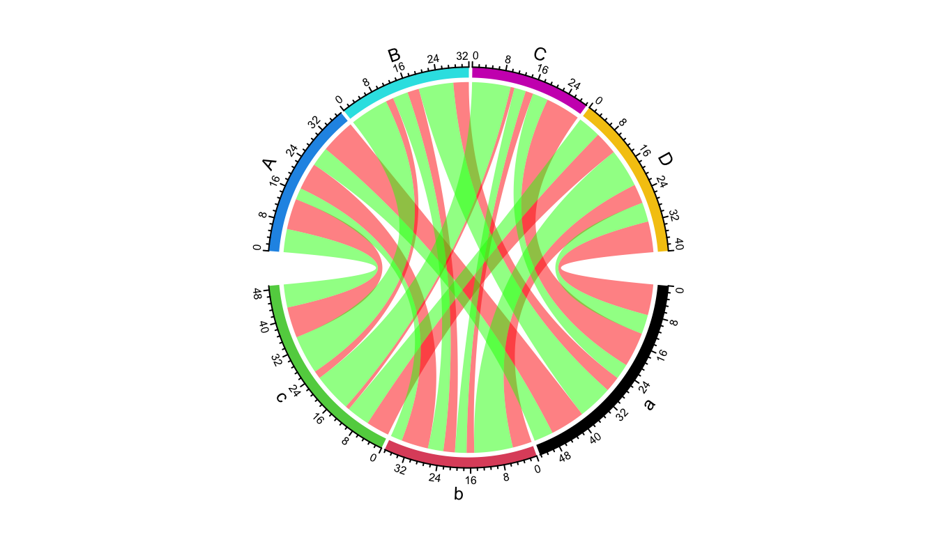
Figure 14.32: Multiple links for a same pair of sectors.
This functionality is useful when you want to visualize Figure 14.32 as two Chord diagrams, one for positive values and one for negative values, but still correspond the size of sector to the sum of both positive and negative values.
par(mfrow = c(1, 2))
chordDiagram(df, col = "red", link.visible = df$value > 0, grid.col = grid.col)
title("Positive links")
chordDiagram(df, col = "green", link.visible = df$value < 0, grid.col = grid.col)
title("Negative links")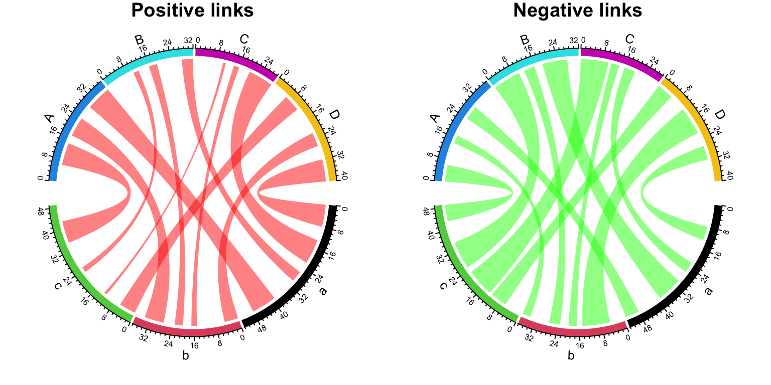
Figure 14.33: Split positive links and negative links.
14.13.2 Unequal width of the link ends
Almost all of the Chord diagrams shown in this chapter (except Figure 14.31), the width of the two ends of a link is always the same. This means same amount of information comes from one sector and goes to the other sector. However, for some cases, this is not always true. For example, when do scaling on sectors, the link actually has unequal width of the two ends (Figure 14.31 right).
Since the two ends have different width, now the data frame needs two numeric columns which correspond to the two ends of the links. Check following example:
df = expand.grid(letters[1:3], LETTERS[1:4])
df$value = 1
df$value2 = 3  # the names of the two columns do not matter
par(mfrow = c(1, 2))
chordDiagram(df[, 1:3], grid.col = grid.col)
title("one column of values")
chordDiagram(df[, 1:4], grid.col = grid.col)  # note we use two value-columns here
title("two columns of values")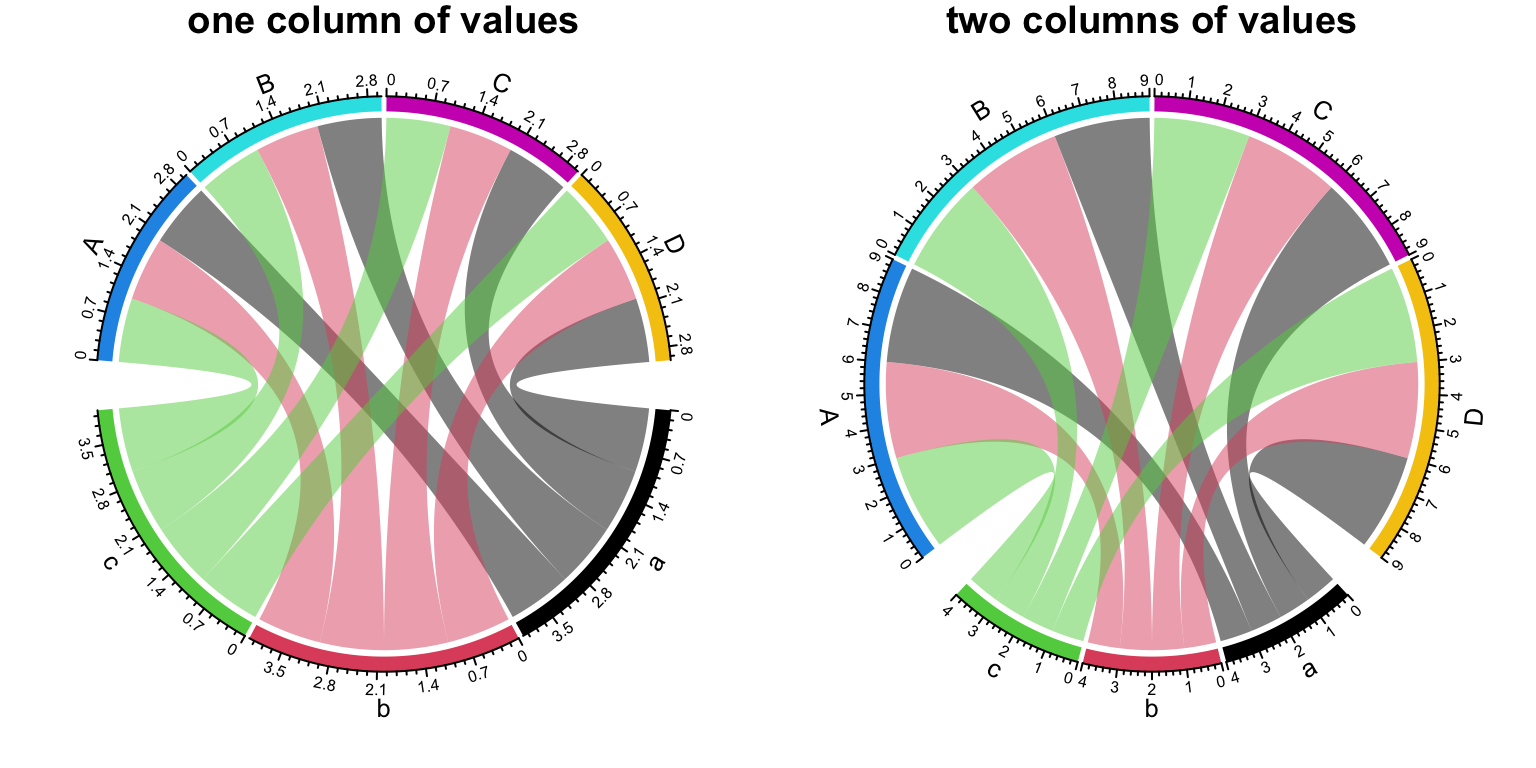
Figure 14.34: Unequal width of the link ends.