Chapter 5 Implement high-level circular plots
In this chapter, we show several examples which combine low-level graphic functions to construct complicated graphics for specific purposes.
5.1 Circular barplots
circlize already has a circos.barplot() function that draws the
barplots. Here is another type of circular barplots. In the following code, we put all
the nine bars in one track and one sector. You can also put them into 9
tracks, but the code would be very similar. See Figure
5.1.
category = paste0("category", "_", 1:9)
percent = sort(sample(40:80, 9))
color = rev(rainbow(length(percent)))

library(circlize)
circos.par("start.degree" = 90, cell.padding = c(0, 0, 0, 0))
circos.initialize("a", xlim = c(0, 100)) # 'a` just means there is one sector
circos.track(ylim = c(0.5, length(percent)+0.5), track.height = 0.8,
    bg.border = NA, panel.fun = function(x, y) {
        xlim = CELL_META$xlim
        circos.segments(rep(xlim[1], 9), 1:9,
                        rep(xlim[2], 9), 1:9,
                        col = "#CCCCCC")
        circos.rect(rep(0, 9), 1:9 - 0.45, percent, 1:9 + 0.45,
            col = color, border = "white")
        circos.text(rep(xlim[1], 9), 1:9,
            paste(category, " - ", percent, "%"),
            facing = "downward", adj = c(1.05, 0.5), cex = 0.8)
        breaks = seq(0, 85, by = 5)
        circos.axis(h = "top", major.at = breaks, labels = paste0(breaks, "%"),
            labels.cex = 0.6)
})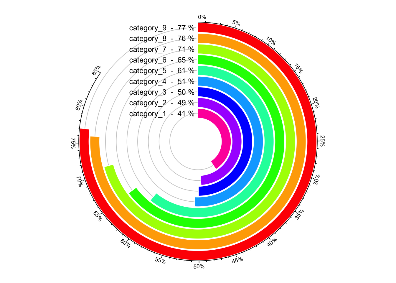
Figure 5.1: A circular barplot.
circos.clear()When adding text by circos.text(), adj is specified to c(1.05, 0.5)
which means text is aligned to the right and there is also offset between the
text and the anchor points. We can also use mm_x() to set the offset to
absolute units. Conversion on x direction in a circular coordinate is affected
by the position on y axis, here we must set the h argument. Following code
can be used to replace the circos.text() in above example.
circos.text(xlim[1] - mm_x(2, h = 1:9), 1:9,
    paste(category, " - ", percent, "%"),
    facing = "downward", adj = c(1, 0.5), cex = 0.8)
5.2 Histograms
circlize ships a circos.trackHist() function which draws histograms in
cells. This function is a high-level function which caculates data ranges on y
axes and creates a new track. The implement of this function is simple, that it
first calculates the histogram in each cell by hist() function, then draws
histogram by using circos.rect().
Users can choose to visualize data distributions by density lines by setting
draw.density = TRUE.
Figure 5.2 shows a histogram track under default
settings, a histogram track with specified bin.size and a track with density
lines. By default, bin size of histogram in each cell is calculated
separatedly and they will be different between cells, which makes it not
consistent to compare. Manually setting bin.size in all cells to a same
value helps to compare the distributions between cells.
x = rnorm(1600)
sectors = sample(letters[1:16], 1600, replace = TRUE)
circos.initialize(sectors, x = x)
circos.trackHist(sectors, x = x, col = "#999999",
    border = "#999999")
circos.trackHist(sectors, x = x, bin.size = 0.1,
    col = "#999999", border = "#999999")
circos.trackHist(sectors, x = x, draw.density = TRUE,
    col = "#999999", border = "#999999")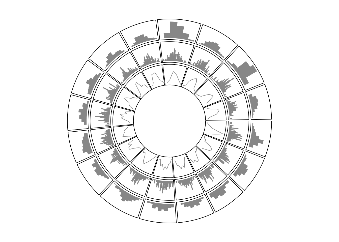
Figure 5.2: Histograms on circular layout.
circos.clear()5.3 Phylogenetic trees
Circular dendrograms have many applications, one of which is to visualize
phylogenetic trees. Basically, a phylogenetic tree is
a dendrogram which is a combination of lines. In R, there are several classes that
describe such type of tree such as hclust, dendrogram and phylo.
In this example, we will demonstrate how to draw the tree from the dendrogram class.
Nevertheless, other classes can be converted to dendrogram without too much difficulty.
The bird.orders data we are using here is from ape package. This data set is
related to species of birds.
library(ape)
data(bird.orders)
hc = as.hclust(bird.orders)
We split the tree into six sub trees by cutree() and convert the data into a
dendrogram object.
labels = hc$labels  # name of birds
ct = cutree(hc, 6)  # cut tree into 6 pieces
n = length(labels)  # number of bird species
dend = as.dendrogram(hc)
As we mentioned before, the x-value for the phylogenetic tree is in fact index. Thus, the x-lim is just the minimum and maximum index of labels in the tree. Since there is only one phylogenetic tree, we only need one “big” sector.
In the first track, we plot the name of each bird, with different colors to represent different sub trees.
circos.par(cell.padding = c(0, 0, 0, 0))
circos.initialize("a", xlim = c(0, n)) # only one sector
circos.track(ylim = c(0, 1), bg.border = NA, track.height = 0.3,
    panel.fun = function(x, y) {
        for(i in seq_len(n)) {
            circos.text(i-0.5, 0, labels[i], adj = c(0, 0.5),
                facing = "clockwise", niceFacing = TRUE,
                col = ct[labels[i]], cex = 0.5)
        }
})
In the above code, setting xlim to c(0, n) is very important because the
leaves of the dendrogram are drawn at x = seq(0.5, n - 0.5).
In the second track, we plot the circular dendrogram by circos.dendrogram() (Figure 5.3 left).
You can render the dendrogram by dendextend package.
suppressPackageStartupMessages(library(dendextend))
dend = color_branches(dend, k = 6, col = 1:6)
dend_height = attr(dend, "height")
circos.track(ylim = c(0, dend_height), bg.border = NA,
    track.height = 0.4, panel.fun = function(x, y) {
        circos.dendrogram(dend)
})
circos.clear()
By default, dendrograms are facing outside of the circle (so that the labels
should also be added outside the dendrogram). In circos.dendrogram(), you
can set facing argument to inside to make them facing inside. In this
case, dendrogram track is added first and labels are added later (Figure 5.3 right).
circos.dendrogram(dend, facing = "inside")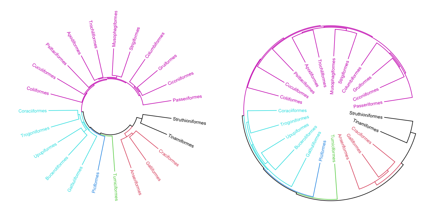
Figure 5.3: A circular phylogenetic tree.
If you look at the souce code of circos.dendrogram() and replace
circos.lines() to lines(), actually the function can correctly make a
dendrogram in the normal coordinate.
With the flexibility of circlize package, it is easy to add more tracks if you want to add more corresponded information for the dendrogram to the plot.
5.4 Manually create heatmaps
Heatmaps, and sometimes combined with dendrograms are frequently used to
visualize e.g. gene expression. Heatmaps are basically composed by rectangles,
thus, they can be implemented by circos.rect().
In following example, we make a circular plot with two heatmaps. First we generate the two matrix and perform clustring on the two matrix.
mat = matrix(rnorm(100*10), nrow = 100, ncol = 10)
col_fun = colorRamp2(c(-2, 0, 2), c("green", "black", "red"))
sectors = rep(letters[1:2], times = c(30, 70))
mat_list = list(a = mat[sectors == "a", ],
                b = mat[sectors == "b", ])
dend_list = list(a = as.dendrogram(hclust(dist(mat_list[["a"]]))),
                 b = as.dendrogram(hclust(dist(mat_list[["b"]]))))
In the first track, columns in the matrix are adjusted by the clustering.
Also note we use circos.rect() in a vectorized way.
circos.par(cell.padding = c(0, 0, 0, 0), gap.degree = 5)
circos.initialize(sectors, xlim = cbind(c(0, 0), table(sectors)))
circos.track(ylim = c(0, 10), bg.border = NA, panel.fun = function(x, y) {
    sector.index = CELL_META$sector.index
    m = mat_list[[sector.index]]
    dend = dend_list[[sector.index]]

    m2 = m[order.dendrogram(dend), ]
    col_mat = col_fun(m2)
    nr = nrow(m2)
    nc = ncol(m2)
    for(i in 1:nc) {
        circos.rect(1:nr - 1, rep(nc - i, nr),
            1:nr, rep(nc - i + 1, nr),
            border = col_mat[, i], col = col_mat[, i])
    }
})
Since there are two dendrograms, it is important to make the height
of both dendrogram in a same scale. We calculate the maximum height
of the two dendrograms and set it to ylim of the second track (Figure 5.4).
max_height = max(sapply(dend_list, function(x) attr(x, "height")))
circos.track(ylim = c(0, max_height), bg.border = NA, track.height = 0.3,
    panel.fun = function(x, y) {
        sector.index = get.cell.meta.data("sector.index")
        dend = dend_list[[sector.index]]
        circos.dendrogram(dend, max_height = max_height)
})
circos.clear()
Figure 5.4: Circular heatmaps.
In the next chapter, we will introduce a high-level function circos.heatmap()
which draws fancy circular heatmaps.